Monthly archives: June, 2026

Our 60-what? browngrotta arts’ latest publication

Catalog Cover: Transformations: dialogues in art and materials

Another exhibition, time for another catalog. The volume for this Spring’s exhibition, Transformations: dialogues in art and materials, is our 63rd (57 catalogs, 6 monographs). With work by 79 artists highlighted in Transformations, the catalog was bound to be a big one. In fact it weighs in at 164 full-color pages. The works in Transformations were installed to illustrate the varying ways artists used the same material — whether traditional, silk, cotton, sisal or more unusual, feathers, horsehair, and jute. The catalog essay explores additional themes.

Hisako Sekijima catalog spread
Two different types of Bambo Baskets by Hisako Sekijima. Photo by Tom Grotta

Making and Meaning
Some artists in Transformations take their materials beyond physical characteristics— asking viewers to feel, remember, or reconsider. Stéphanie Jacques describes this approach with characteristic directness: “[P]lant matter is not the subject of my work. It is a means among others… But this means is not trivial. It connects me to what man has always done, shaping what he needs with his hands from what he sees around him. What matters to me is to talk about what is alive.” Jacques constructs sculptural forms that are humanoid but less than literal, using volume to give life to an unfilled interior space — speaking of the movements of the body, desire, intuitions, something that pushes from the inside and overflows. For Hisako Sekijima the subject is not the material alone; it is the dynamic interplay between what the material will and will not do, and what the maker can discover within that negotiation. 

Willow title page
willow works by Dail Behennah, Stéphanie Jacques and Esmé Hofman. Photo by Tom Grotta

The Material as Its Own Message
For some artists, the material does not carry meaning so much as it is the meaning. Sue Lawty and Yasuhisa Kohyama work at opposite ends of the material world —one with fiber and stone, the other with clay and fire — but they share a conviction that the deepest outcomes come not from overriding what a material wants to do, but from creating conditions for it to reveal itself.

Yasuhisa Kohyama and Sue Lawty catalog pages
Ceramic by Yasuhisa Kohyama and Indigo weaving by Sue Lawty. Photo by Tom Grotta

Material as Cultural Memory
James Bassler and Eduardo Portillo and María Dávila ask us to attend to where materials have been — to the long human histories encoded in fiber, dye, and weave structure. For these artists, meaning is inseparable from origin; the biography of a material is part of what the finished work contains. Bassler has spent decades drawing from Navajo wedge-weave, pre-Columbian scaffold weave, and Andean shibori, accumulating a global inventory of material knowledge. Portillo and Dávila traveled extensively in China and India to study indigo dye-making, silk sericulture, and handweaving, learning that fiber is a vehicle for understanding other cultures. Their Azul Indigo series emerged from looking for blue in their Venezuelan mountain landscape. 

James Bassler and Eduardo Portillo and María Dávila catalog pages
Indigo weavings by James Bassler and Eduardo Portillo and María Dávila. Photo by Tom Grotta

Between System and Surprise
One theme recurring in Transformations is the tension between system and discovery. Merja Keskinen describes this generative uncertainty: “I work to see. The joy of discovery and the delight of experiencing colors are essential to me.” Norie Hatakeyama works with factory-made paper-packing tape, an experimental material that enables her to break free from traditional limitations. By submitting an industrial material to the ancient technique of plaiting, she transforms both: the tape becomes sculpture, and the sculpture raises questions about what we mean by “natural.”

Norie Hatakeyama and  Merja Keskinen cTALOG PAGES
Paper sculpture by Norie Hatakeyama and line weaving Merja Keskinen. By Tom Grotta

Drawing with Material, Drawing in Space
Several artists treat fiber not as the medium of weaving but as an instrument of drawing itself. “Instead of drawing on paper,” Marian Bijlenga says, “I draw in space by using textile as a material.”After rejecting weaving as too slow, she discovered horsehair as an element — stiff enough to stand on its own, allowing a new kind of freedom. Kyoko Kumai has spent decades achieving something similarly paradoxical with stainless steel. She has written of her chosen material with wonder: “Thin pieces of stainless steel wire create a richly expressive fabric that does not stand solidly, cleaving the air. It has its own language fluttering above the floor; breathing and melting into the air.” 

Kyoko Kumai Catalog spread
steel filament textiles by Kyoko Kumai. Photo by Tom Grotta

The works in Transformations demonstrate how material intelligence, at its highest level, transcends the categories of craft and fine art altogether.
Here Comes the Sun: Art and the Summer Solstice

Summer Solstice is the radiant first day of summer in the northern hemisphere. It arrives this week. It will be the longest day of the year and the shortest night. A holdover from pagan days, when our connection to nature was far, far closer, the solstice marks — among other things — the sun’s peak energy, the height of nature’s vitality and the boundary between seasons.  Not surprisingly, these are topics that engage artists. 

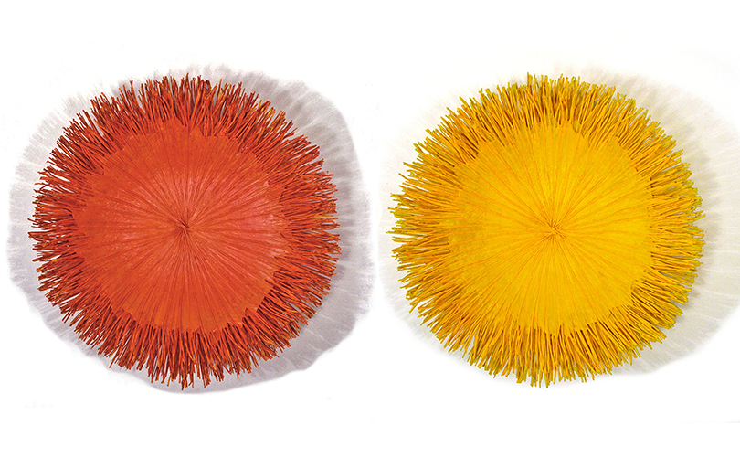
Sun Series wall baskets, Mary Merkel-Hess
60-61mm Sun Series, Mary Merkel-Hess, paper, reed, 6″ x 24″ x 24″,(each), 2013. Photos by Tom Grotta

We wish you a successful solstice and celebrate it with art. The summer solstice in art spans thousands of years, evolving from ancient astronomical monuments to romanticized folklore and expressive modern landscapes. Among the most famous is Summer Solstice (In Memory of the American Chestnut Tree), by Charles Burchfield (1893 -1967). Burchfield wanted to celebrate “this great moment when the sun and earth meet in their greatest intimacy—a truly mystical event—” by painting one of his grandest landscapes.

My Sun for Everyone, Lija Rage, 2018
31r My Sun for Everyone, Lija Rage, 2018. Photo by Tom Grotta

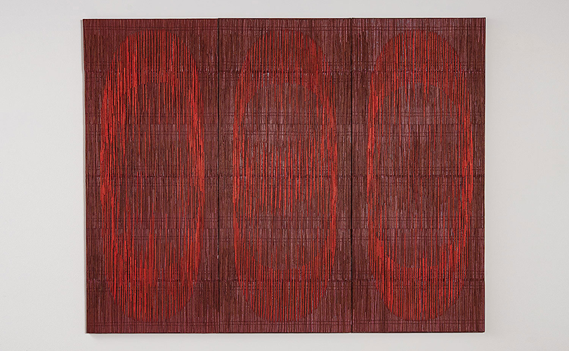
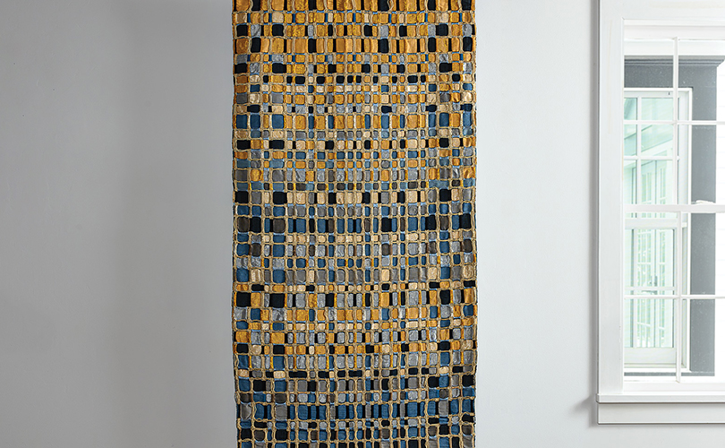
The primary hues are vibrant and earthy. They include sunny yellow and gold to represent the sun, peak solar energy, joy, and illuminations and lush geen: to symbolize fertility, abundance, growth, and the vibrant earth. Also featured in solstice celebrations are fiery orange and red to reflect passion, courage, and the transformative energy of fire like that in My Sun for Everyone by Lija Rage. Sky and water blue that echo the expansive summer sky, as you will see in Sol de la Tarde (by Eduardo Portillo and María Davíla, are yet another combination evoked by this event.

Sol de la Tarde (Mid Afternoon Sun), Eduardo Portillo & Mariá Eugenia Dávila
26pd Sol de la Tarde (Mid Afternoon Sun), Eduardo Portillo & Mariá Eugenia Dávila, silk , moriche palm fiber, copper filaments and natural dyes, 75″ x 37.5″, 2013

Cultures around the globe have historically celebrated this celestail event. Its core symbolic meanings encompass several universal themes, including: Triumph of Light: The abundance of daylight symbolizes enlightenment, the shedding of darkness, and the awakening of the spirit; and Abundance and Fertility: Historically viewed as the height of the growing season, the solstice represents the earth’s fertility, blossoming, and a bountiful harvest.

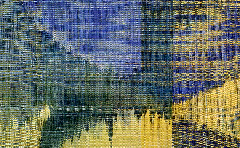
Sun Dial, Polly Barton
Detail: 18pb Sun Dial, Polly Barton, silk warp and weft, indigo pigment with soy milk. Ikat weft, 15″ x 12″, 2015. Photo by Tom Grotta

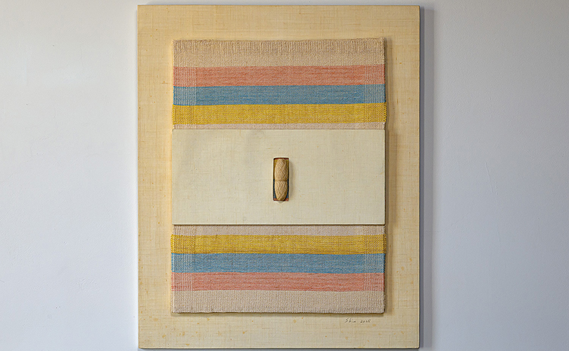
Also included are  Life Balance and Duality: Despite celebrating the maximum sunlight, the summer solstice also quietly marks the day the sun “stands still” and the days begin to shorten. This duality symbolizes the delicate balance between light and dark, action and stillness, epitomized in Polly Barton’s Sun Dial. Also represented, New Beginnings: The energetic shift toward summer is often used as a symbolic marker to let go of old patterns, set new intentions, and manifest personal growth. Emotional Summer by Young-ok Shin, explores this theme.

Emotional Summer, Young-ok Shin
10sy Emotional Summer, Young-ok Shin, Hand-wound Mosikuri, ramie, linen thread, 24″ x 18.5″ x 1.6″, 2025. Photo by Tom Grotta

We wish you all these and more. Happy Solstice!


Process Notes: Woodblock Printing with Paul Furneaux

Scottish artist Paul Furneaux has included a detailed behind-the-scenes look at his artistic process on his website. It’s so informative, we asked if we might adapt it for readers of arttexstyle. Enjoy!

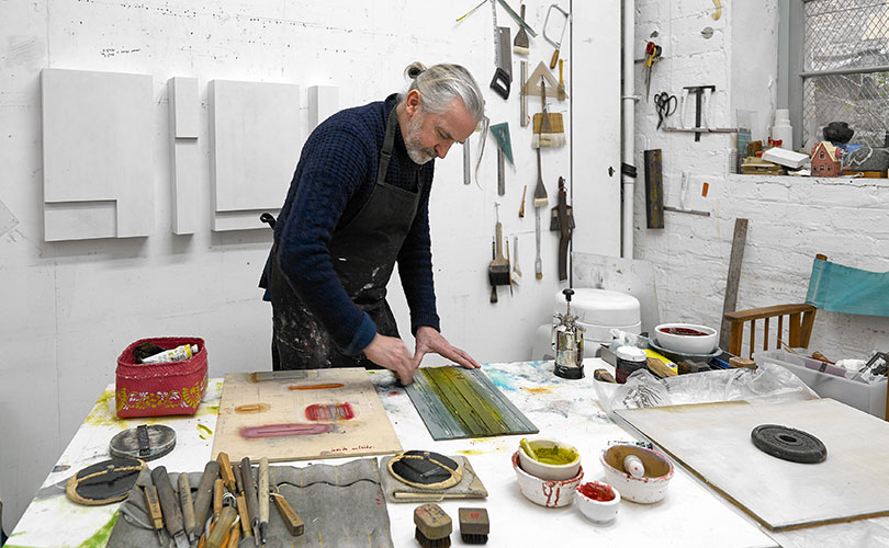
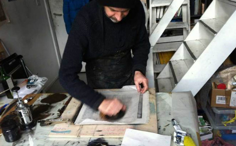
Paul Furneaux printing in his studio
Paul Furneaux printing in his studio. Photo courtesy: Paul Furneaux

approach
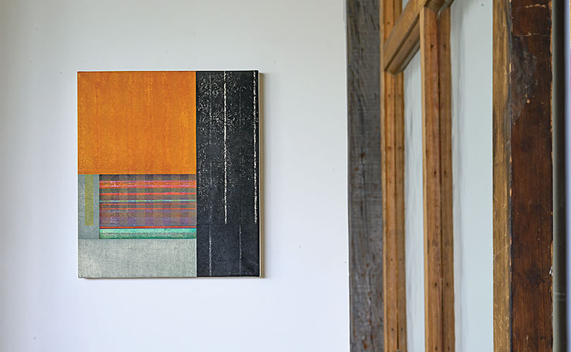
Coming from a painting background where the possibilities seem endless, I am more and more fascinated by the limitations imposed by woodblock printing. What excites me is the level of individuality that comes through. It is such a direct, tactile process – its range of marks and qualities are unique.

The emphasis at Tama Art University (where I studied) was on students finding their own approach to this traditional technique. This is something that has stayed with me.For example, although at times I use the traditional kento system to achieve a tight registration, I often take more flexible approaches. I also like to combine the more controlled cutting adopted by many Japanese printers, with the freer expressive style more commonly associated with woodcut in the west.

One of the materials widely used in Tama is varnish. As this repels watercolor, it can be applied to the wood as a painterly addition to the mark-making process. Often a print will come about through a combination of planning and intuitive evolution. This can result in a print being one-off, or a series of variations. These may be resolved into a ‘final’ printed edition but just as often the creative impulse has taken its course.

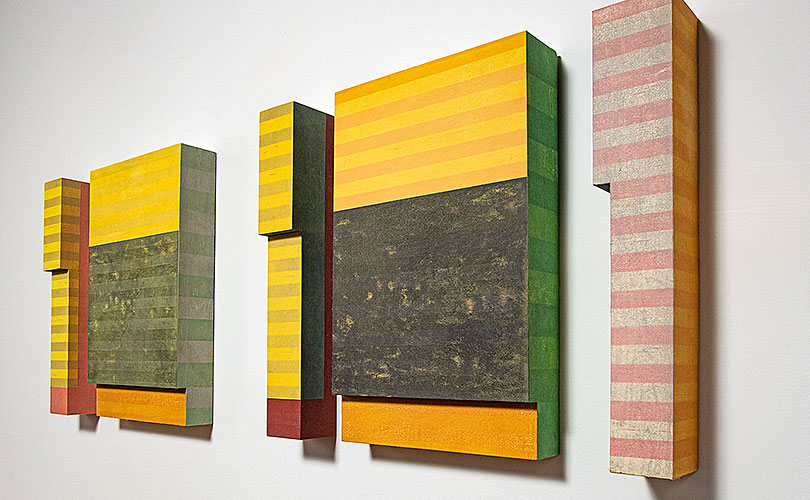
Garden Shadows: City Shadows, Paul Furneaux
7pf Garden Shadows: City Shadows, Paul Furneaux, Mokuhanga (japanese woodcut print ), gesso, rice paste and pva archival glue, solid tulip wood, 20.5” x 55” x 4”, 2021. Photo Tom Grotta

paper
There are many hundreds of Japanese papers (washi), handmade specifically for watercolor printing. Selection can be quite a long process. The paper usually needs to be sized though Japanese paper gets stronger as it gets older, so sometimes sizing is unnecessary.

The size itself can take a couple of days to make. Its ingredients include nikawa, a type of animal glue, and alum. These are ground, melted in water, and evenly applied with a large soft dosa brush. Once the paper is dry, I try to leave it for several days to allow the size to settle in.

The paper is moistened by layering between several dampened sheets of newsprint. These are wrapped in layers of plastic that allows the moisture to spread evenly. It takes 2 to 6 hours for the paper to dampen ready for printing.

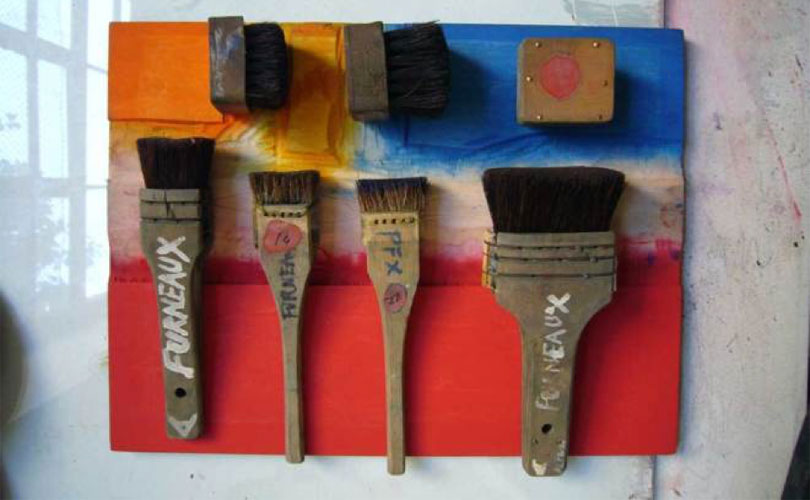
Brushes on an inked piece of woodblock
Brushes on an inked piece of woodblock. Photo courtesy: Paul Furneaux

brushes
The brushes used to apply color to woodblocks are a mixture of horse and pig or deer hair. They look like shoe brushes, as you’ll see from the photo below. If the brushes are out of shape, I leave plenty of time for re-shaping as it can take all day.

Before use, the brushes are singed with fire, or a hot plate, and rubbed on a sharkskin, or modern metal equivalent. This splits the hair ends, and softens them, so that they hold more watercolor.

paints and pigments
I normally use gouache or watercolor paints, prepared in small dishes or used directly from the tube. If I want a richer color, I use pure pigments. These are ground in a pestle and mortar and mixed with a binder, such as gum arabic or animal glue. I’ll usually also mix them with some rice paste glue on the block itself.

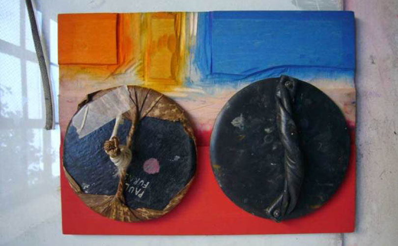
Printing barens on an inked piece of woodblock
Printing barens on an inked piece of woodblock. Photo courtesy: Paul Furneaux

baren
A baren is used to rub paper onto a colored woodblock. This is a disk about the size of a saucer, usually wrapped in a bamboo leaf, that fits in the palm of the hand.A printer will have several barens to achieve different effects. These may range from inexpensive machine wrapped card, to a skillfully crafted object made over several weeks. The latter cost anything from £300 to £1000. Ball-bearing barens are also popular.

Before use, the bamboo leaf has some light oil rubbed into it. The force of printing, and possibly dampness from the paper, will eventually split the leaf unless this is done. A press can be used instead of a baren, but you lose flexibility. Extra emphasis in areas and intended baren marks can be integral to the final work.

Soft Sea Lewis II, Paul Furneaux
8pf Soft Sea Lewis II, Paul Furneaux, Mokuhan Ga, Japanese woodcut print, sealed birch, UV. Photo Tom Grotta


woodblock
Building up a printed image in layers may take several woodblocks. Blocks are selected for the different properties of their wood type. I tend to use shina veneer, which is relatively easy to cut and has a smooth grain. When I need a rougher surface, the shina can be burnt slightly and rubbed to raise the grain; alternatively I use other woods.

The wood is usually cut away to create a relief image for printing. Before printing the block is soaked with water. This keeps the color on the surface of the block, rather than being sucked into the wood.

Paul printing in his studio
Paul printing in his studio. Photo courtesy: Paul Furneaux

printing
Color is evenly brushed in a thin layer onto the woodblock, then left until it appears to start to dry. At this point, a sheet of the dampened paper is put in position with the aid of a registration guide. A thin piece of paper, or plastic, is placed over the paper to be printed; then carefully but quickly rubbed over with a baren. This process is repeated for each color, building up the image in layers. For a rich saturation, I apply the same color again.

The results, we would add, speak for themselves!


Art Out and About — a Busy Summer Season

There are exciting exhibitions in diverse locales worldwide to visit this summer  — from China to California, Italy to Connecticut. 

Federica Luzzi and Naoya Takahara: Exercises in Being Like Others
June 4 – August 2, 2026
Mattatoio di Roma, Slaughterhouse
Piazza Orazio Giustiniani, 4
00153 Rome
https://www.mattatoioroma.it/mostra/federica-luzzi-e-naoya-takahara-esercizi-per-essere-come-gli-altri

Federica Luzzi, 3 giugno 2026 Mattatoio, foto Giorgio Benni 5

In Rome, sculptures, installations, fragile sheets, fabrics, stitching, and false monuments transform the pavilion of a former Slaughterhouse into a visual journey in which each piece is a song and a constant fear of suffering violence to the body, to one’s own body, and to its play. The two-person exhibition features Federica Luzzi, an Italian born in Rome, and Naoya Takahara, a Japanese born in Ehime but living in Rome since 1977. Separated (soul is never accessible), each works for the other; each dreams of the other’s respective East and West. The exhibition highlights two cultures and a shared search for propitious places — Luzzi through the constant trepidation of the body, the paralysing feminine sense; Naoya with the only comfort of being childlike. 

Material Matters: Sheila Hicks and Shi Hui
Through August 2, 2026West Bund MuseumGallery 3
2600 Longteng Avenue, Xuhui District
Shanghai, China
https://wbmshanghai.com/en/exhibition/1452-event-material-matters

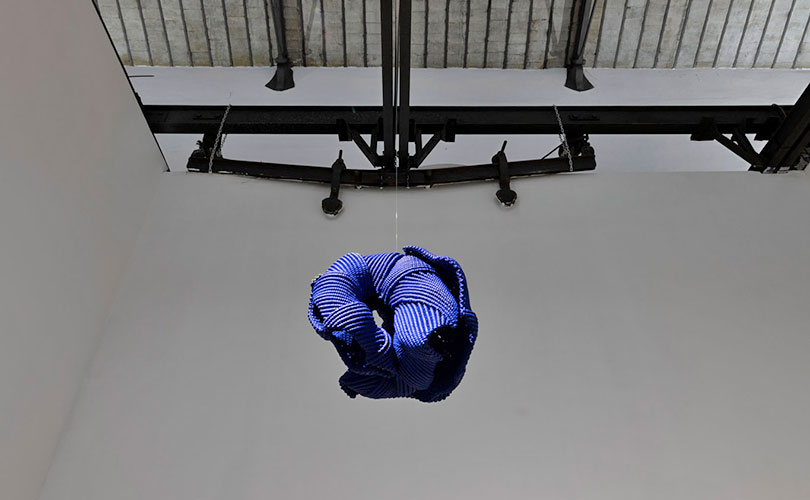
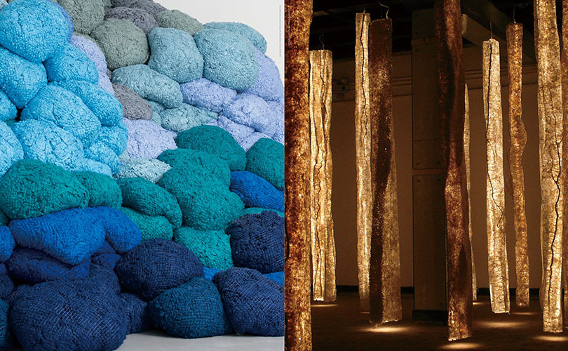
Photo, Left: Sheila HICKS, Nowhere to Go (partial image), 2022©National Gallery of Victoria, NGVWA, 2024, Right: SHI Hui, Frozen Wind (partial image), 2004©Courtesy of Shi Hui, Hangzhou

In this pair of solo exhibitions in Shanghai, visitors are captivated by how Sheila Hicks intertwines threads, colors, and histories, and engages with softness and monumentality. At the same time, they decipher the multiple lives Shi Hui gives to paper pulp, and revel in the ways her work rekindles Chinese artistic traditions.

Subconscious Surfaced
Through August 29, 2026 
Moderne Gallery 
1705 N American St. STE 3, 
Philadelphia, PA 19122
https://modernegallery.com/subconscious-surfaced/?mc_cid=ebd45972ba

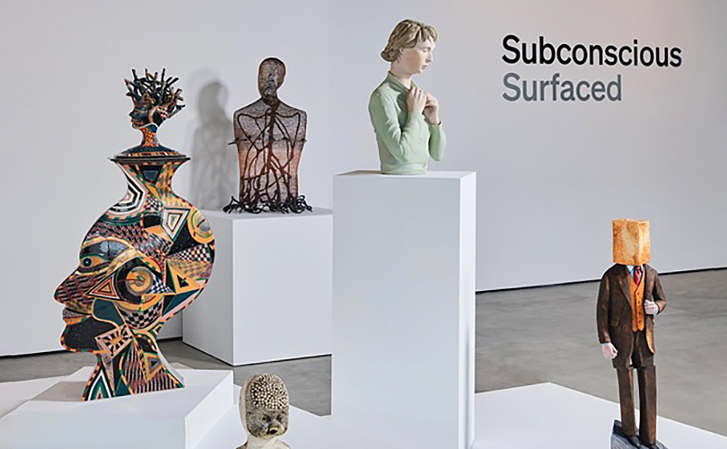
photo: Christian Giannelli for Moderne Gallery

Subconscious Surfaced is a group exhibition featuring works from the 1960s through the early 2000s. The exhibition, which includes the work of Norma Minkowitz, explores a shared thread of surreal, otherworldly sculptural form across a range of expressions, techniques, and contexts. A number of works in the exhibition were acquired by Marc and Diane Grainer, renowned patrons, collectors, and champions of the arts, who assembled a singular collection over the course of more than 45 years. On view are works featuring figures, narratives, and compositions drawn from deep within the subconscious, emerging from a realm beyond the threshold of immediate awareness.

Diedrick Brackens: gather tender night
Through August 23, 2026
Yerba Buena Center for the Arts
701 Mission Street
San Francisco, CA
https://ybca.org/event/diedrick-brackens-gather-tender-night

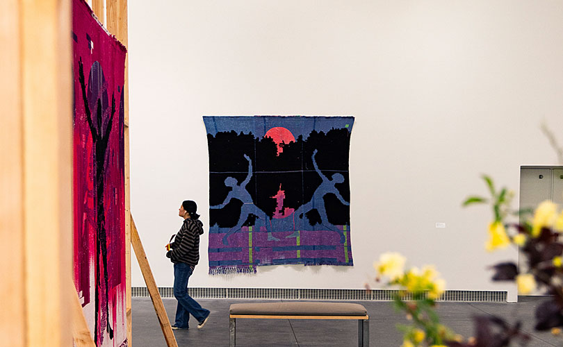
photo: Corey Marsau, courtesy of YBCA

Diedrick Brackens: gather tender night is the textile artist’s first solo exhibition in the Bay Area of California, featuring fifteen weavings created since 2020, that consider tenderness, migration, and connections with the natural world. Executed on the loom in hand-dyed, cotton fiber and acrylic yarn, Brackens’s works convey a masterful and meditative process of physical discovery and storytelling.

WRIT and WEFTED: Sally Van Doren, paintings and drawings; Nancy Koenigsberg, woven wire sculptures
Through June 21st.
Daphne:art Gallery and Advisory
Bantam, CT. Through June 21st. 
By appointment: daphneadeeds@gmail.com

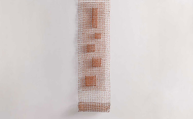
58nak Pocket Scroll, Nancy Koenigsberg, twisted copper, 73.5″ x 17.5″ x 6″, 2007. Photo by Tom Grotta

In reviewer Julie Durkin’s words, the exhibition pairs, “two artists who both work at the boundary between language and material.” Sally Van Doren is a poet who works with illegible handwriting. Nancy Koenigsberg “draws” with wire — nets and mats, cubes and chains — that suggest fascinating interior and shadow lives

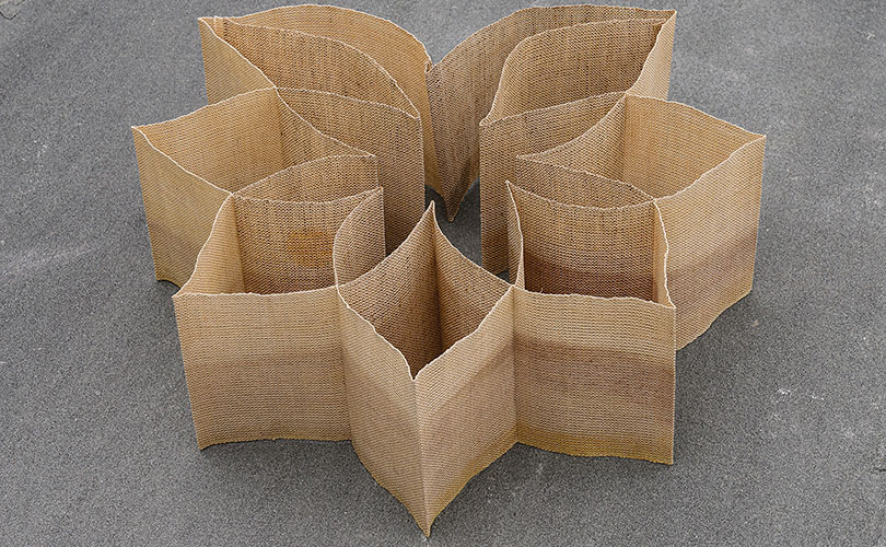
166k Haleakala-3, Kay Sekimachi, linen, heat transfer print on warp, overeprinting and double weave, buckrum and stich witchery, 3.625″ x 5.375″ x 31″, 1999. Photo by Tom Grotta

Mark your calendar for the fall: Noguchi to Asawa: Designing Postwar Americawhich will include work by Ruth Asawa and Kay Sekimachi, among others. It will open at the Barnes Foundation in Philadelphia, Pennsylvania on September 20, 2026.

Enjoy!