If an exhibition takes place but there is no catalog to document it, did anyone see it? Certainly not enough people have seen it, as far as browngrotta arts is concerned. That’s why we produce a catalog for nearly every exhibition we host.
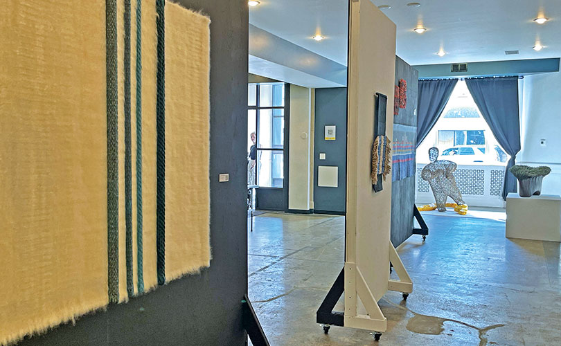
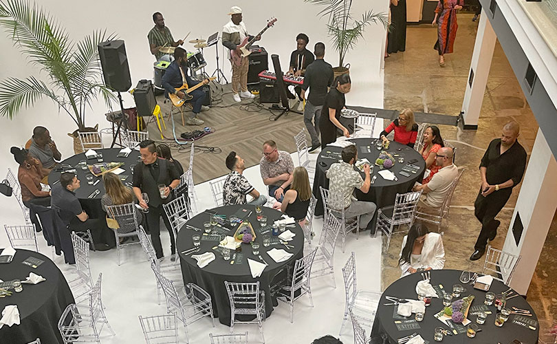
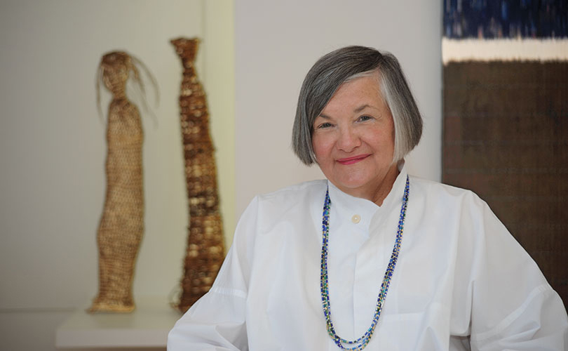
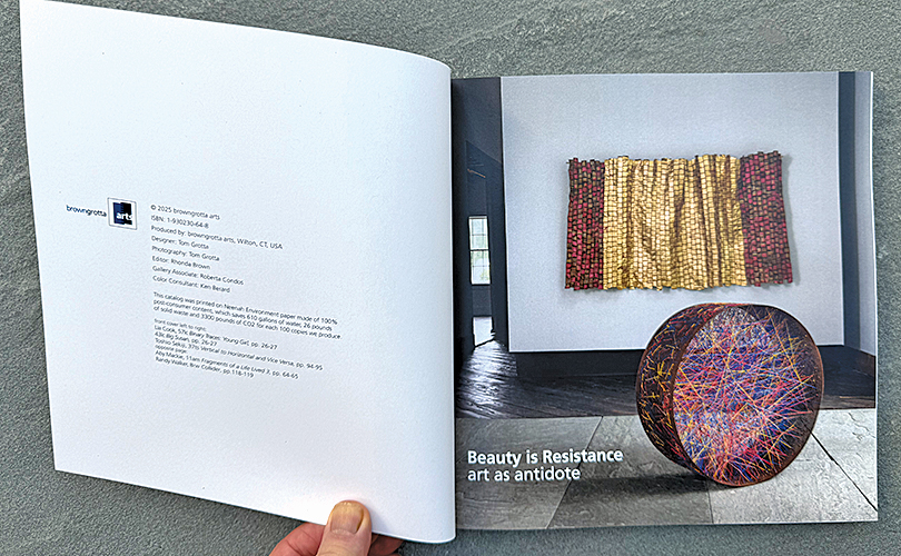
We had hundreds of people visit our Fall 2025 exhibition, Beauty is Resistance: art as antidote. But we also cowry to share the remarkable works in Beauty with even more people through our installation video and Zoom talkthrough, both on our YouTube channel, and through the print version of the show, a catalog (our 61st), available on our website.
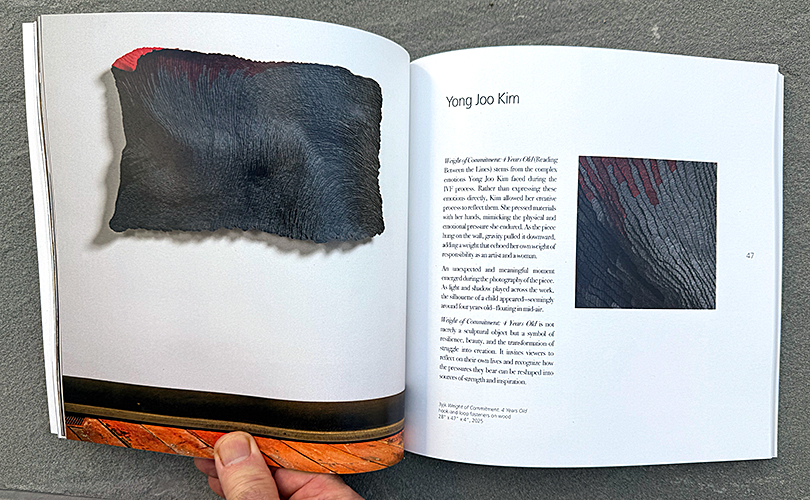
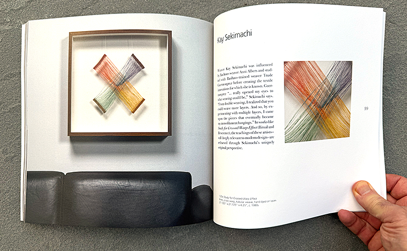
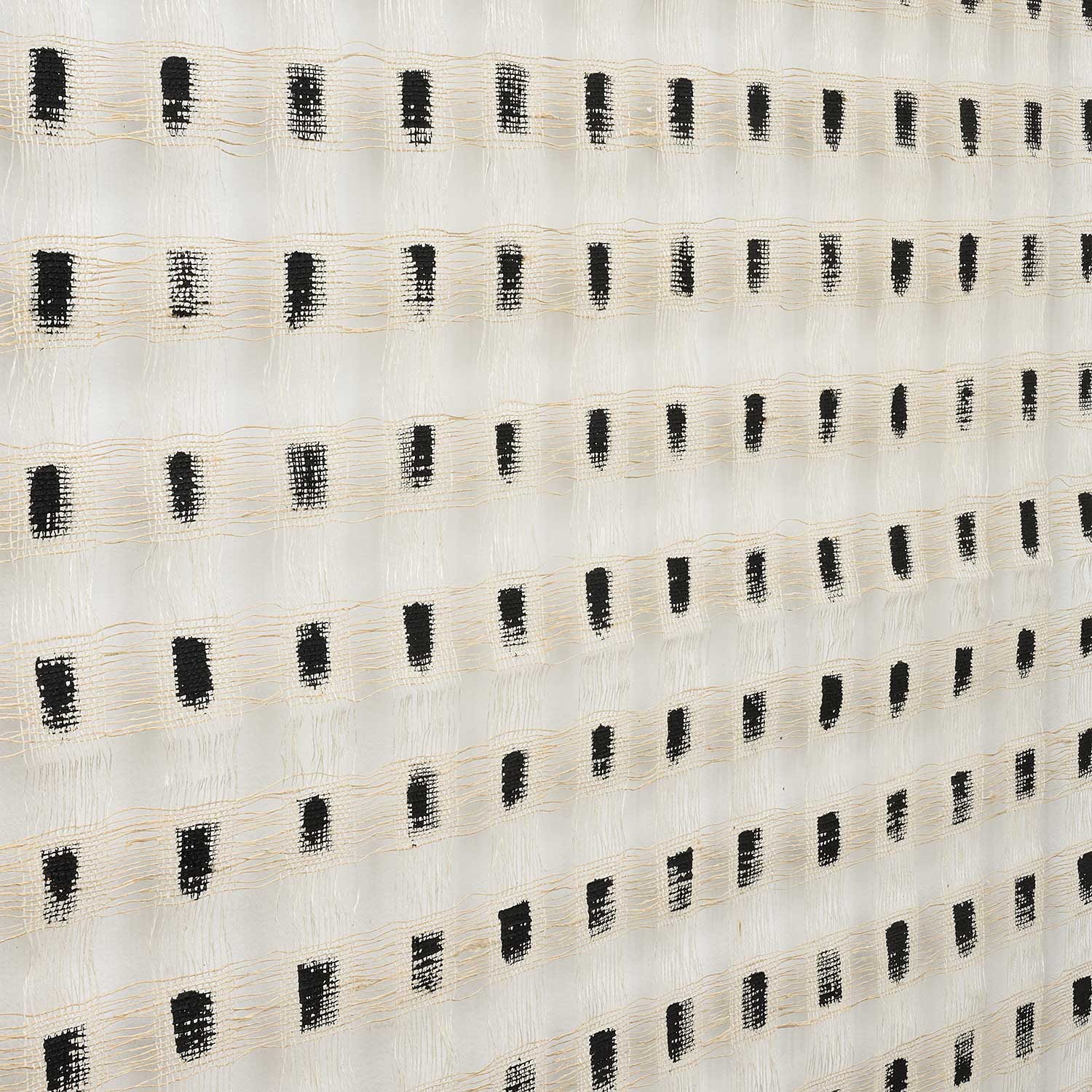
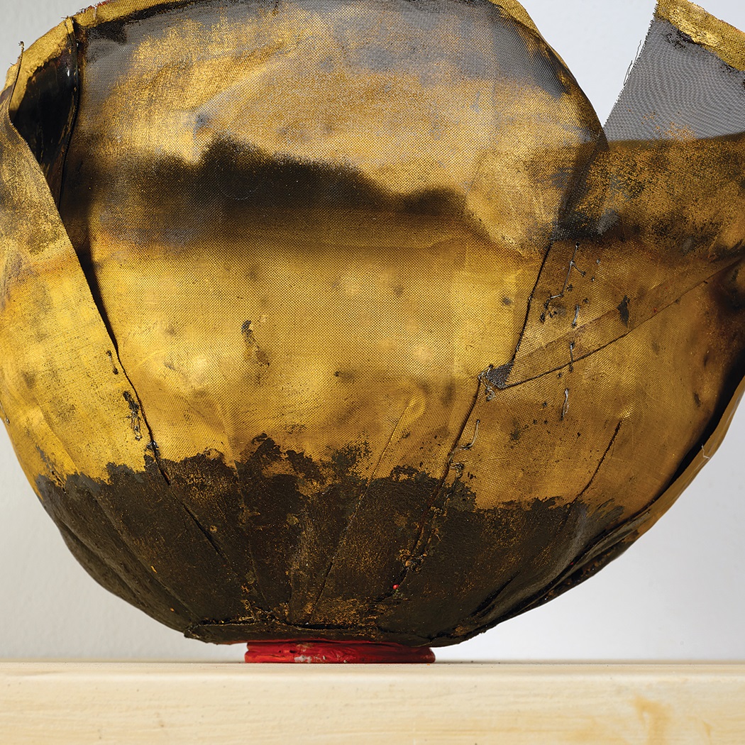
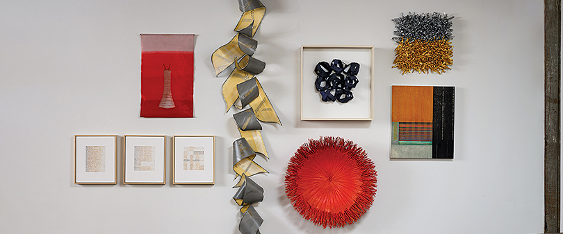
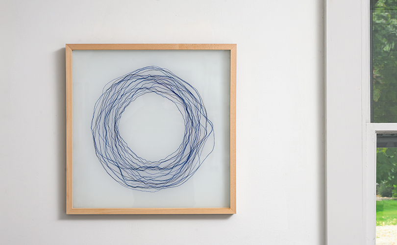
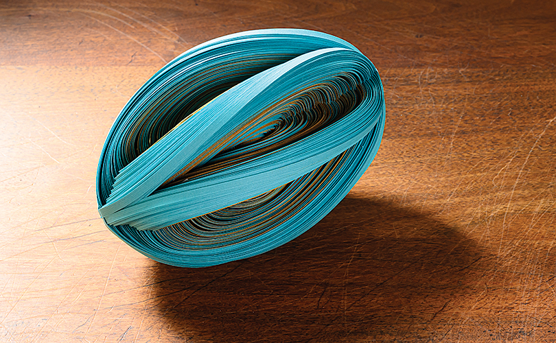
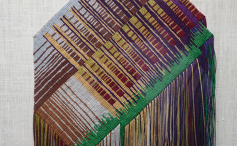
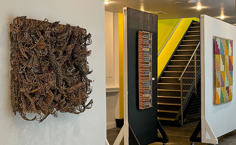
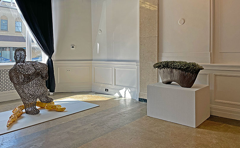
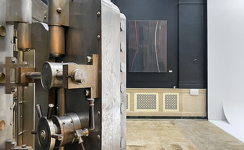
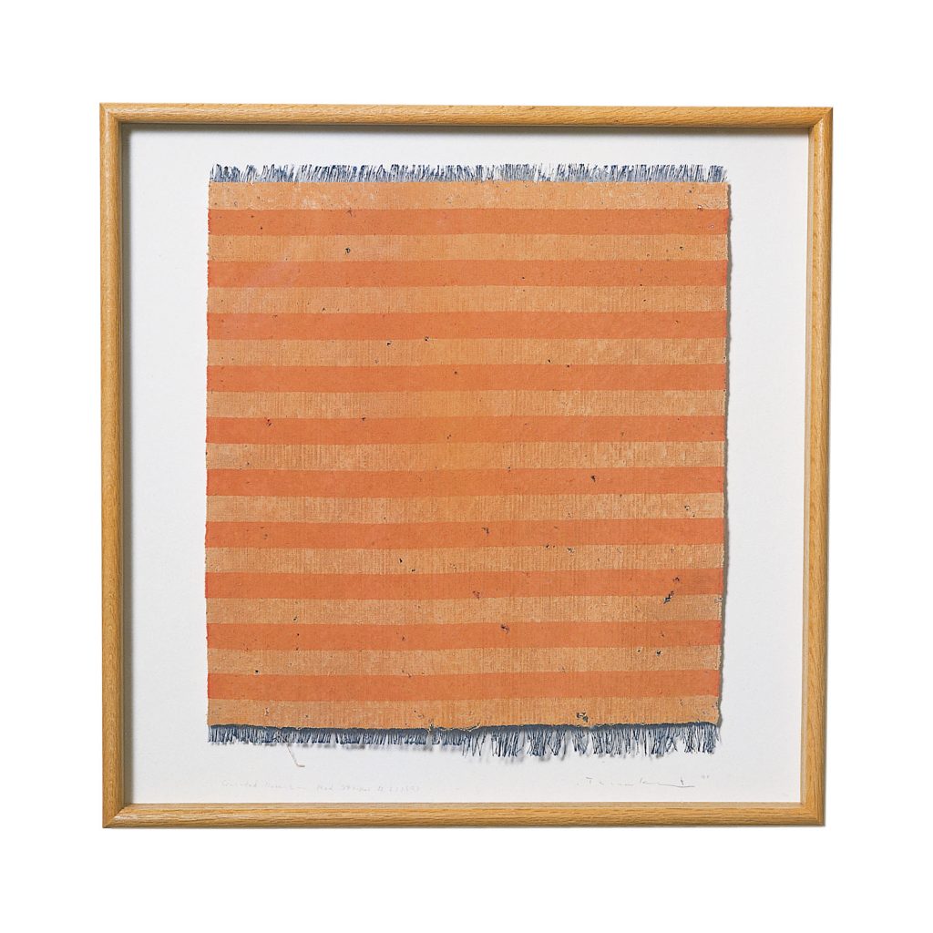
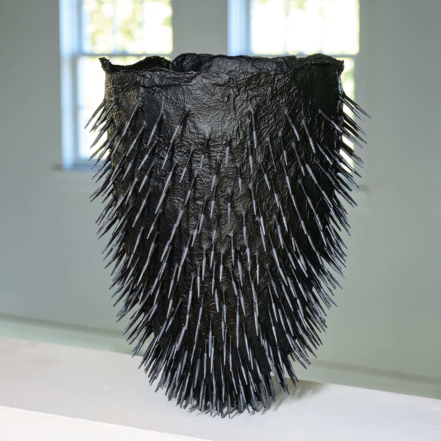
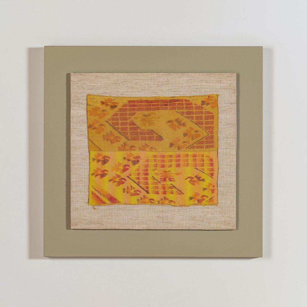
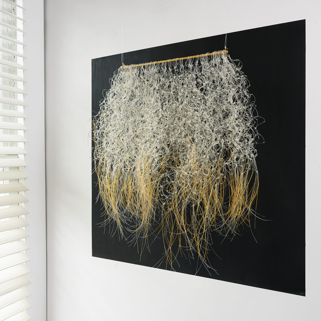
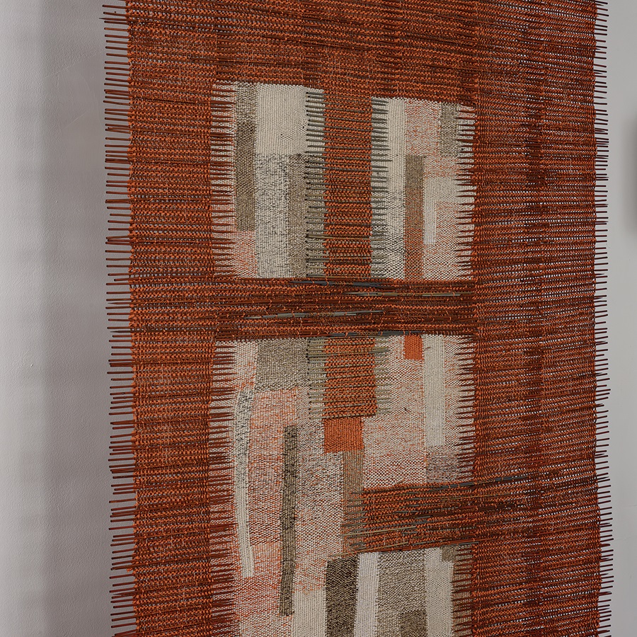
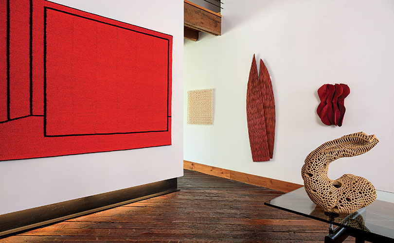
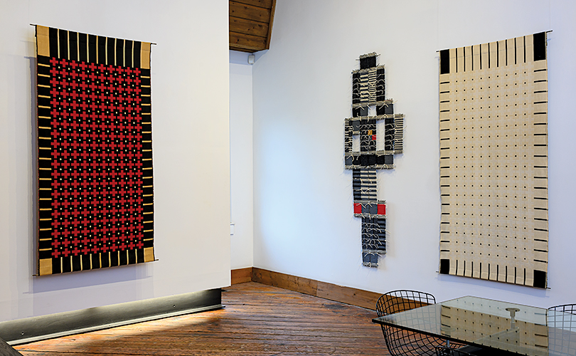
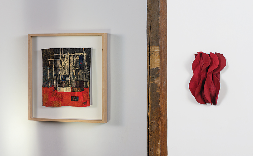
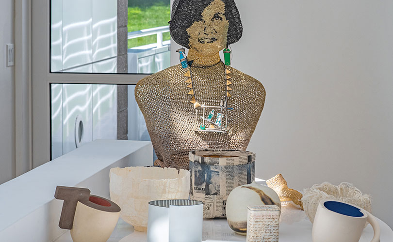
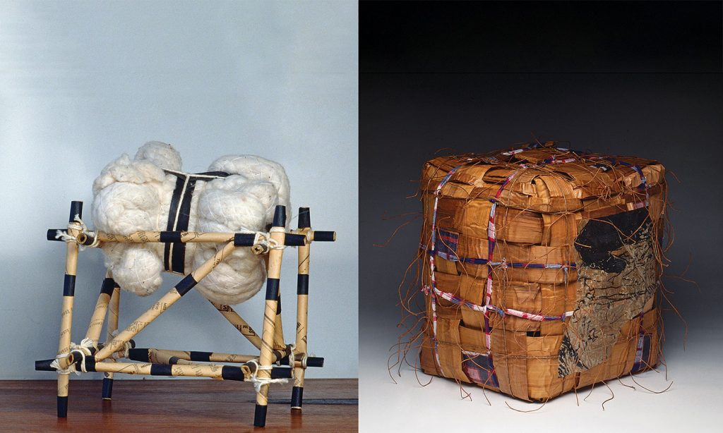
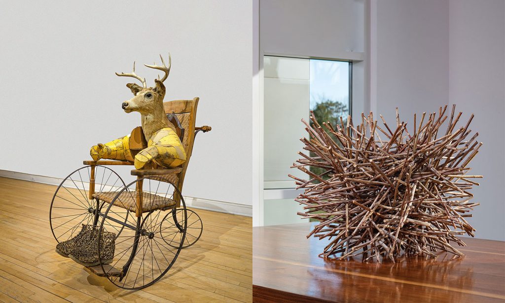
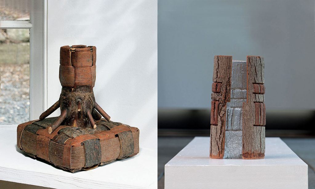
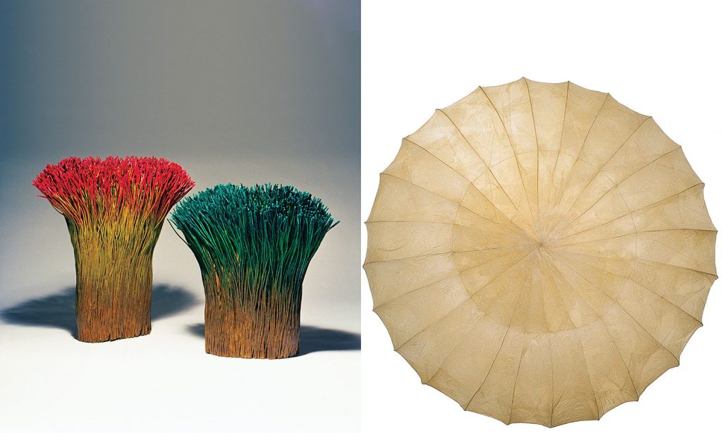
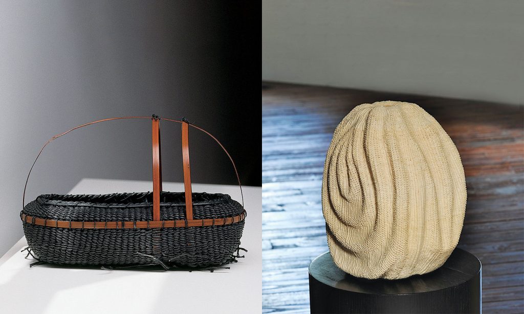
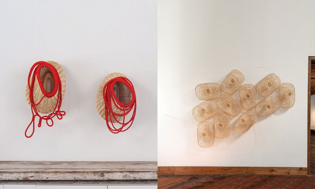
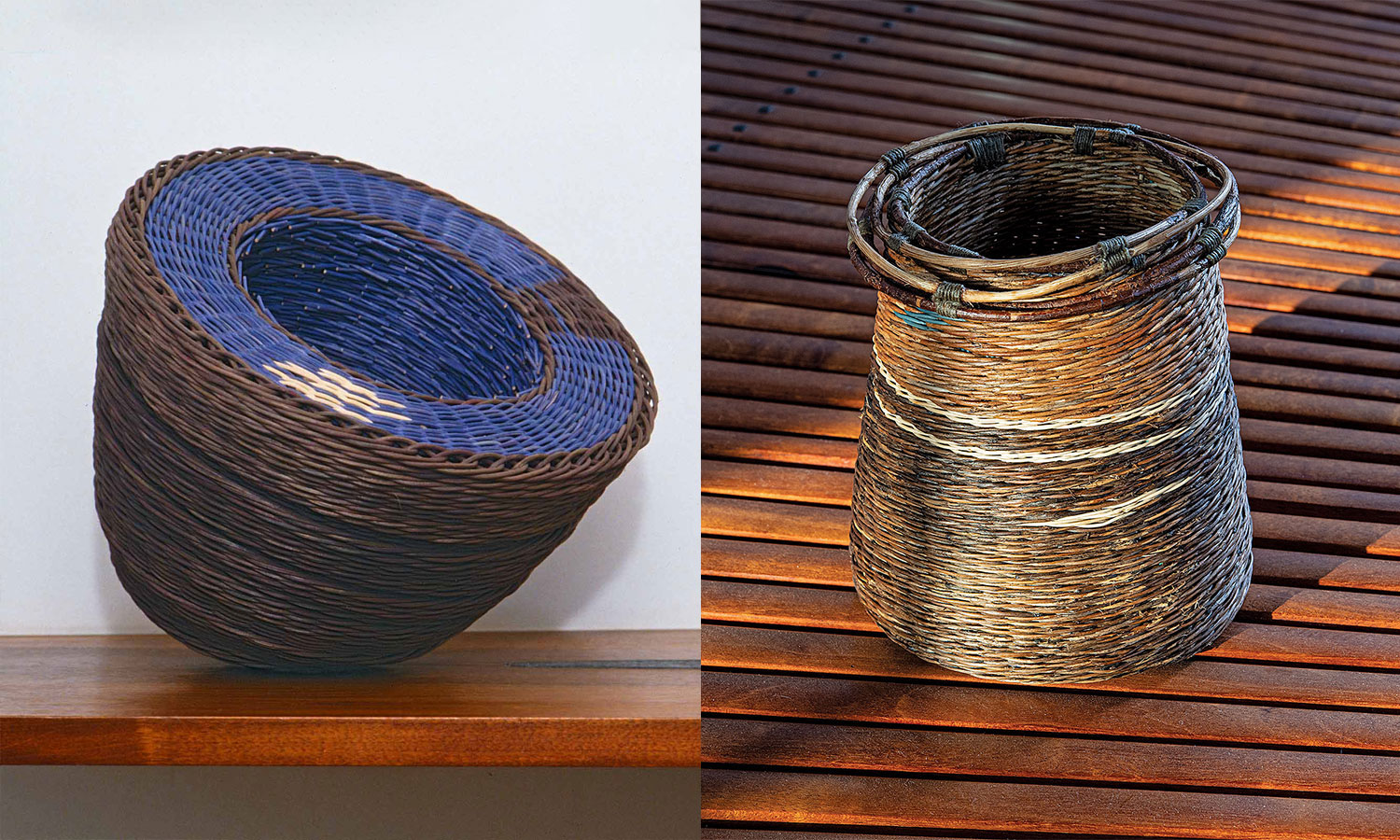
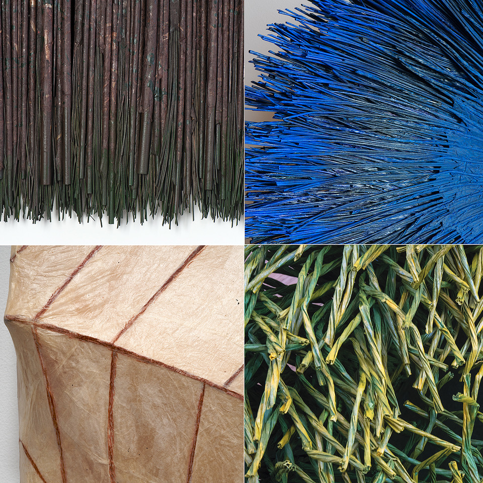
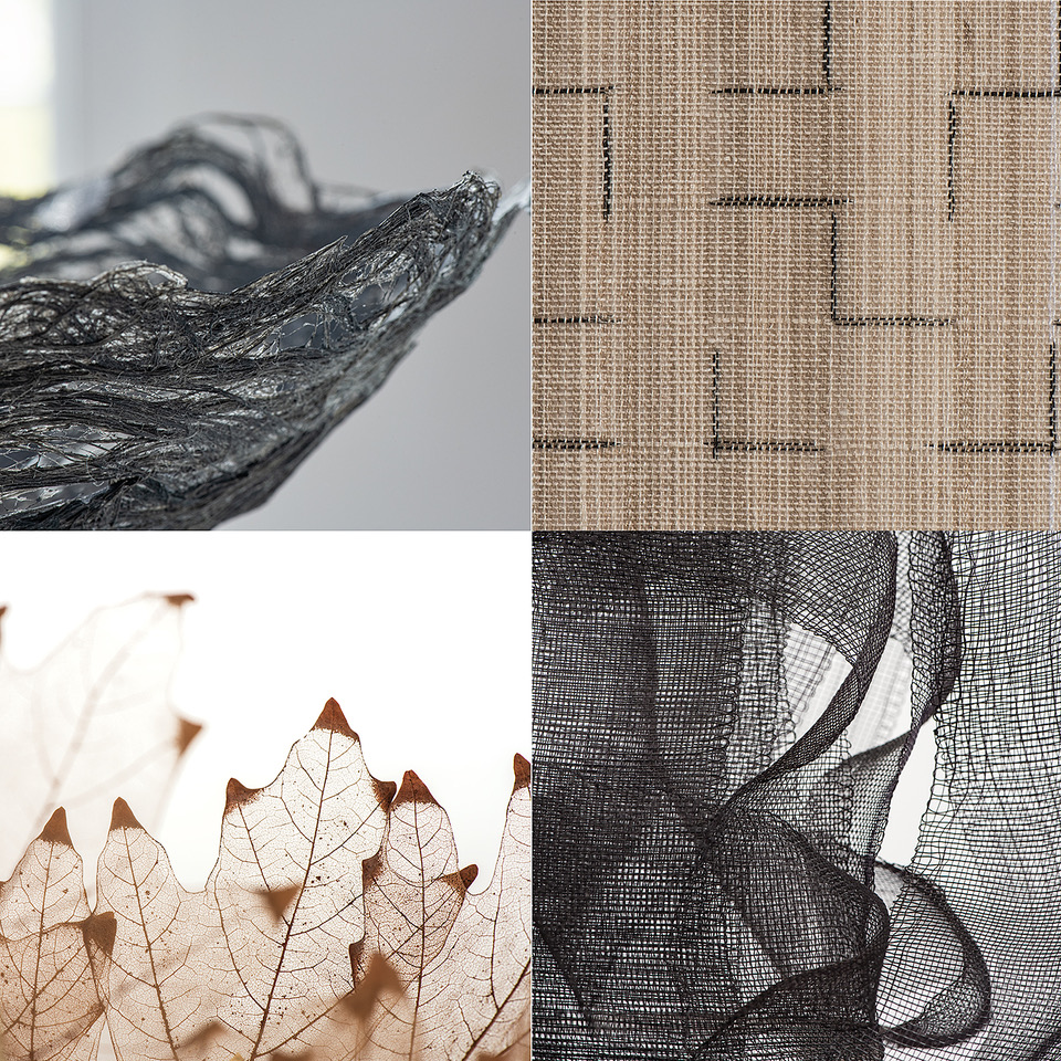
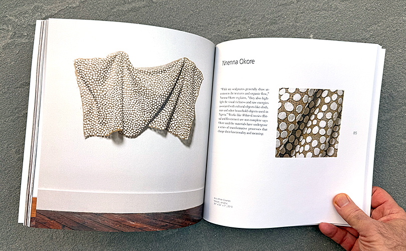
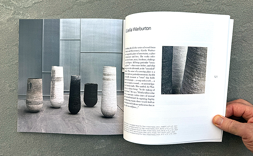
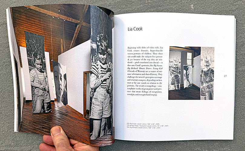
The 132-page catalog contains 125 full-color images. There are full view and detail images of each of the featured works in the exhibition. There are statements about each work in the catalog. The works in the exhibition fell loosely into four subthemes: Reading Between the Lines, Threads of Memory, Radical Ornament, and Ritual and Reverence, and the catalog identifies the category that each work falls into.
Elizabeth Essner, Windgate Associate Curator at the Museum of Art, Houston contributed an insightful essay to the catalog, “Looking at Beauty.” Essner writes about the role of nature in many of the artists’ work — for materials, lessons, and poetic inspiration. She examines varying historic conceptions of beauty, subjective, objective, and embodied, and discusses the significance of prevailing cultural aesthetics. in summarizing beauty’s pivotal place in art, Essner quotes late art critic Peter Schjeldahl (1942 – 2022) who predicted that in the future, “beauty will be what it always has been and, despite everything, is now in furtive and inarticulate ways: an irrepressible, anarchic, healing human response without which life is a mistake.”
Order your copy on our website. If it’s a gift, let us know at art@browngrotta.com before December 15th and we will gift wrap your copy before we send it.