Our New this Week instagrams and browngrotta-created artlive videos in March were populated with works that evidence singular intention and mastery of a variety of materials. The featured artists reinvisioned everything from paper straws, to repurposed textiles, to willow branches with catkins intact.
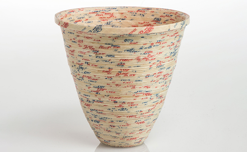
The first work we highlighted was Karyl Sisson’s Pepsi Faux Pot. For years, Karyl Sisson has been collecting things like sewing notions — buttons and zippers, womenʼs vanity items — bobby pins, hair pins, and curlers, and paper drinking straws like the straws in Pepsi Cola Faux Pot. “I like the idea and practice of recycling and am drawn to undervalued and overlooked materials,” Sisson says. “These common, manufactured objects, reminiscent of my childhood, are the building blocks of my sculptures and wall art, while simple interlocking techniques found in basketry and needlework are usually the method of construction.”
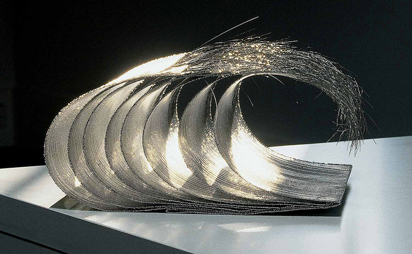
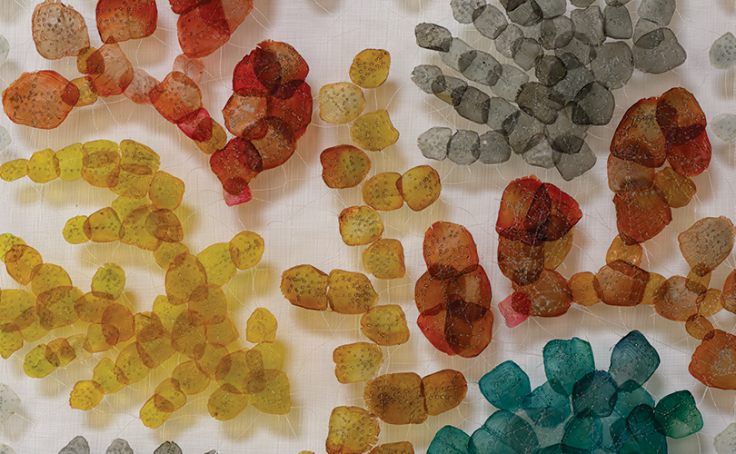
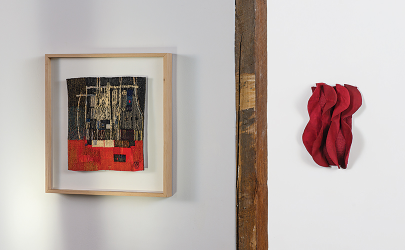
Our video of Simone Pheulpin’s Nova, part of the Eclipse series, gives viewers an opportunity to see up close the remarkable alchemy involved in this artist’s work. In Pheulpin’s hands humble strips of cotton become remarkable objects that evoke natural phenomena. She uses a method of her own devising, using neither glue or stitches. “I’m very, very interested in the roots, the layers, everything that is natural,” Pheulpin says. “The concretions, the accumulations, I love that, that’s the basic nature, the basis of my inspiration. I really like everything that is linear, everything that is repeated, piles of wood, walls. I love the walls, also by the sea, for example, the flowing water, the marks in the sand, the desert, the dunes, all that.” Pheulpin’s work will be part of a deep dive into materials in our upcoming exhibition, Transformations: dialogues in art and materials (May 9 – 17, 2026).
Barcelona-based artist Aby Mackie also approaches “humble” material in innovative ways — in her case, discarded textiles and household remnants are repurposed as fine art. Sourced from the streets of Barcelona, in works like Between Order and Chaos, she reimagines overlooked materials as powerful reflections on memory and value. In Barcelona, the contents of entire homes are often either thrown into the streets or auctioned off at Encants Vells market. The creation of Mackie’s work is driven by the selection and repurposing of objects and textiles from these sources in order to explore ongoing cultural themes, including materialism and consumerism. Mackie’s work will also be included in Transformations in May.
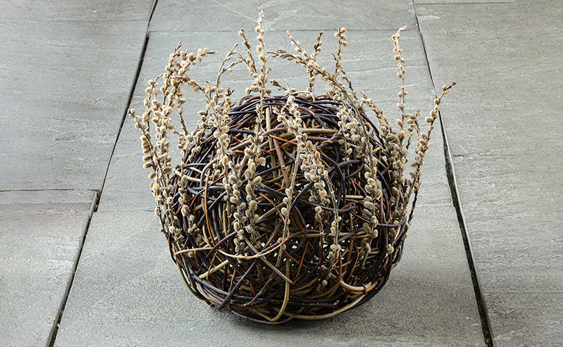
The inspiration for Lizzie Farey’s work comes from the inherent qualities found in the natural materials around her Scotland location. Using willow, birch, heather, bog myrtle, and many other locally grown woods, her work ranges form traditional to organic sculptural forms — much of it pushing the boundaries of traditional technique. In Willow Ball – 2 and Pussy Willow Bowl, willow seems to have been plucked unchanged from its natural surroundings, yet, with shape and color, the artist adds more. The works achieve Farey’s aim, to create baskets as reminders of the intense pleasure of nature – taking viewers to a place and a time that is universal.
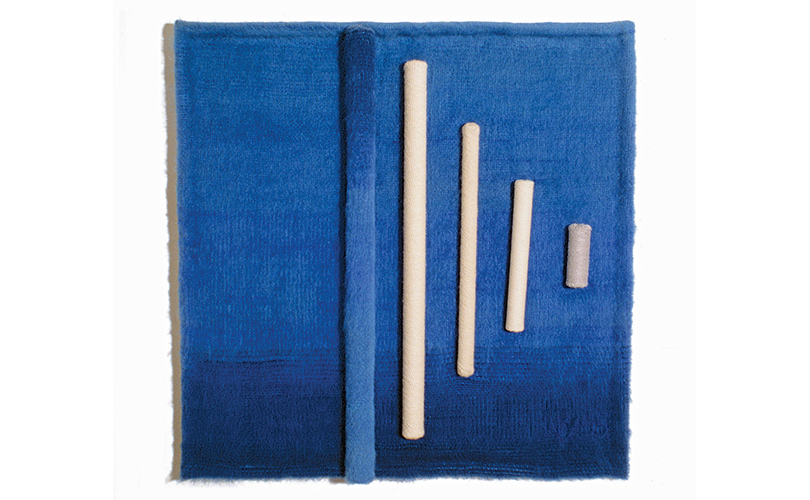
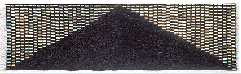
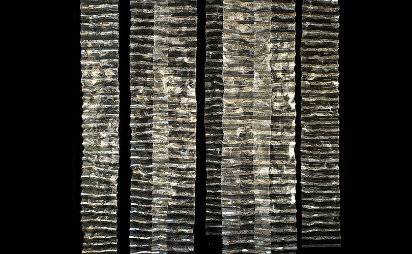
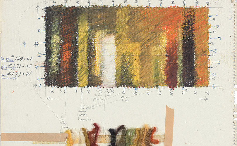
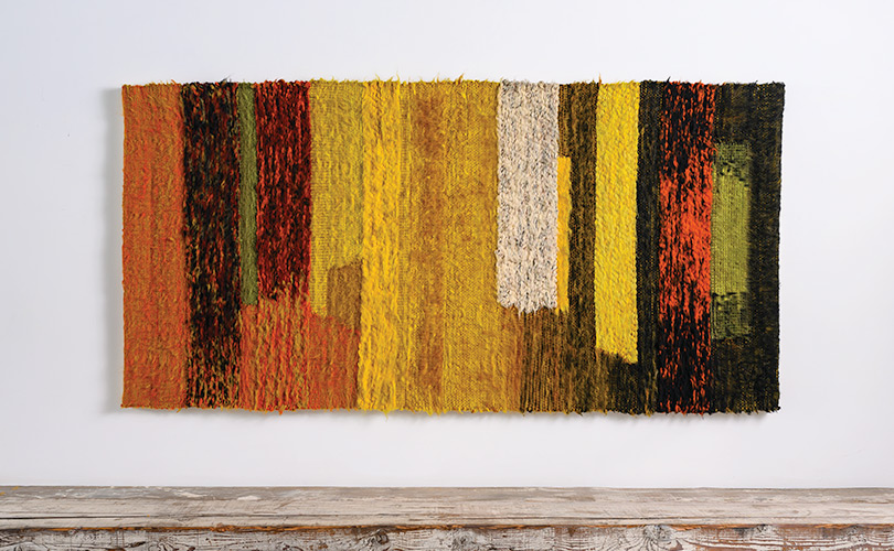
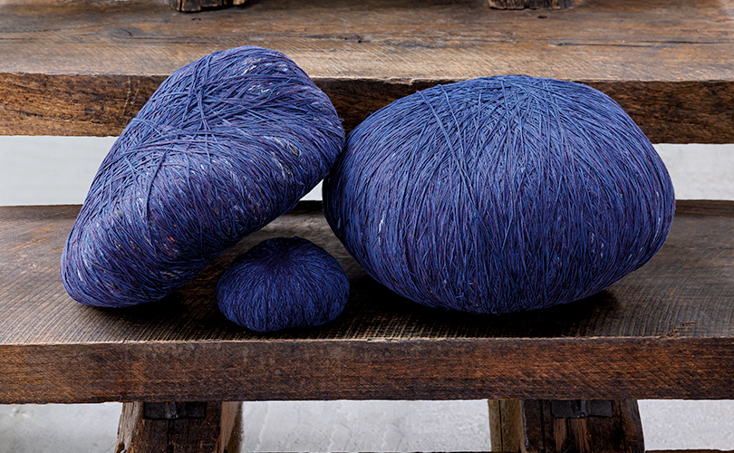
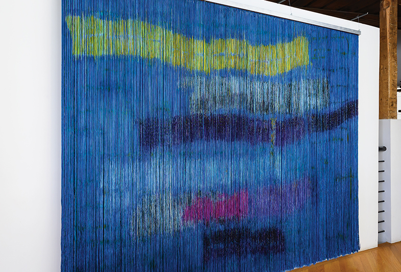
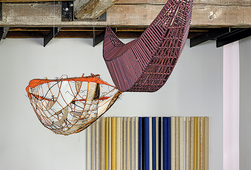
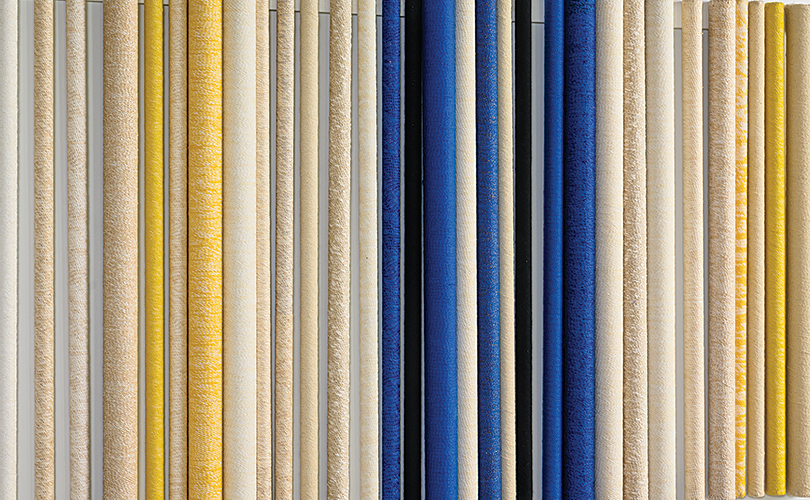
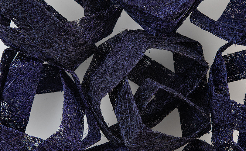
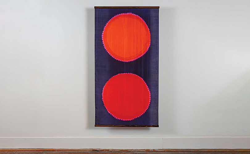
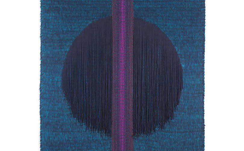
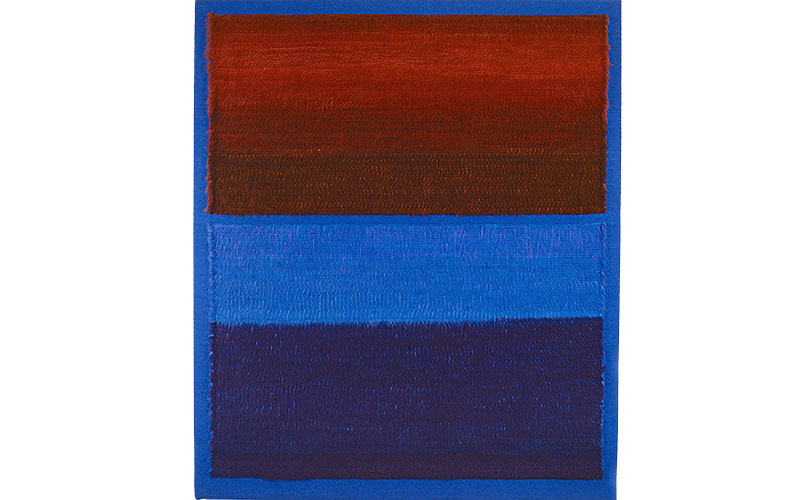
Mariette Rousseau-Vermette was a noted Quebec-based Canadian tapestry artist who pioneered innovations in fiber art during the 1960s, 70s and 80s. Rousseau-Vermette created weavings in which she experimented with scale, form, material, and color, which became known as tapestry-paintings. In Verticles dans le bleu the artist incorporates metal tubes wrapped in wool to create dimension and interest. Rousseau-Vermette’s work mixing optical fibers and wool will be included inTransformations in May.
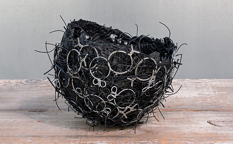
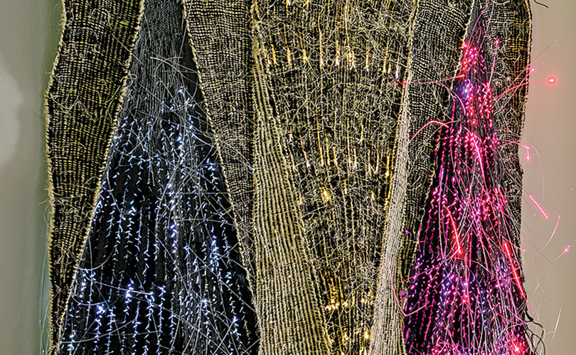
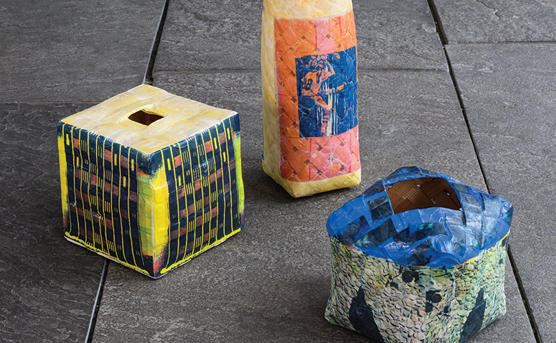
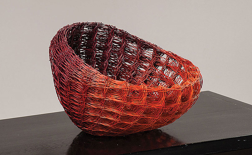
In Charred Black 2, part of his Seven Baskets series, John Garrett fashions welded wire mesh into a vessel shaped by conflict and renewal. Inspired by images of war-torn landscapes, layers of paint, metal leaf, and bound wire evoke structures scarred and rebuilt, holding both destruction and resilience within their forms. “I had seen many pictures of the destruction of wars in Sudan, Ukraine, Israel, and Gaza,… Piles of debris littered landscapes,” Garrett says. “My painted paper baskets looked to me like structures distressed and damaged and covered in dust.” Forms were painted and repainted and became new again while speaking of horrors between the layers. Shiny metal leaf covered the interiors and exteriors of others. Charred Black 2 was wrapped with rings of plied wire and tied down with more wire or fabric, bringing to mind a structure awaiting more layers of concrete or plaster.
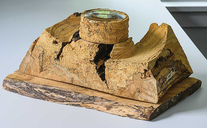
In the 1970s, when she was in her 40s and early 50s, Dorothy Gill Barnes taught herself basketry through books, independent study, occasional classes, and connections with traditional makers, also drawing inspiration from contemporary artists and emerging developments in the field. Within a decade, her strikingly original works—crafted from natural materials—gained national and international recognition. Barnes delighted in revealing the ingenuity of nature, from animal-made forms to processes of growth and decay. Her work invites viewers to slow down and truly notice. In Spalted Maple Looking Glass, she has created an interactive experience: a glass lens, frames a small twig, magnifying both the object and its hollow. Through the lens, the tiny scene appears vast — refashioning something ordinary into a moment of wonder.
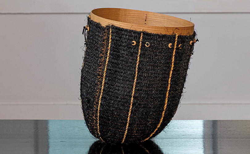
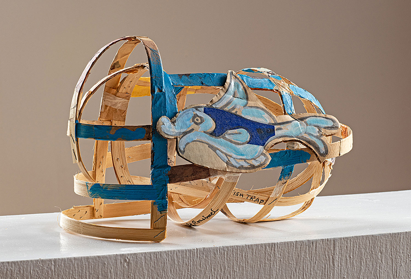
Marion Hildebrandt studied at the University of California, where she received degrees in the decorative arts and home economics. The artist lived and worked in Napa Valley, California, where she collected the plants — grasses, branches, pine needles, and bark — that she used to make her baskets. She employed the same materials that Native Americans used when they inhabited the area. Like them, Hildebrandt appreciated the natural materials that surrounded her, utilizing her artistic vision to create artistic art forms into structural objects like #r165.