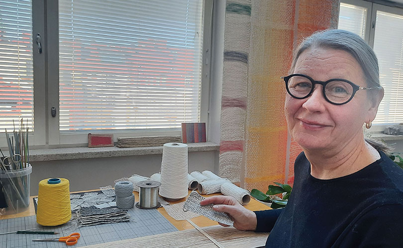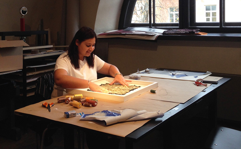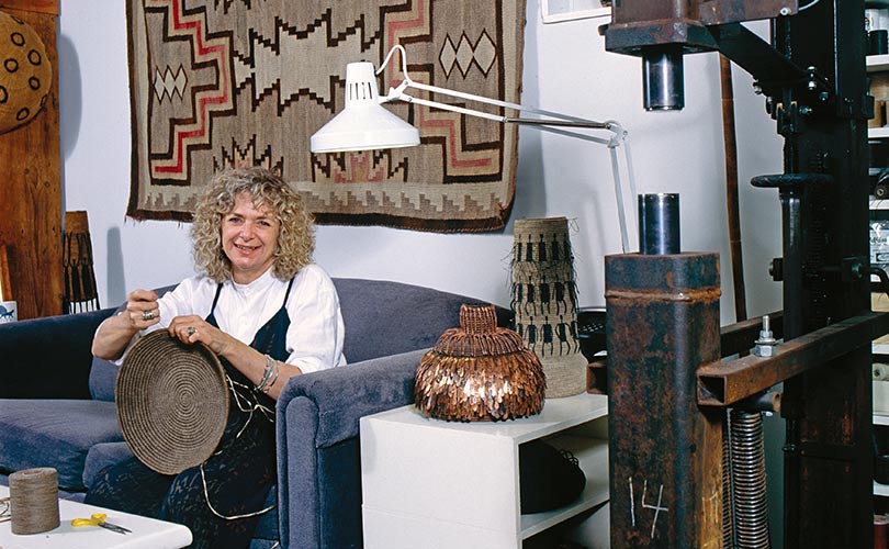
Textile artist Aby Mackie works from a former bread factory in Barcelona’s Poblenou district, where domestic life and studio practice share the same uninterrupted space. Here are reflections on the materials, histories, and instincts that drive her work.
In a fading corner of Poblenou, textile artist Aby Mackie lives inside a former bakery where nothing is polished away, not the industrial scars, not the clutter of family life, not even the ghosts held in cloth.
Barcelona has always known how to reinvent itself, Mackie says. Warehouses become galleries, fishermen’s quarters become boutique hotels, factories soften into loft apartments advertised in the language of “authenticity” and “creative living”. But in Poblenou, the city’s old industrial heartland, some buildings still resists the smoothness of redevelopment. For now, at least.
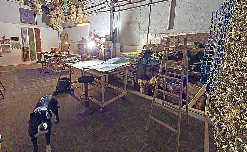
On an unassuming street between construction sites and old workshops stands a former bread factory dating back to the early 1900s. It operated as a working bakery until 2015. Today it is home to the textile artist Aby Mackie, her husband Laurence and two teenage children, two cats, a dog, and an ever-shifting ecology of cloth, furniture, ceramics, books and salvaged objects.
“There’s never really a distinction between work and living here,” Mackie says. “The work exists inside the house, and the house exists inside the work.”
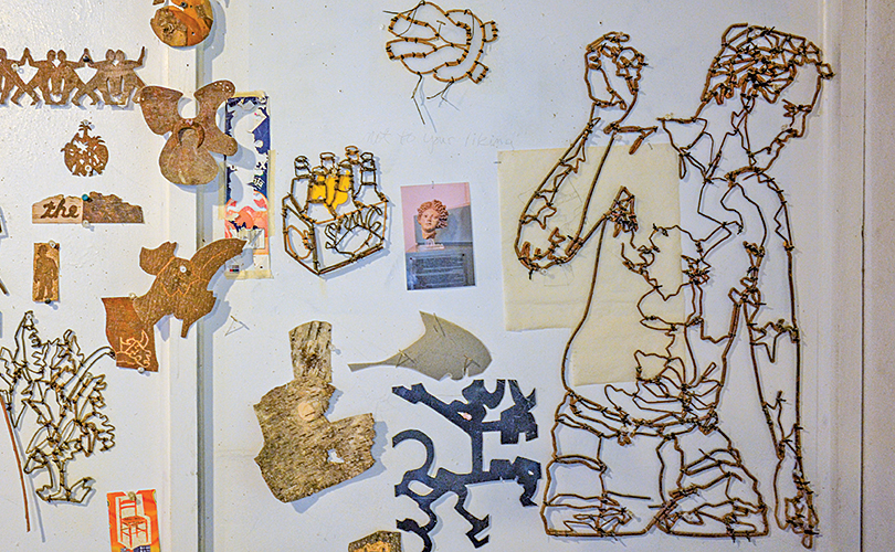
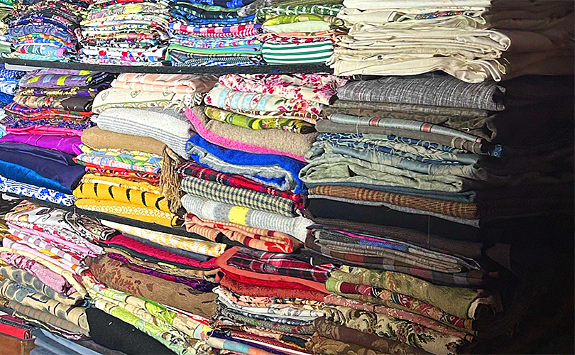
The statement feels literal. Folded textiles spill from shelving. Fabrics wait half-stitched across large tables. Antique chairs hold piles of cloth in various states of repair and transformation. Kilim rugs overlap beneath olive-green 1960s leather seating. Mid-century shelving bows gently under the weight of books, vessels and material samples. The walls are layered salon-style with vernacular ceramics, found mirrors, tapestries, paintings and objects gathered from Barcelona’s Encants flea market or rescued from the street.
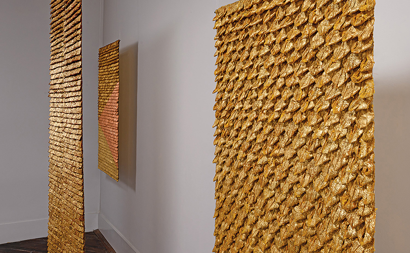
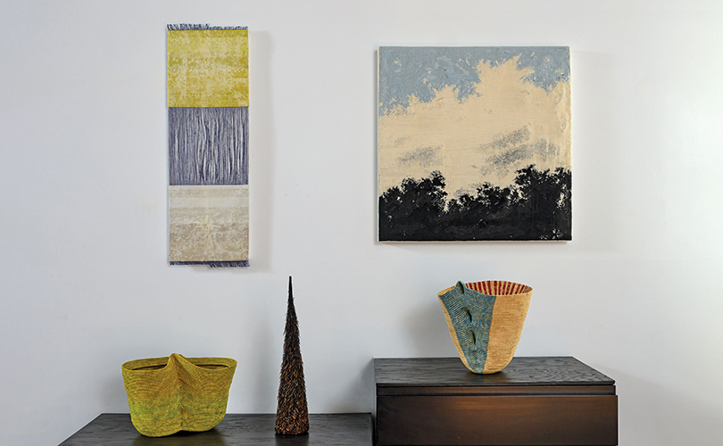
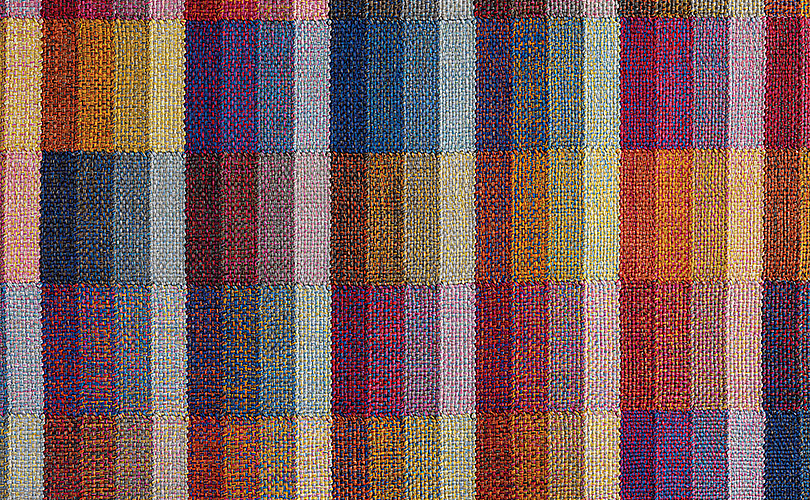
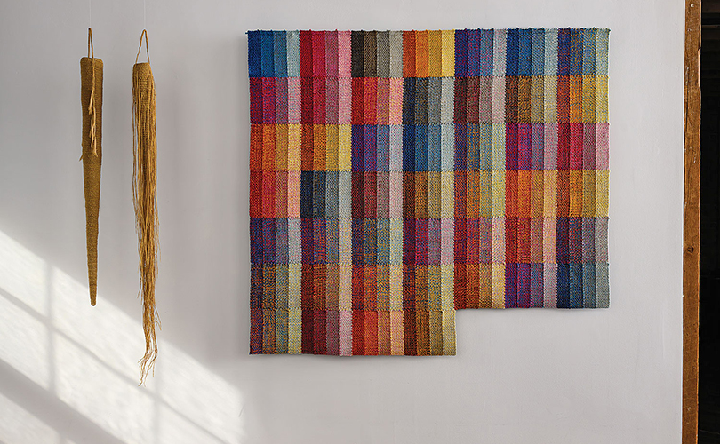
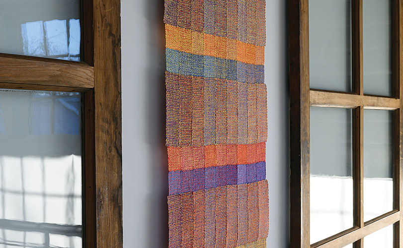
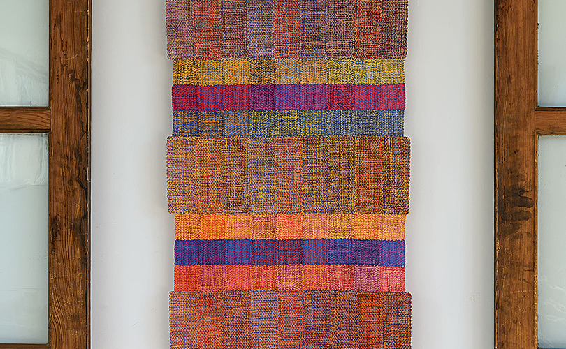
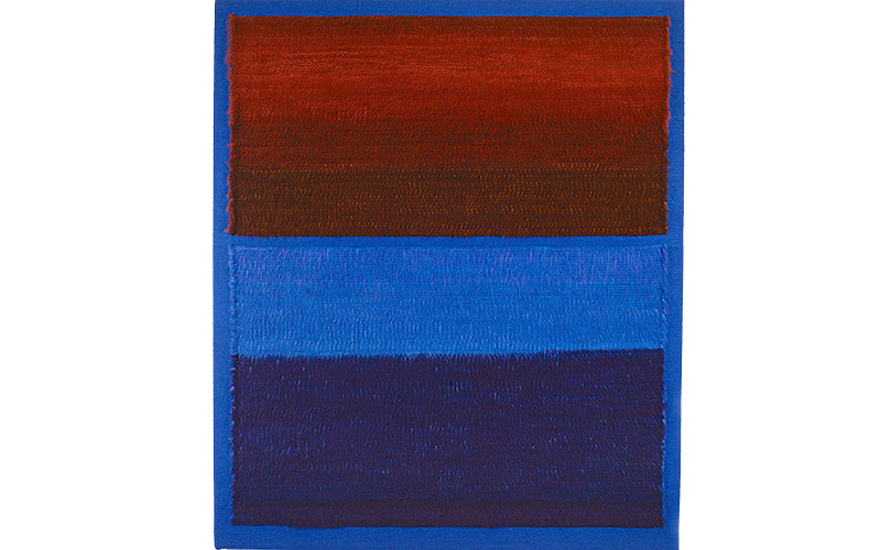
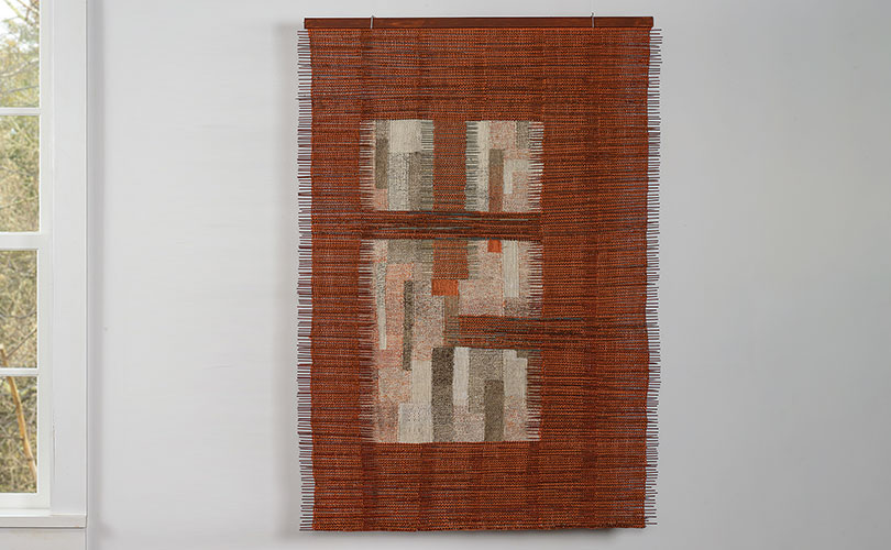
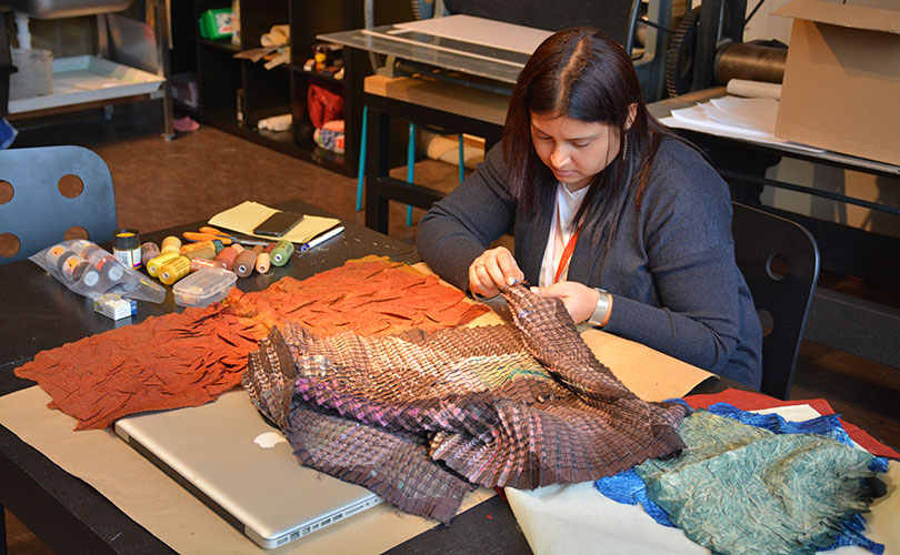
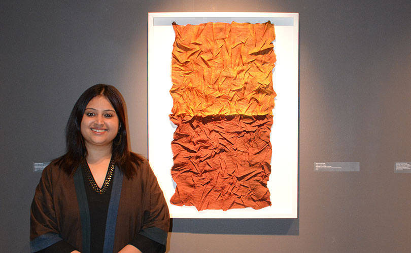
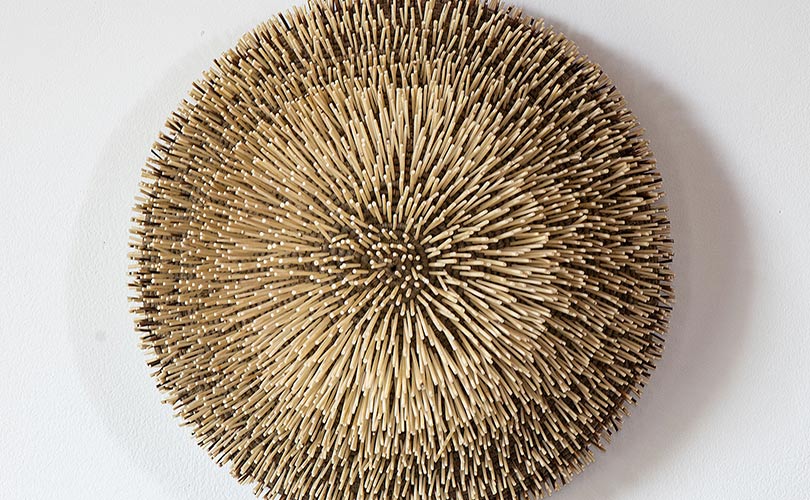
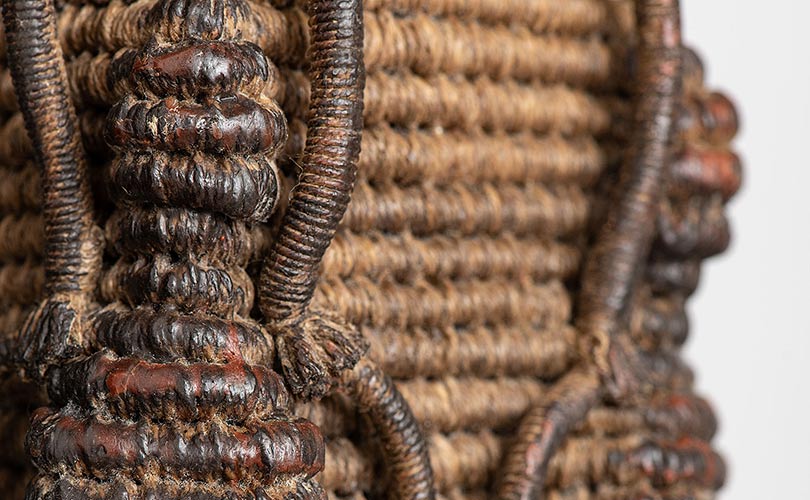
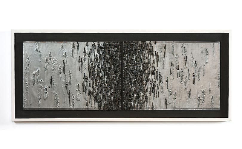
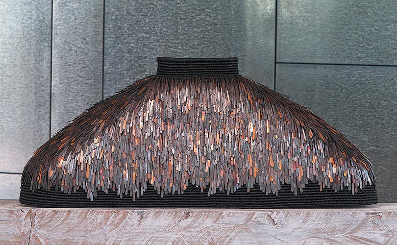
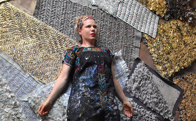
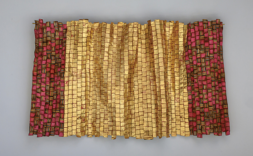
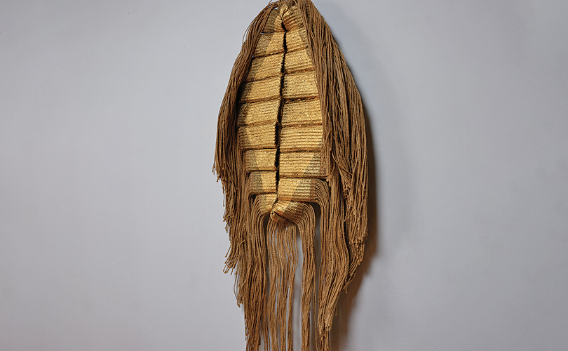
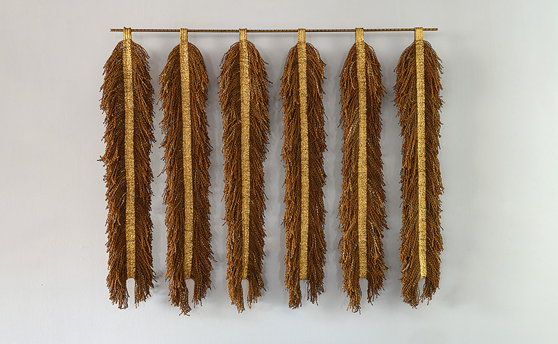
That accumulation mirrors Mackie’s artistic practice. Working predominantly in textiles, she deconstructs existing fabrics, often domestic linens and once-intimate household cloths, before reassembling them into tactile works that retain visible traces of their earlier lives. Her pieces hover somewhere between fine art, archaeology, and repair.
“There’s a history embedded in textiles that interests me enormously,” she says. “A worn edge, a repair, a stain, those things aren’t imperfections to erase. They’re evidence of life lived.” Throughout the house, evidence is everywhere.
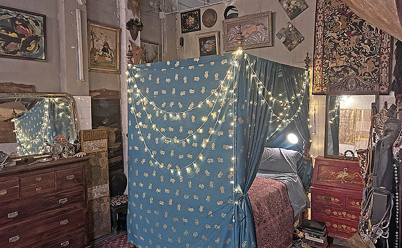
In the bathroom, collections of hand mirrors are hung rhythmically rather than symmetrically, multiplying reflections and fragments of light. In the open-plan living space, the skeletal base of the building’s enormous former oven remains intact, anchoring the room like an industrial ruin incorporated into domestic life. Part of the metal oven pot make an improbable lamp shade. Nearby sits a 19th-century four-poster bed, improbably grand within the old factory volume.
Like much of Poblenou’s remaining industrial architecture, the former bakery is slated for demolition in the coming years as the neighborhood continues its transformation. Mackie understands the precariousness of occupying such a space. “There’s a temporary feeling to it now,” she says. “You know these buildings are disappearing one by one.”
Perhaps that impermanence explains why the house feels less decorated than inhabited, less concerned with permanence than with continual adaptation.
Objects arrive constantly. Barcelona’s weekly ritual of leaving unwanted possessions on the street has become an informal sourcing network for the family. A discarded tapestry. A stack of ceramic plates. An abandoned chair with good bones.
“People leave incredible things outside,” Mackie says. “Things that already contain a life.” The city itself becomes part of the work.
Originally from Leicester, Mackie studied in Nottingham before traveling extensively in her 20s. She arrived in Barcelona 23 years ago intending only to learn Spanish before moving onwards to Mexico. She never left.“Apart from a short time living in Chile, Catalonia became home very quickly,” she says.
That sense of rootedness exists in tension with her practice, which is fundamentally about transformation. Cloth is cut apart, reconstructed, layered, distressed, and repaired. Histories are preserved but altered. Critics increasingly situate her work within conversations around sustainability, material memory and the politics of domestic labour. Yet inside the former bakery, theory feels secondary to touch.
The atmosphere of the house is overwhelmingly tactile. Aged leather. Glazed clay. Raw wood. Woven wool. Fraying linen. Oxidised metal. Every surface invites handling.
Even the architecture participates in this material conversation. The factory was never aggressively renovated after the bakery closed. Rather than erasing its industrial character, Mackie and her family have adapted themselves to the building’s existing logic.
During the day, textiles move constantly through the space. Materials are cut on dining tables. Cloth dries near bookshelves. New works lean casually against antique furniture. The boundaries between production and domesticity collapse entirely.
“The house isn’t styled around the practice,” Mackie says. “It’s produced through it. That distinction matters.
Many artists speak about blurring art and life, but here the overlap feels genuinely unresolved. Family existence leaves visible marks. Teenagers move through spaces filled with fragile artworks. Pets sleep beneath unfinished pieces. Daily routines interrupt concentration. Nothing is isolated or protected from the mess of ordinary life.
And perhaps that is what gives both the work and the house their unusual emotional texture. Textiles, after all, are among the most intimate materials humans produce. They absorb bodies, habits, histories, and time. Mackie’s practice depends upon recognizing that emotional residue rather than sanitizing it away.