Category: Guest Post

Sue Lawty Visits Anni Albers at the Tate Modern

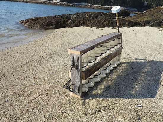
‘Our tactile experiences are elemental’  

I was eleven when On Weaving was first published. I was making dens in the woods and wondering what I’d be when I grew up. 

Anni Albers at the Tate Modern. (Lawty’s favorite piece in the exhibition.) Photo by Sue Lawty.

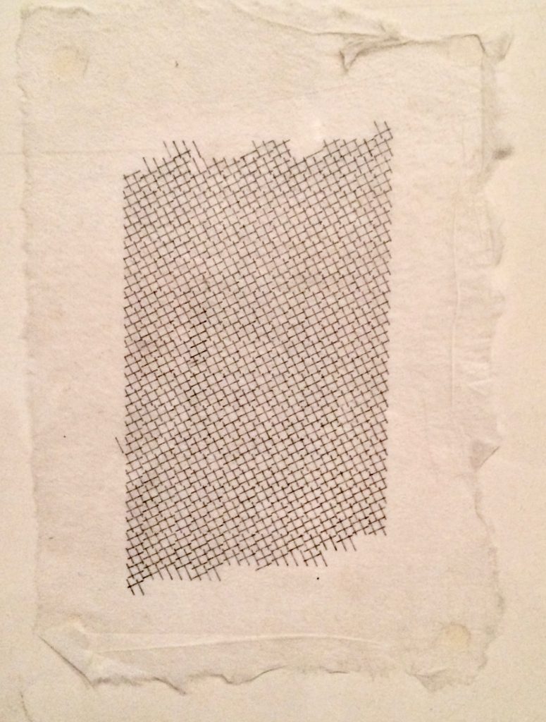
 Years later Anni Albers’ seminal book was to become pivotal in the development of my teaching and thinking. I actually bought it in 1983 from the Museum of Fine Arts in Boston, $8.95, black and white, paperback. Yet it wasn’t the images that first grabbed me, but the four pages of chapter eight: Tactile Sensibility. The phrase “tactile sensibility” was new to me, and even if in my fingertips I knew there was such a thing, I’d never heard it named before and given a serious discourse. 

11sl LEAD V Sue Lawty, lead warp and weft, hand woven & beaten, 24″ x 18″ x 1.5″, 61cm x 48cm x 4cm, 2009

Of course, many important influences shape us as we carve our creative journey, not least Beyond Craft: The Art Fabric, Mildred Constantine and Jack Lenor Larsen’s groundbreaking publication and the first art book I ever bought. However, it was Anni Albers’ rigorous unpicking of the intrinsic relationship between the structure of weaving and the fibers chosen that fired a key part of my working ethos; as she put it  “…the inner structure together with its effects on the outside …the engineering task of building up a fabric …developing the vocabulary of tactile language.” read her words over and over and used them in teaching alongside practical workshops informed by her open, questioning approach. I still do.

Anni Albers at the Tate Modern. Photo by Sue Lawty

Visiting the fabulous Anni Albers exhibition at Tate Modern in late 2018, I was struck by how rhythm, repetition, a monochromatic/ limited color palette and the austerity of working with the least number of elements, are all essential elements in both our creative outputs. 

Sue Lawty
December 31, 2018


Some Observations: On Light and Air

Recently I visited the Los Angeles County Museum of Art specifically to spend time immersed in the imagination of James Turrell whose retrospective covers fifty years of work exploring light, sky, perception, color, shape and architecture. http://www.lacma.org/art/exhibition/james-turrell-retrospective.   The meditative quality of this exhibition encourages the viewer to be a considered observer and allow what they see and perceive to be altered by their physical experience with the work.  Ultimately the transformative and ephemeral qualities of light exist in the mind of each person.  The artist gives us the opportunity to bathe our senses in illusion and reflection.

The next day on a non-stop eastbound flight traveling in the morning from Los Angeles to Boston I was seated on the north side of the airplane and could view the magnificent snow covered Rocky Mountains below rising from the earth with the suggestion of a world without grief.

photo by Wendy Wahl

photo by Wendy Wahl

 
In the minutes that followed I found myself focused on the carbon footprint that air travel leaves and thinking about the best way to balance my personal footprint. Knowing for the moment “I am where I am” my gaze returned to the framed light as we swiftly moved above the fruited plains. I watched until somewhere over the Great Lakes the image through the oval-edged window changed into another remarkable illuminated landscape.

photo by Wendy Wahl

photo by Wendy Wahl

As a commercial airline passenger for over four decades I have encountered a wide range of situations and had experiences that touch on almost every imaginable emotion. Each flight has a unique dimension heightened by the sounds, sights, smells and physical proximity of the other passengers in a tightly enclosed space. The curious activity of moving at fast speeds from one environment to another, around and about what has become a very small sphere in a short period of time, stimulates thought about place, perception and the possibility of portals. Having flown on Pan Am, Continental, Delta, American Airlines, United Airlines, Laker Airways, Peoples Express, Southwest, British Airways, Hawaiian Air, TWA, Qantas, Virgin Australia, Aero Mexico, China Air, Alitalia, Air India, Lufthansa, Air France, JetBlue and a number of puddle jumpers – I’m feeling that of all these, Virgin America has created an illusion of a different sort for air travelers through the use of color and light.
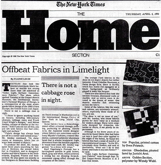
VirginAmericaPlane1

Wendy Wahl
March 2014


Process Notes: Gyöngy Laky on Red in Art and Life

photo by Gyöngy Laky

photo by Gyöngy Laky

Early in 2013, I was working in my studio in San Francisco on a commission for a collector using the beautiful small branches of deep purplish/red/brown California Manzanita.  I decided to paint the slant cut ends of each twig piece in a color.

photo by Gyöngy Laky

Red in life: Gyöngy calls her self a “one-color drinker.”
photo by Gyöngy Laky

As I began to figure out what that color might be, I also began listening to Orhan Pamuk’s captivating, fascinating, informative and suspenseful murder mystery novel set in the 16th C, My Name Is Red.  (16 discs 20.5 hrs.)  Sometimes it is difficult to trace the provenance of specific details as they evolve in the studio, but toward the end of the book I realized that the “Turkish” red that I had chosen from my many test samples of color for the sculpture must have been suggested by Pamuk’s extraordinary novel.  (During this period I was also listening constantly to the music of Otis Redding when not Pamuk’s story, so his music may have played a role in my subconscious decision making activity also.)

photo by Gyöngy Laky

photo by Gyöngy Laky

The Pamuk discs were given to me by a wonderful young British artist, Rebecca Taber, who was my studio assistant for a time before relocating to Southern France.  When I emailed her that I was immersed in Pamuk, she responded,  “it’s so symbolic in many ways.  I loved the way there was a description of the clash between cultures seemingly so contemporary and yet never forgetting the period in the 1500’s when it is set. What a great studio partner!  It’s so lovely to think of you there deep in Turkish red soaking up the streets of Istanbul whilst in San Francisco!” Reading Pamuk’s novel the reader will be immersed in feeling this extraordinary color and learning fascinating things about Turkey and art.

photo by Gyöngy Laky

“Do not forget that colors are not known, but felt.” – Pamuk
photo by Gyöngy Laky

In Chapter 31 – “How exquisite it is to be red.”

I do love red, though I find it a difficult and tricky color.  I am currently working on my second red “devil” question mark sculpture.  I want a wide range of reds.  I can mix seemingly unlimited variations of greens, but reds… even when carefully mixing, they start looking alike within very narrow ranges – all the deep reds start looking similar and all the orange reds start looking as if from the same mixture.

Red is powerful.  Some while ago, as women began to be more prominent in politics, I noticed that more and more of them were wearing red.  It struck me as strange to see the few reds among all the dark suit uniforms of the men.  I did not like it.  It was such a strong image showing us how few women there were in leadership roles.  Then I began to dislike seeing women in red.  More and more of the TV newscasters, CEO’s of companies and female pundits appeared in red.  Red on television often vibrates!  This is very distracting.  There is no light red.  Light red is pink.  Pink, in my opinion, is an even worse color for women… and little girls… now ubiquitous in pink, shoes, princess dresses, back packs, purses, socks, etc. (thank you Disney!). Every other color I can think of can be presented in a light version, but not red (though, perhaps, black is an exception, as well, becoming grey – many think of grey as a separate color.)

photo by Gyöngy Laky

photo by Gyöngy Laky

Red for women is associated with erotic… being hot.  We call women tomatoes.  Red for hearts – blood red.  Red for emotion.  Red faced – blushing.  Little Red Riding Hood.  Red is powerful.  Red is political.  Red is distracting as no other color can be.  It may, conversely, be as attracting as no other color can be.

And, from Pamuk I learned, red is not known, but felt….  And that is something I have always experienced when using it and why, I now realize, I like it so much.


Guest Blog: Wendy Wahl on Newspapers Then and Now

The following story describes an obsession with a newspaper that some people may take for granted.  Perhaps at one point this desire was heightened because I had been included in the paper’s folds.

ww-image-#1-scan

photo by Wendy Wahl

As I took the 106 steps from an east door of my home I focused on the sensation of my feet walking across the recently laid pavers, onto the gravel drive and through a break in the stonewall to the street to see if it had really arrived. I had waited over 20 years for this moment and I savored each stride with anticipation that was punctuated with my own sounds of excitement. Patient hopefulness described my wait to unfold the neatly layered sections to discover what was inside. Though I feared it wouldn’t be there like so many times before and all my expectations would be shattered, I still felt somehow today was different.

For several years I would get in my car and travel the approximate 10 miles roundtrip to Taylor’s Country Store where I had reserved my copy of the paper.  Back then Taylor’s could be described as a charming, dusty, ramshackle, screen-door-hits-you-on-the-way-in-and-out kind of place. The entrance was so close to the two-lane main road that when you pulled up to park in the allotted space you’d be lucky not to hit anything or anyone. Inside the store was something you had to physically experience. There was nothing there I would eat; many of the product expiration dates had been reached and much of the packaged food was unrecognizable. It was one of the few destinations between my house and pretty much anything else heading east towards the University of Rhode Island just beyond the Kingston train station.  The store marked the north end of the Great Swamp. Mom and Pop Taylor were the quintessential shopkeepers who were humorously kind. I would usually run into someone I knew there. Around the same time the Department of Transportation took out the rotaries aka suicide circles on Route 138, Taylor’s closed.  The Alternative Food Co-op moved in which I welcomed having nearby because you could purchase fresh, local fruits and vegetables, eggs and dry foods in bulk.  An Asian Market followed this that brought lemongrass, tamarind and an array of new flavors to my neighborhood; a delicious culinary addition to rural South County but neither carried the newspaper I wanted to wrap up in at least on the weekend.

In 1990 I contacted The New York Times to see if I could get the paper delivered.  I was instructed to fax my order in.  If you remember this was a time when answering machines were being challenged by the immediacy of the fax machine.  I saw it as the thin edge of the personal communications wedge. After getting no results from my requests via this technology I picked up the telephone, not a smart phone or a cordless, but a copper connected landline and made the call to the subscription office to create an account to get the paper delivered to my doorstep. The person on the other end of the phone seemed genuinely helpful to include me in the community of those who wake up to find “all the news that fit to print” within arms length.  The representative took my name, address and credit card information and told me that I should expect to wait 4-6 weeks for my first delivery.  I immediately put the expected date into my day-at-a-glance book and waited with great expectation.  I probably don’t have to tell you that it didn’t arrive and oddly enough they started to send subscriptions advertisements. When I called to find out what happened the explanation was that “currently there isn’t delivery of the Sunday Times in your area.” I was told it could be mailed and I may receive it on Wednesday or Thursday. Seriously?

Geographically Rhode Island isn’t that far away from New York and the whole state is the size of the county of Los Angeles.  Myself a native Angelino, I often think of the avocado and loquat trees that dotted the landscape and how the Santa Monica Mountains terminate at the sea.  My thoughts drift to a time where the scent of citrus from the fruit groves lingered in the air after passing through the San Gabriel valley on a two-hour drive to the snow-covered San Bernardino range.  I still remember the importance of our first RCA color console.  The latest in home technology that aired Walter Cronkite every evening, the Jetsons on Saturday mornings and the Ed Sullivan show on Sunday night but this didn’t change home delivery of several newspapers that were available at the time.  Looking back, it was an era of door-to-door sales of print subscriptions that included magazines, books and in our case the newspaper from the Big Apple.  I mistakenly assumed I could receive The New York Times delivered in New England.  Now I understand that even by Rhode Island driving standards I’m off the beaten track.  In order to get to where I live you have to travel off the main east west artery of the state passing through turf fields, an Audubon preserve bordered by a white pine forest, cross over a one lane bridge, go past a pottery up a winding hill and at the time down an unpaved road to arrive at the last house whose postal address was a rural route and where three town lines intersect in the road in front of the house.  I explained to the representative whom I hoped had a sympathetic ear that it was only two-and-a-half miles off the main road.  The representative told me there just weren’t enough people who wanted delivery in my neck of the woods.  I asked if they would just leave it at the end of the road so I could pick it up there. They stopped sending notices.

A new rhythm developed where I would call the toll-free subscription number every few months to go through the motions of creating an account only to be met with the same results.  After the millennium my efforts dwindled to every six months and then perhaps once a year.  Then suddenly sometime in 2007 they began to send offers again letting me know that delivery was available in my area.  I took the bait each time over and over again.  I was delighted to see my invitation to get home delivery and at an introductory price of 50% off in my mailbox.  I would dutifully fill out the form, repost it and back it up with a call where I would be informed that in fact it would be on its way.  Yes, it’s finally happening – I’d dance about and sing hallelujah!  My husband would look at me with a raised eyebrow “are you going to fall for it again?”  Always hopeful, my response was “indeed.” But as you can guess, it didn’t happen.  To my family I must have seemed so pathetic to continue on this ridiculous ride for years.  Eventually I stopped responding to the solicitations giving up on the prospects of it ever happening.  However, in early April last year I received a notice in the mail from the subscription office that delivery was available.  I thought, what have I got to lose?  I called.

ww-image-#2

photo by Webdy Wahl

Admittedly I’d become relatively skeptical but perhaps this was the moment – the time had arrived when I would actually be able to get it delivered.  If this sounds like a promotional ad for The New York Times, perhaps it is.  Drum roll please…last year on a Sunday morning in May I went to my Providence Journal box where I had requested the Times be placed, a logical idea since both papers are now printed and delivered from the same location, to see if it was there and it was!  It would have been enough that it arrived at all but it was Mother’s Day and it had the Travel of the Times magazine – armchair candy.  So pleased to have the newspaper in my hands I began separating the paper by quickly scanning and then for the moment setting aside the front page because it’s too grim to take in the global inequities so early in the day.  The striking contrast of headlines and stories to the needed advertisements to keep it printed is unsettling.  I move on to the SundayReview, my favorite section, where I’m confident I will discover something that will inform my work.  That week I was introduced to Alice E. Kober, the instrumental backstage player in deciphering Linear B, “an unknown language in an unknown script” as described by linguist Margalit Fox author of recently released The Riddle of the Labyrinth: The Quest to Crack an Ancient Code.  It made me think about lost civilizations.  In that same section was a news analysis titled The Hidden World Under Our Feet.  As a mycophile and tree hugger it caught my eye.  Jim Robbins articulates the idea that “the world’s ocean of soil is one of our largest reservoirs of biodiversity” and that “the complex soil ecosystem is highly evolved and sophisticated”. His new release The Man Who Planted Trees  (different from the book with the same title by Jean Giono, published in 1953 and I suspect inspired by) documents one nurseryman’s quest to clone the biggest trees on the planet in order to save our forests and ecosystem.  I’m feeling gratified for all my efforts.  Then it’s on to each section: Arts and Leisure, Travel, BookReview, SundayBusiness, SundayStyles, SportsSunday, and the Magazine where I’m puzzled, challenged and humbled by Will Shortz.  Unfortunately the New England edition doesn’t have a classified section. Nostalgia wafts in on a zephyr and I can see my father in his plaid wool robe sitting at the kitchen table, the overhead fixture illuminating the plate of peanut butter filled celery troughs and his reflection in the sliding glass door, reading the want ads out of curiosity.  For me some weeks the paper is devoured the day it arrives and is then left lying about the house and studio to be reread and reused.  There is something so comforting about curling up on the sofa or sitting at the round table with a really good newspaper.  I enjoy the feel of it between my fingers, the smell of the ink and that familiar font that I now need magnifiers to read.

ww-image-#3

photo by Wendy Wahl

Newspapers have many uses beyond their primary function to communicate information and ideas.  Among these the most intriguing is as a medium for making art.  Picasso immediately comes to mind as appropriator of the material.  In 1909, Fillippo Marinetti coerced Le Figaro to print his controversial manifesto promoting the Futurist movement.  In the 21st century Jim Hodges covered a newspaper from Amman, Jordan in 24k gold.  An exhibition celebrating the relationship between newspapers and the arts titled Shock of the News at the National Gallery of Art in Washington, DC documents these and many other 20th century artists using newspaper as a medium for the message. Print-Inspired Art: All The News That’s Fit To Paint : NPR .

I embrace the reality of digital access to information at my fingertips like a library on the desktop – when the technology is working.  Recently while scrolling through the TED Talks I came across a presentation by Jacek Utko, a Polish newspaper designer and former architect who is questioning the notion that newspapers can be saved by reconnecting readers through good design and content choices.  Something along the lines of form follows function.  www.ted.com/…/jacek_utko_asks_can_design
Now as I walk back to my house carrying the newspapers each week I feel a sense of relief in finally having The New York Times delivered directly on Sunday.  Unfortunately sometimes this feeling is too quickly followed by the fear that now that I can have it delivered it might go out of print altogether and soon not be physically delivered anywhere.

 Wendy Wahl

February 12, 2014


Guest Post: David Ling at Haystack School of Crafts, Deer Isle, Maine

David Ling Haystack Blog

photo by David Ling

Nestled into the stoney evergreen clad ledge that seems to slip effortlessly into the atlantic off the coast of Deer Isle Maine, Haystack was to prove a desirable radical contrast to New York City, business and routine.

1000 miles, six ferries, two weeks of glass workshop, 42 haystack meals (in addition to the 10 lobster rolls en route)  no cell connection and barely any online connection, the contrast was complete.

photo by David Ling

photo by David Ling

Initially drawn to haystack for its architectural and landscape setting as well as the reputation I heard over the decades of serving collectors and working with the artisans, I wanted to experience haystack for myself.The link between my architectural practice and haystack is glass. I love glass. With my Modernist Bauhaus background, I grew to appreciate and love glass. Starting with Paul Scheerbart, Bruno Taut, and  the Crystal chain letters, glass took on utopian mythical proportions. Studying in Crown Hall, Mies’ glass temple to architectural education, I loved watching how the translucent glass captured light and became a filter for experiencing nature. Later, after starting my own practice, I created glass windows, glass floors, glass ceilings, glass roofs, glass furniture all using

photo by David Ling

photo by David Ling

tempered, laminated, annealed, acid etched, sandblasted, fractured glass in my work. But that’s where the similarities end. The very physical act of working with glass was to prove radically different from using glass in my architectural practice. I discovered that the very process of blowing glass requires teamwork, physical participation. Working with glass I found, required both focus and a peripheral awareness of my collaborators, heat –and not just any heat but adjusting heat with time in the air, contact with the stainless steel marver, water and wood. I found the luminous fluid quality of molten glass mesmerizing. Streams, puddles and droplets of liquid light.

In contrast to the flat planar architectural applications of glass, I learned through experimentation how glass could take on other qualities in its molten state: elastic, malleable, impervious, explosive, optical. I also started relearning how to experiment, explore and return to a childlike curiosity.

photo by David Ling

photo by David Ling

While I’m not sure how haystack will affect my future work, I am compelled by not just glass itself but how light and water play with glass. On a personal level I rediscovered child like playfulness, learning to experiment and embracing trial amd error. Collaborating with my classmates was a balletic choreography involving heat and light.

Our instructor Bo Yoon was instrumental in opening my eyes to the unique qualities of glass, not just technique.

As a class, we collectively produced a glass boat, a tree draped in glass strands, mini glass grenades, water filled glass prisms and lenses. One of the most interesting thrusts of Bo’s class and when I was most interested in was the combination of the qualities of glass interacting with water and light. With my rudimentary skills and overwhelming help from Bo, teaching assistants and fellow classmates I produced a diving bell helmet out of class. With an unobstructed view of the underwater world I could bob in the Atlantic coastal waters, listening to my own breathing and waves amplified by the buoyant glass bubble.

David Ling Architect
davidlingarchitect.com


Guest Post: Hisako Sekijima

Hisako Sekijima at Haystack School of Crafts, Deer Isle, Maine

photo by Meghan Price

photo by Meghan Price

In my morning check of e-mail in early September, I was happily reconnected with Haystack Mountain School of Crafts in Deer Isle, Maine by a message from Meghan Price, asking “Flexible Minds!” to share her memorable photographs of Haystack 2013. Meghan is a textile artist from Toronto who assisted me in the basketry workshop I presented there this summer. The workshop, Strong Materials and Flexible Minds, ran from August 11th to 23rd. It was my fourth workshop at Haystack and my second with Meghan’s assistance.

Basketmaking at Haystack with Hisako Sekijima 2013

photo by Meghan Price

In this summer’s workshop there were fourteen people working hard in a spacious woodshop overlooking a Maine spruce forest and bay; twelve participants from Canada, Japan, Israel, Denmark and the US. The class members were diverse in nationality, age, professional career and skill level, but homogeneous in other ways – all female, flexible minded, friendly and diligent. I enjoyed working with them greatly and I appreciated that Haystack gave us such an enjoyable temporary community of art. It is wonderful that Haystack has retained for many years its beautiful location, thoughtful management and sustainable considerations for the environment, along with a highly stimulating artistic atmosphere. I admire even more the numberless individuals and groups whose innovative effort and contributions have enabled Haystack to remain unchanged for its long history.

Hisako Sekijima Lecturing her class at Haystack, photo by Meghan Price

Hisako Sekijima Lecturing her class at Haystack, photo by Meghan Price

photo by Meghan Price

photo by Meghan Price

I have designed my workshops as very experimental as well as hands-on. I assign a small number of basic problems of basketmaking that participants are expected to explore by themselves. I expect participants to encounter additional problems and challenges unique to each of them in the process of seeking a resolution to the problem assigned. I entitled the workshop at Haystack this summer Strong Materials and Flexible Minds, in order to convey clearly my intent to encourage participants to re-conceive basketmaking in terms of the relationship of a maker to the materials.  Participants would re-evaluate already acquired techniques and common ideas while taking a fresh look at the materials domain as well as nonmaterial factors such as negative space. From alternative viewpoints, we reviewed familiar tools/devices. In short, the workshop was to help one learn again or “un-learn” what one thinks one knows.

photo by Meghan Price

photo by Meghan Price

The group photograph shows the happy class after finishing an improvised installation with various pieces plaited in paper tapes cut from old Haystack posters. The layout on the table reads “H-A-Y-S-T-A-C-K.” Why are they happy? Because they have gained confidence: “I can make any form in plaiting by myself!” The exercise involved an exploration of plaiting. I taught them only how to make a square with three strands and left it to them to find from there how to make various forms. Some did so very easily. Some struggled. But I waited until each had mastered it herself. The next morning, I discussed the outcome, bringing attention to various resolutions that could achieve the same form.  and explained that their development would lead to further differences. Everyone was amazed that the same form had emerged, but had not always been accomplished in the same way.  That is, everyone realized that each could create in her own way if not taught to apply only a single method by a teacher. Everyone came to feel her own way – not only worth her patience but also more meaningful to her. The photograph shows the joy of achieving a challenge, on students’ part as well as a teacher’s.

Hisako Sekijima photo by Meghan

Hisako Sekijima
photo by Meghan

Hisako Sekijima Yokohama, Japan


Guest Post Alert: Carol Westfall

Wednesday, June 13, 2012

Felt Balls for Peace, Carol Westfall, felted wool with barbed wire, 3″ each, 1994, photo by D. James Dee

We’ve uploaded a new guest post, Textiles and Politics by Carol Westfall. “Textile art is no exception to the rule that art both drives and documents political upheaval,” she writes. This post examines the textile in relationship to national and international political issues, including war, population control, energy and natural resource use and economic inequality. Westfall will be among the presenters at the Textile Society of America’s 13th Biennial Symposium in Washington, DC in September.


Guest Post Alert: Carol Westfall

Fiber Futures: Japan’s Textile Pioneers

Carol Westfall first Guest Post is up. To Read FibernFutures: Japan’s Textile Pioneers, click Guest Post Above;

Hitomi Nagai (1954- ). Birth, 2011. Cotton; waffle weave. 79 x— 43 x— 11 in. (200 x— 110 x 28 cm). Photo: Mareo Suemasa.


Guest Post Alert: Carol Westfall’s First Guest Post This Monday

Kazuyo Onoyama, Orikata (Folded Form), 2006. Kyôko Ibe, Screen from the Hogosho series, 2009. Fuminori Ono, Feel the Wind, 2010. Hisako Sekijima, Kôzô o motsu ryô II (Volume That Has Structure II), #546, 2009. Hisako Sekijima, Renzoku suru sen (Continuous Lines), #559, 2010. Hisako Sekijima, Jûsan’yô no satsu (A Book with Thirteen Leaves), #553, 2009. Installation photo by Richard Goodbody.

Over the next few months, we’ll be featuring Guest Posts by artist, educator, collector and friend, Carol Westfall.  Westfall’s work has been exhibited extensively in Japan, Europe, South America and the US. She has taught at both Columbia University’s Teacher’s College in New York City and in the Fine Arts Department at Montclair State University in New Jersey  and is one of the artists included in the upcoming exhibition, Distinguished Educators, at the Crane Arts Building in Philadelphia, Pennsylvania next March. We worked with Westfall when she was at Montclair state University to produce the Art of Substance  exhibition in the gallery there.

In her first post, up Monday, November 28th, she takes a comprehensive look at the Fiber Futures: Japan’s Textile Pioneers exhibition, open through December 18th, which is still being talked up in New York City (including in a segment on Sunday Arts NY on PBS, Channel 13). In December, she’ll review Crafting Modernism: Midcentury American Art and Design, at the Museum of Arts and Design, in New York through January 15th. Kazuyo Onoyama, Orikata (Folded Form), 2006. Kyôko Ibe, Screen from the Hogosho series, 2009. Fuminori Ono, Feel the Wind, 2010. Hisako Sekijima, Kôzô o motsu ryô II (Volume That Has Structure II), #546, 2009. Hisako Sekijima, Renzoku suru sen (Continuous Lines), #559, 2010. Hisako Sekijima, Jûsan’yô no satsu (A Book with Thirteen Leaves), #553, 2009. Installation photo by Richard Goodbody.


Guest Posts: Kim Schuefftan

small child riding a giant carp from Takayama photo by Chad Chad Orzel

We’ve posted Kim Schuefftan’s second observation on art in Japan. To read


Public Art:
How Important is Public and Approximately Vice Versa? click here.

Technorati Tags: Art, Kim Schuefftan, Public Art