Tag: Gudren Pagter

Save the Date: Japandí Revisited in Wayne, PA, December 7, 2024 to January 25, 2025

Willow basket by Mark Kosonen, Indigo banner by Hiroyuki Shindo
54mk Willow Cat Basket, Markku Kosonen sibirica, satix phylicifalia, 7″ x 11.5″ x 11″, 1990
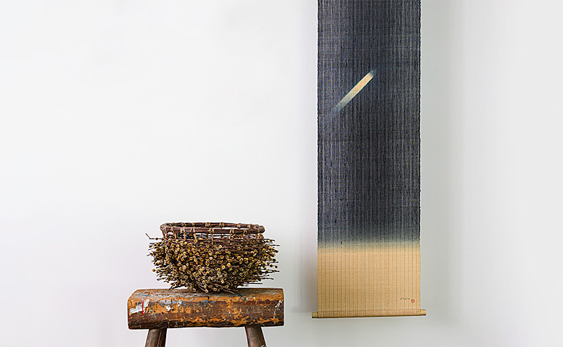
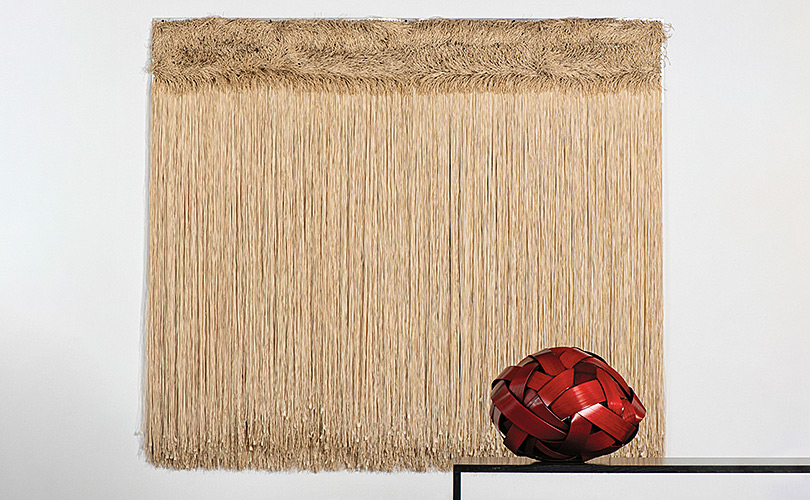
4hsh.1 Wall Hanging, Hiroyuki Shindo, linen, handspun and handwoven, indigo dye, 69″ x 17″ , 1995. Photo by Tom Grotta

It turned out so nice, we decided to do it twice. Three years ago we curated an exhibition at browngrotta arts exploring the inspirations shared by artists in Japan and the Scandinavian countries, Sweden, Finland, Norway, and Denmark. We uncovered so many interesting stories and artistic references among the artists we work with we’ve decided to revisit this topic again this winter at the Wayne Art Center in Wayne, Pennsylvania. Japandí Revisited: shared aesthetics and influences will open on December 7, 2024 and run through January 25, 2025. 

Basket Strings by Birgit Birkkjaer
102bb Woven Art Basket Strings, Birgit Birkkjaer, linen, paper, horsehair, hemp yarn, silk-steel, yarn, glue, 61″ x 35″ x 4″, 2024. Photo by Tom Grotta

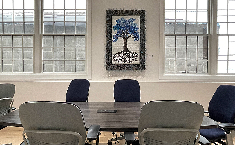
The Ethel Sergeant Clark Smith Gallery at the Wayne Art Center is spacious and bright and an inviting space. Vistors to Wayne will see some familiar works alongside new ones, from Birgit Birkkjaer, Hiroyuki Shindo, and Naoko SerinoJapandí Revisited will also feature artists new to our Japandí assemblage, including Shoko FukudaToshiko TakaezuAya KajiwaraKogetsu Kosuge, and Hiroko Sato-Pijanowski.

Åse Ljones and Naoko Serino
Åse Ljones, 16al Dobbel Domino, hand embroidery on linen, stretched on frame, 56.675″ x 57″ x 2.5″, 2015
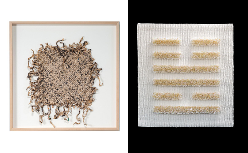
Naoko Serino, Generating 9, jute, 30″ x 30″ x 7″, 2014. Photos by Tom Grotta

Japandí in design is a fusion style that references shared aspects of Scandinavian and Japanese aesthetics.  “It is the East-meets-West design movement. It blends Japanese artistic elements and wabi-sabi philosophy with Scandinavian comfort and warmth or hygge,” Shanty Wijaya, an interior designer and owner of AllPrace told Architectural Digest in 2023“Both Japanese and Scandinavian design aesthetics are focused on simplicity, natural elements, comfort, and sustainability. It teaches us to find beauty in imperfection, form deep connections to the earth and nature, and enjoy the simple pleasures of life.”   

paper boat sculpture by Jane Balsgaard
38jb Relief, Jane Balsgaard, iron, bamboo, willow, fishing line and handmade plantpaper, 74″ x 18″ x 12″, 2014. Photo by Tom Grotta

There are four elements highlighted in Japandí Revisted — natural materials and sustainability, minimalism, exquisite craftsmanship and, as Wijaya notes, similarities between the Japanese concept of wabi-sabi and the Scandinavian concept of hygge. A respect for materials is found in both cultures. Danish artist Jane Balsgaard spent time in Japan in 1993 and 1998, preparing for exhibits there. Works of paper and twigs were the result. In her work, white paper often contrasts the dark color of the willow twigs.  “Another element in [Balsgaard’s] works that has connection to Japan,” writes Mirjam Golfer-Jørgensen, “is the skeleton, that partly frames the paper, partly combines with the hollows in the constuction, and gives another character to the paper that with a lightness that creates a contrast towards to the hollows.” (Influences from Japan in Danish Art and Design 1870 – 2010, Mirjam Golfer-Jørgensen, Danish Architectural Press, 2013.)

Gudren Pagter and Keiji Nio
5gp Framed, Gudrun Pagter, linen, sisal and flax, 65” x 60”, 2018
14kn Large Interlacing – R, Keiji Nio, nylon fiber, 54″ x 54″ x 15.5″, 2004. Photo by Tom Grotta

These cultures share is an affinity for purity, minimalism, and simplicity. Danish artist Grethe Wittrock’s work includes expanses of twisted paper strands in single colors — minimal and simple yet powerful expressions of what Finnish Designer Alvar Aalto called “the language of materials.” Wittrock observed the similar appreciation for minimalism firsthand when she traveled to Japan and studied with Japanese paper makers and renowned indigo dyer, Shihoko Fukomoto. “I started to uncover what Nordic sensibilities are by living abroad,” Wittrock says. “I lived in Kyoto, and saw an aesthetic in Japanese design similar to the Nordic tradition. You could say that there is an agreement that less is more. As they say in the Nordic countries ‘even less is even more.’” Gudrun Pagter is another Danish artist whose abstract works in primary colors reflect the modernism for which Scandinavia is known. “From the exotic and foreign land we find an aesthetically common understanding of a minimalist idiom,” Pagter says, “an understanding of the core of a composition — that is, cutting off everything ‘unnecessary.’”

Grethe Wittrock and Jiro Yonezawa
Grethe Wittrock , 2gr The Second Cousin, white paperyarn knotted on steelplate, 67” x 78.75”, 2006
Jiro Yonezawa, 100jy Red Fossil 20−4, bamboo, urushi laquer, 22.5” x 21.25” x 21”, 2020. Photo by Tom Grotta

Meticulous craftsmanship is another element heralded in Japandí. Stainless steel fibers are masterfully incorporated into the work of three of the artists in this exhibition. Agneta Hobin of Finland weaves the fine threads into mesh, incorporating mica and folding the material into shapes — fans, strips, and bridges. Jin-Sook So’s work is informed by time spent in Korea, Sweden, and Japan. She uses transparent stainless steel mesh cloth, folded, stitched, painted and electroplated to create shimmering objects for the wall or tabletop. The past and present are referenced in So’s work in ways that are strikingly modern and original.  She has used steel mesh to create contemporary Korean pojagi and to re-envision common objects — chairs, boxes and bowls. Kyoko Kumai of Japan spins the fibers into ethereal, silver landscapes.

Toshio Sekiji and Eva Vargö
Toshio Sekiji, 34ts Counterpoint 8, Korean newspapers; black urushi lacquer, 28″ x 25″ x 4″, 2009
Eva Vargö, 6ev No. 55 (Book of Changes), linen, thread, paper strings, gold leaves, 31.75” x 29.375” x 1.5,” 2019. Photo by Tom Grotta

Several artists in the Japandí exhibition evidence an appreciation for repurposing materials as wabi-sabi envisions. Toshio Sekiji’s works are made of newspapers from Japan, India and the US and even maps from Jerusalem. Paper is a material that creates an atmosphere as well as art. Eva Vargö, a Swedish artist who has spent many years in Japan, describes how washi paper, when produced in the traditional way, has a special quality — light filters through paper from lamps and shoji screen doors creates a warm and special feeling, in keeping with the appreciation of the imperfect embodied in wabi-sabi and wellness and contentment in hygge.

A sneak peek — here’s the Wayne exhibition in 2-D. Photo by Tom Grotta.

We hope you can make it to Pennsylvania this winter!


A Pop-Up is a Good Op

Two Vermettes, Two offices
Claude Vermette’s water color Maligne Lake, 1979 and Mariette Rousseau-Vermette’s tapestry Electricity/Energy, 1994. Photo by Tom Grotta

If Wikipedia is to be believed, Pop-Up art exhibitions began in 2007 in New York City. They now occur all over they world. Pop-ups are generally temporary events, less formal than a gallery or a museum, often using unusual spaces. Their popularity has boomed since the oughts, including Banksy’s Dismaland which collected work by 58 artists in a rundown seaside town in the UK in 2015, Yasoi Kusama’s room that exploded with flowers in Melbourne, Australia in 2018, the Museum of Ice Cream (not technically a museum) currently in several locations including Miami, Boston and Singapore, and The Color Factory in New York City, Houston, and Chicago. Pop-Ups are often immersive, interactive, and collaborative like Meow Wolf in Santa Fe, which began in 2008 as a small collective of artists sharing an interest in publicly displaying their works and developing their skills. Meow Wolf now aims to “redefine the paradigm of art and storytelling to make a positive difference in the world.”

Out of Focus Series by Grethe Sørensen
White Shell Tongue I & II, 2006 prints by Federica Luzzi and Out of Focus tapestries by Grethe Sørensen, 2007. Photo by Tom Grotta

Fast forward to 2024: browngrotta arts has its own Pop-Up of sorts at JUICE Creative Group in Norwalk, CT. JUICE handles our social media, website development, event planning and other miscellany. It has loads of clients coming into its business and rental studio space each week. Now, select Juice visitors are able to view (and acquire) JUICE Art, a specially assembled group of works from artists who work with browngrotta arts.

Warren Seelig installation
Warren Seelig’s White Wheel, 1996 and Small Double Ended, 1996. Photo by Tom Grotta

In curating the collection, we were mindful of the JUICE ethos. It’s a brand and digital agency based in the US, with team members all over the world. JUICE takes pride in the team of brand experts, designers, marketers and tech geeks it’s built, and the vibrant creative culture it has fostered. To reflect that creativity and energy, we suggested works like Grethe Sorensen’s Out of Focus that references pixels from printing, Warren Seelig’s mechanical sculptures, Small Double-Ended and White Wheel, Gyöngy Laky’s playful Beach Sketchmade of electrical tape wrapped branches and Electricity/Energy by Mariette Rousseau-Vermette, a tapestry that incorporates wire.

Sekiji, Laky and Seelig in the corner office
From left to right works by Toshio Sekiji, NYT Collage, 1997, Gyöngy Laky, Beach Sketch, 1987, Warren Seelig, Shadowfield/ Colored Light Single, 2017. Photo by Tom Grotta

Printed pages are another theme; the agency produces a lot of textual content. There are collages made of books and newspapers by Toshio Sekiji; works by Wendy Wahl of encyclopedia pages, and an interesting work by Mercedes Vicente that mixes string and spiral notebook pages and “hints” at writing. Photography, too, was a theme. In a room clients use, we placed a textile triptych made of photo images of Japanese tile roofs that are fragmented, silk screened, and metal-leafed made by Glen Kaufman along with works of paper by Gizella Warburton. On a floor of offices, there are photographs of fiber sculptures by Federica Luzzi, White Shell Tongue 1 and 2 beside a graphic tapestry by Gudrun Pagter.

John McQueen in the conference room
In the conference room, Intimate Domain, 2019 by John McQueen

In deciding what to display, we also collaborated with the JUICE team, including some works by artists they chose. John McQueen is a favorite of several team members. We included Intimate Domain, which includes a tree made of repurposed plastic surrounded by a frame made of small branches and cable ties and also Treed, a depiction of a tree where the drawing creeps off the page an onto the frame. Another popular artist was Canadian painter and ceramist Claude Vermette. There are two of his large canvases, one triptych and one small water color hung throughout the space. Also on the team’s list, works by Keiji Nio, Jo Barker, Dorothy Gill Barnes, Jiro Yonezawa, Chiyoko Tanaka and Jennifer Falck Linssen.

Claude Vermette and Gudren Pageter
Claude Vermette. Clairière, 1992 painting, Gudren Pagter, Thin Green Line , 2017 tapestry, Toshio Sekiji, Black Collage, 1998. Photo by Tom Grotta

For us, a Pop-Up is a Good Op. The JUICE space looks better, clients and staff appreciate the work, and we get more eyeballs for some great works of art!