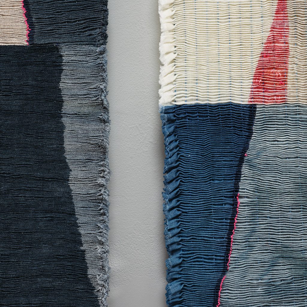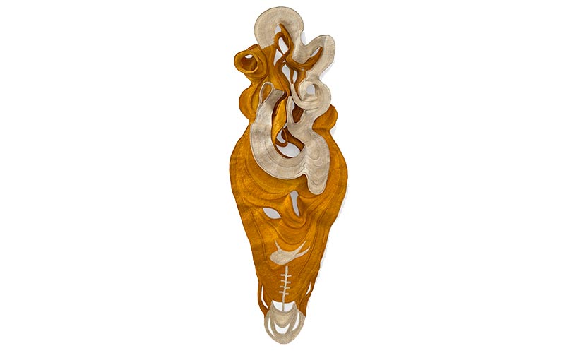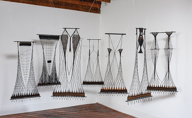
Light plays a key role in our experience of art. Artists create dramatic, immersive environments with light, shifting the focus from mere representation to a sensory experience Sometimes light is used to create an emotional impact — soft light for tranquility; cool light for tension; dark tones for despair. Masters, such as Rembrandt and Caravaggio, used dramatic contrasts between light and dark to create mystery and theatrical focus. Symbolically, light has been used to represent divinity, knowledge, and revelation — often in religious contexts. In other works, light creates the illusion of depth, sculpting form and volume. In contemporary works light is the medium itself — LEDs, neon, optical fiber.
Light can also impact a viewer’s experience — influencing the narrative, highlighting focal points. In the works pictured here, light influences the viewer’s experience, creating one — or more — works when light is shown on the art and a very different second work when shown without a light source. Straight on, light may turn a metallic-tinged work a brilliant white. When light is indirect, the highlight dim and new qualities emerge.
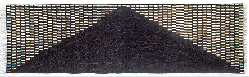
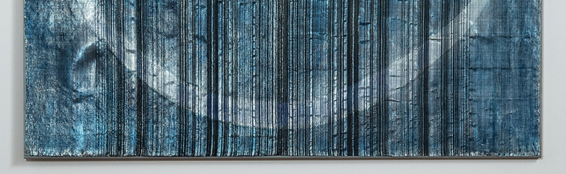
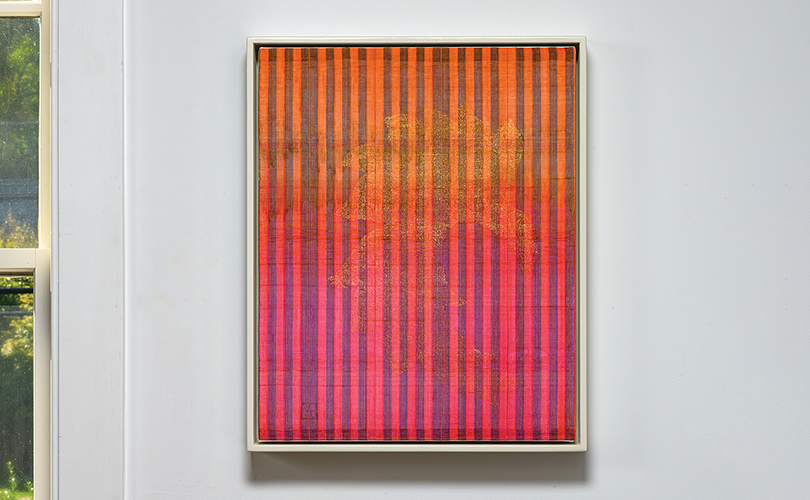
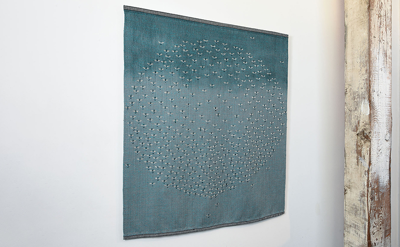
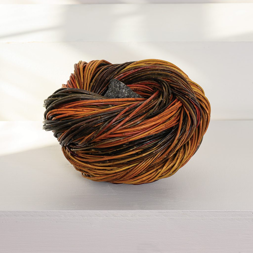
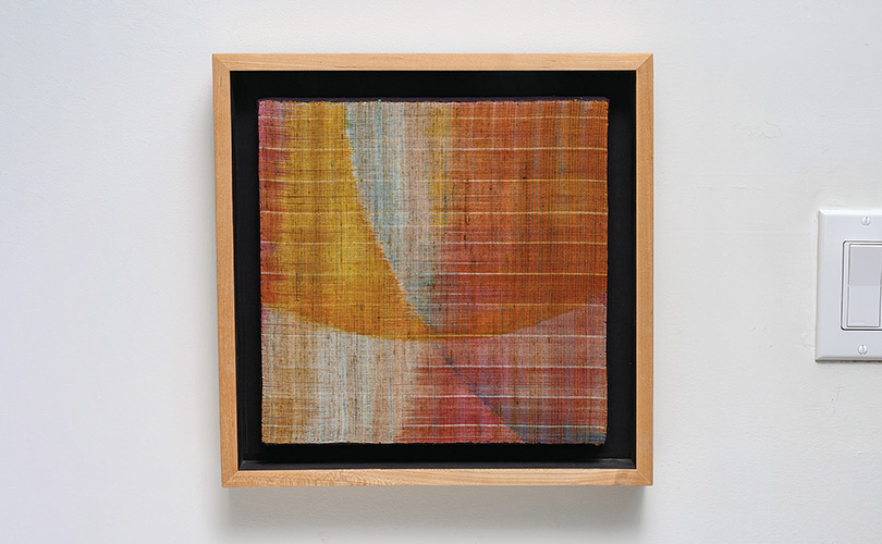
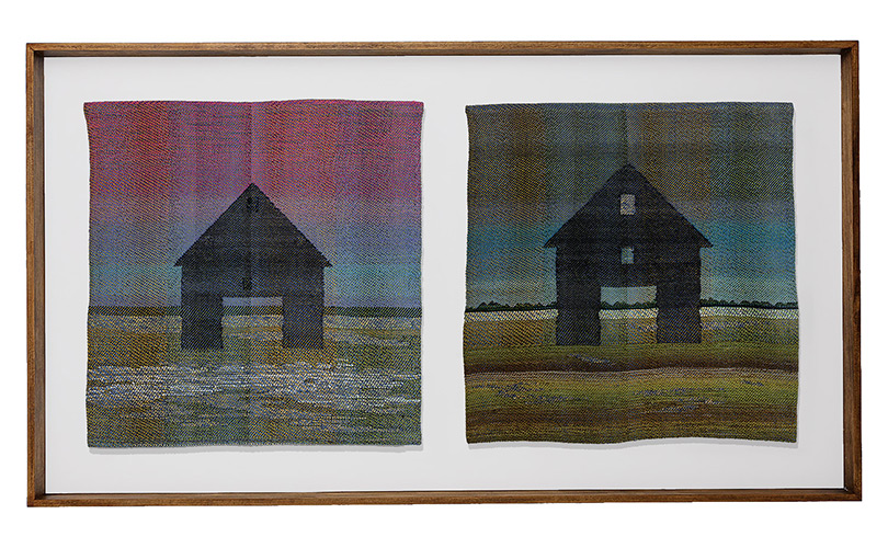
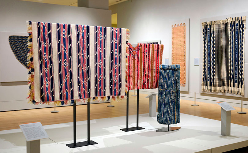
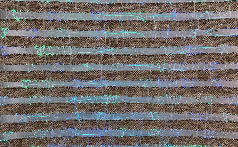
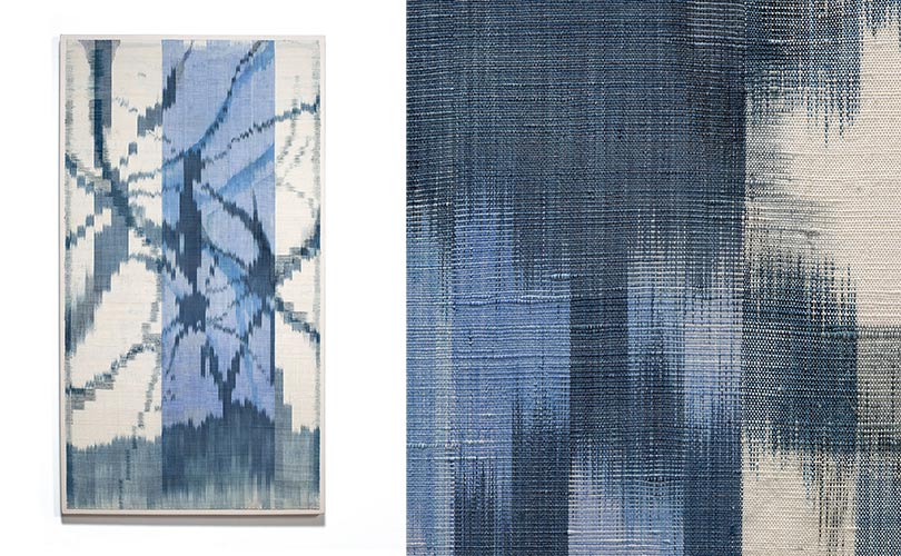
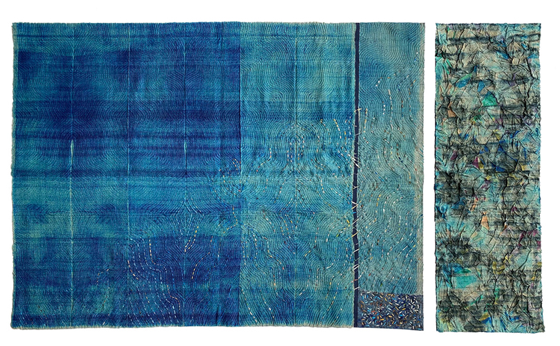
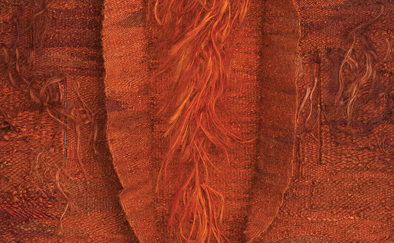
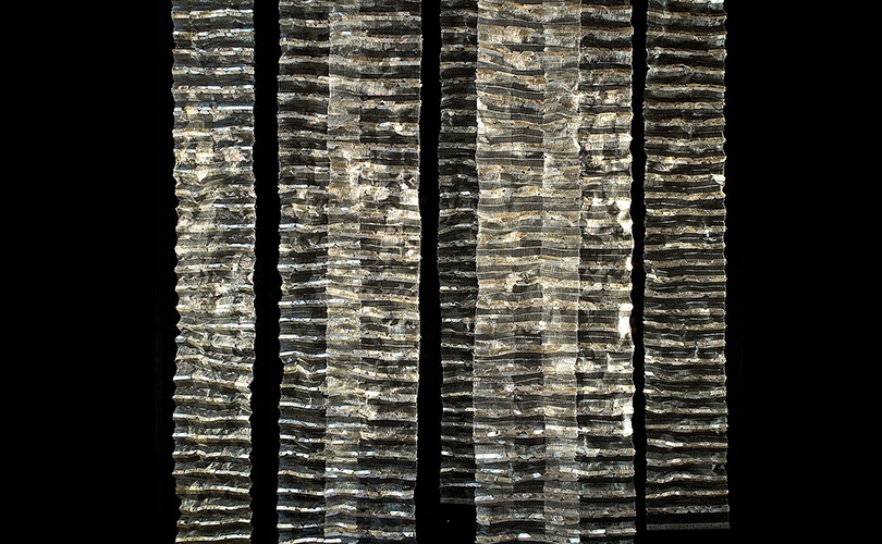
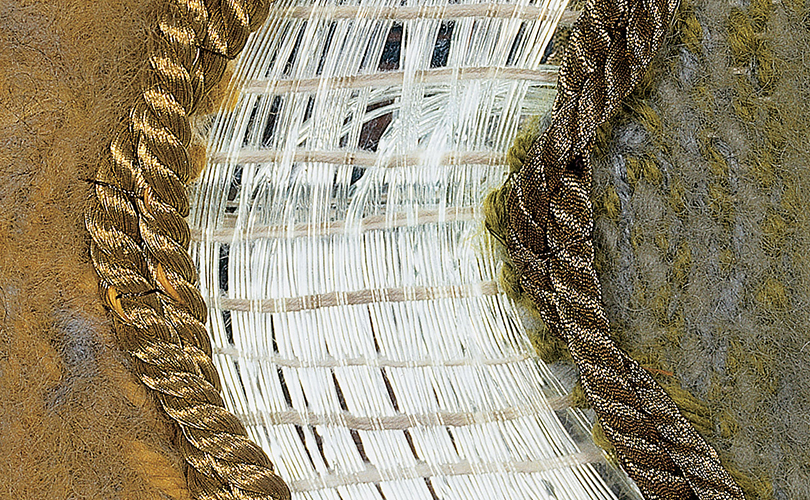
In Adela Akers’s Night Pyramid, a mountainscape comes into sharp focus when illuminated. The image is formed from small strips of foil integrated into the weaving. In Serene Countenance by Polly Barton, the artist uses metallic monofilament and metallic thread to create a subtle glimmer in shadow that transforms into a glowing orb when a light source is introduced. The weft’s metallic thread is brass wrapped around a nylon core, while the warp is a striped combination of silk and metallic-coated monofilament. Other examples of works incorporating metallic threads are Baiba Osite’s Lauks (Field in Autumn) and Animal by Lija Rage.
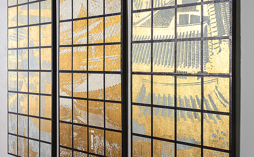
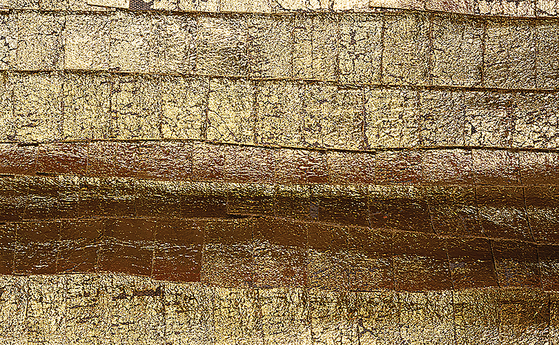
While living in Japan in the 1980s, Glen Kaufman developed a unique and complex technique in which light provides the finishing touch. He began by weaving a twill pattern in silk, composing collages of photographic imagery and silk-screening those images onto the cloth. He then further abstracted the imagery by applying metal leaf. “When I began using … photography, photo silk screen, metal-leaf application,” Kaufman said, “[it] was a unique use of those materials.”
Yeonsoon Chang also employs metallic materials, developing a method to adhere gold leaf to fibers. Her striking works blend innovative technique with references to classical Eastern philosophy. In works such as The Moon, the Stars, the Sun, light reveals shifting perspectives and diverse experiences. In one video, illumination transforms an already intriguing piece into something entirely new, bringing the metal leaf into sharp focus and casting compelling shadows through the mesh structure
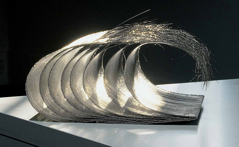
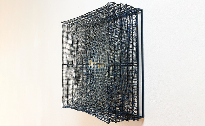
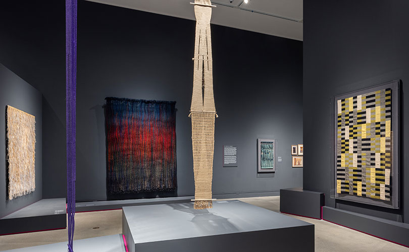
In Kyoko Kumai’s hands, stainless steel mesh appears infused with light, an effect heightened when an external light source is added. Agneta Hobin’s works pull glimmers of light through stainless steel mesh and the unexpected use of mica.
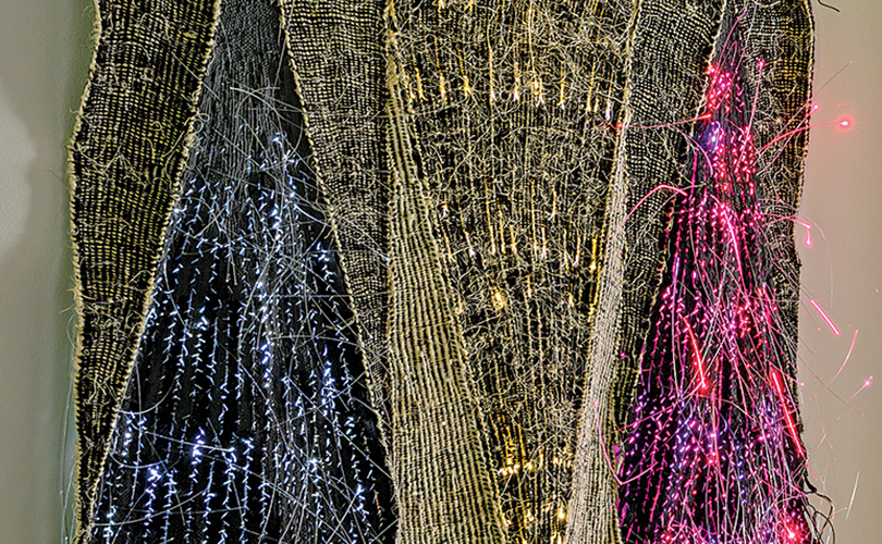
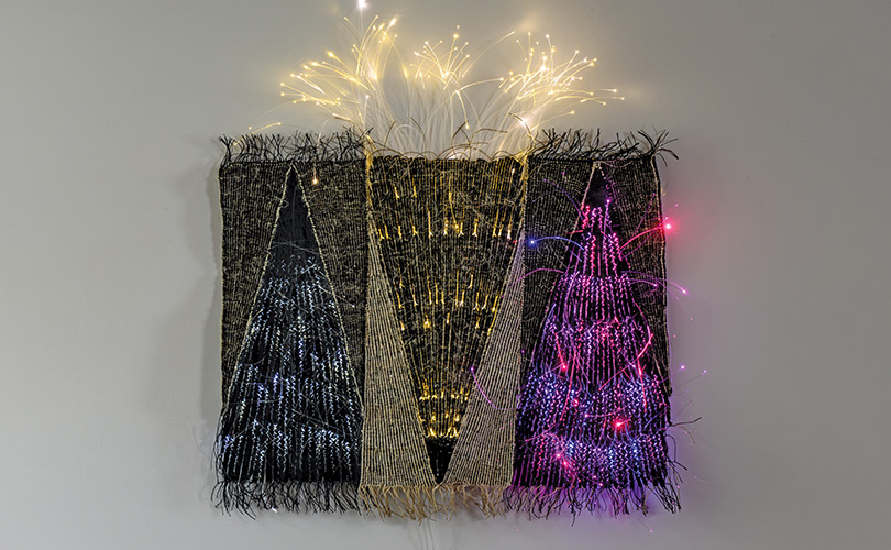
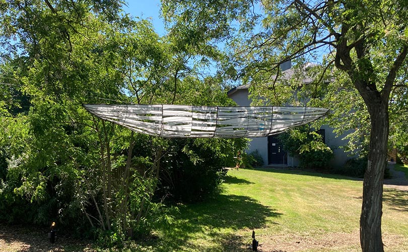
Optical fiber provides an exciting medium for artists Wlodzimierz Cygan and Mariette Rousseau-Vermette. In Totems, a complex weaving takes on a new character when the optical fiber is lit and shifts in color. In Mariette Rousseau-Vermette’s Élégante, a slash of shimmering optical fiber creates subtle intrigue when unlit and serves as a dramatic counterpoint when illuminated.
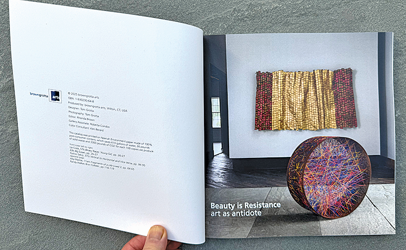
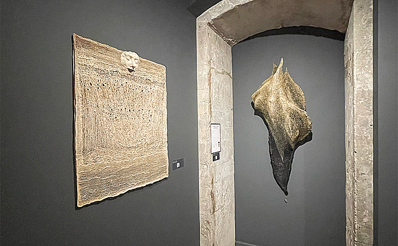
Several works for which light is an element or an enhancement will be included in browngrotta arts’ upcoming exhibition, Transformations: dialogues in art and materials (May 9 – 17).