Category: Text Art

Kisetsukan – Pursuing Seasonal Sense in Art

The weather’s changing here in Connecticut. Sweaters come out of storage, and sandals and sleeveless shirts are packed away. Light-colored duvets give way to warmer quilts and flannels. Pumpkins appear on porches and shelves, paving the way for twinkling lights in December.

What if we gave our art collections the same seasonal revisit?

The Japanese embrace this idea through a practice called kisetsukan, or “seasonal sense” — an aesthetic and cultural principle deeply rooted in their appreciation of nature and the home. This approach doesn’t just apply to art but extends to festivals, food, clothing, and everyday life. Kisetsukan reflects an awareness of the seasons and their emotional impact — something echoed in many cultures.

Sara Brennan, Gali Cnaani, Mary Merkel-Hess Details
Sara Brennan, Gali Cnaani, Mary Merkel-Hess, Lia Cook: Trees, woods and greenery in varying views.

Substituting artwork throughout the year can shift one’s emotional response and renew our connection with both the art and the environment around us. A single piece viewed in spring might evoke freshness and renewal; that same piece in the depths of winter could feel nostalgic or even melancholy.

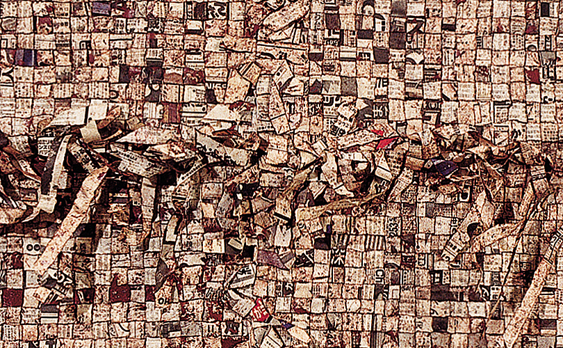
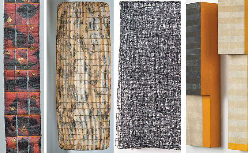
One beautiful example is Paul Furneaux’s City Trees II, City Lights II, a memory of a hidden park in Tokyo where luminous white and pale pink cherry blossoms contrasted against dark-barked pines and the brutalist concrete and glass of the surrounding buildings — a moment of heightened beauty and tension. Works like this could be rotated in and out as the days lengthen or shorten, responding to the mood of the season.

Katherine Westphal, Merja Winqvist, Nancy Koenigsberg, Paul Furneaux details
Katherine Westphal (Fall Leaves); Merja Winqvist (Long Hot Summer); Nancy Koenigsberg (Winter Field), Paul Furneaux (City Trees II and City Lights II). Seasons highlighted in disparate media.

The Benefits of Seasonal Rotation

Rotating your artwork seasonally can:

  • Deepen your connection to nature by aligning your interior space with what’s happening outside.
  • Enhance appreciation for individual works by seeing them with fresh eyes each time they return.
  • Spark reflection on the passage of time and the impermanence of beauty — what the Japanese call mono no aware, a bittersweet awareness of life’s fleeting nature.
  • Expand your collection by giving you reason to collect more works and experiment with pairings, contrasts, and themes.

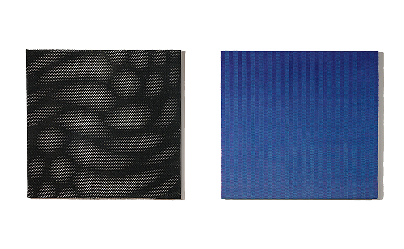
You don’t need to collect four new works for each season to begin. Start small. Instead of grouping similarly sized pieces, try alternating light and dark palettes, or switching black and white for bold color.

Grethe Sorensen diptych
Grethe Sorensen’s Interferens-7 and Blue-Color-Gradation can be hung together or rotated.
Cynthia Schira weavings
Cynthia Schira’s Nightfall and Spring-Lyric can be hung together or rotated.

Some pieces even offer built-in versatility:

Gyöngy Laky's Deviation displayed two ways
Gyöngy Laky’s Deviation installed two ways
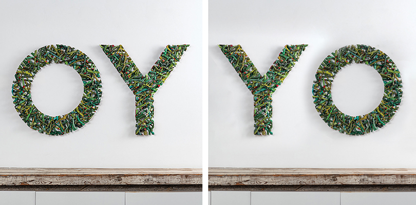
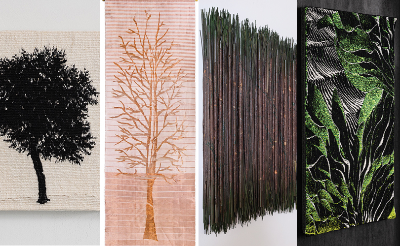
  • Gyöngy Laky’s Deviation — OY can be displayed as “OY” for half the year and flipped to read “YO” for the other. Is it an existential “Oh, Why?” or a cheerful “Yo!” greeting? Let the season decide.
Laura Foster Nicholson's Shed displayed two ways
Laura Foster Nicholson’s Shed installed two ways

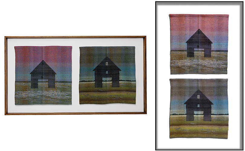
Laura Foster Nicholson’s work Shed can be hung vertically or horizontally, allowing a shift in visual weight and direction.

Sung Rim Parks sculpture on and off the wall
Sung Rim Park’s Beyond 220723. Displayed on the floor and floating in space.

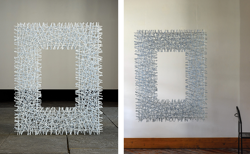
Sung Rim Park’s Beyond series can be installed on or off the wall, offering new perspectives and levels of engagement.

Tall Lia Cook positive/negative image weaving
Lia Cook’s Big Richard front and back.

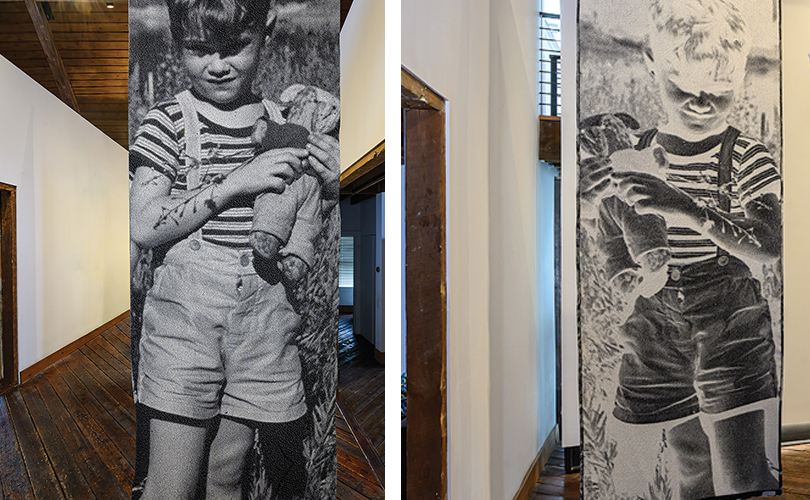
Lia Cook’s banners, like Big Richard, are impactful whether viewed from the front or reversed — another way to surprise the eye.

The more flexible the installation options, the more enjoyment you may find in your collection. Changing your art throughout the year brings new energy into a space, reawakens your senses, and reminds you of the beauty in change itself.


In ConText: the Printed Page as Inspiration, Material, and More

John McQueen Willow book
16jm Bird Brain, John McQueen, woven willow twigs, waxed string, 26” x 23.5”, 2002. Photo by Tom Grotta.

“With all sorts of ideas behind them, artists continue to challenge the idea, content, and structure of the traditional book,” observed Anne Evenhaugen, in Unbound, the Smithsonian Libraries and Archives, online newsletter in 2012 (https://blog.library.si.edu/blog/2012/06/01/what-is-an-artists-book/). Several artists who work with browngrotta arts do all that to books and more. Below are some examples of how the printed page forms or features in their work.

Caroline Bartlett Books
3cb Overwritings VI, Caroline Bartlett, canvas, silk, plastered fabric, cotton thread and pins, 13.25″ x 18.625″, 3.5″, 1998 4 & 5cb Overwritings VIII & 1, Caroline Bartlett, canvas, silk, matchsticks, paper, waxed resisted silk fragments, cotton thread and pins, 9.375″ x 18.625″ x 2.75″, 1998. Photo by Tom Grotta.
Lewis Knauss Books
1ln Fog Book I, Lewis Knauss, linen, hemp, handmade Japanese-style paper and shellac, 12″ x 18″ x 8″, 1999; 2ln Cliff Strata II, Lewis Knauss, linen, hemp, handmade Japanese-style paper and shellac, 9.5″ x9.5″ x 3″, 1999; 3ln Fog Book II, Lewis Knauss, linen, hemp, handmade Japanese-style paper and shellac, 12″ x 16″ x 7″, 1999; 2ln Cliff Strata I, Lewis Knauss, linen, hemp, handmade Japanese-style paper and shellac, 8.5″ x 10″ x 3″, 1999. Photo by Tom Grotta.

For some it’s a literal homage. John McQueen makes actual books of twigs and waxed linen. Their pages turn and the words on the pages can be read. Caroline Bartlett’s version is more of an idea, a memory, than an actual book. In  her Overwritings series, cotton thread, plastered fabric, matchsticks, and waxed resisted silk fragments create marks that reference text that viewers are left to decode. The volumes in Lewis Knauss Book series also read as books, but are even more abstract. Knauss uses linen, hemp, Japanese paper, and shellac to create ruffled pages without text. Mercedes Vicente uses notebook paper to create a book and a thin black cord to “write” on the pages.

Mercedes Vicente thread and paper book
Detail: 5mv Sin Pauta, Mercedes Vicente, notebook, cord, 37” x 14” x 9”, 2014. Photo by Tom Grotta.
Toshio Sekiji woven newspapers
Detail: 23ts Overture, Toshio Skekiji, old Japanese newspapers, 70.25” x 56.25” maple frame, 1998. Photo by Tom Grotta.

Other artists use the printed page as material. For Toshio Sekiji, it’s newspapers, book jackets, and maps that make up his collage/weavings. He explores the merge of cultures in his works. New stories are created atop the old he says, by reading the strips of paper he chooses and the areas he enhances with lacquer. Encyclopedia pages are used as Wendy Wahl‘s as material. “… [t]he leaves may be stacked into forms that suggest an alternative forest of knowledge or tightly scrolled and packed within a frame, making for a composition that suggests a cabinet of hidden knowledge, those archives of information that are at once visible and concealed, at hand and remote.” Akiko Busch, wrote in our catalog, 10th Wave III.  Naomi Kobayashi creates her own text, then incorporates it into delicate weavings. In a true “art imitates life imitates art” moment, a collector of her work who is a writer asked a technical question. If the work were unraveled, could the text be read? Yes, the artist answered and it became a plot twist — in his book, Hiding in the Weave, a student’s tapestry has to be unwoven to discover a clue to her death.

Wendy Wahl encylopedia Floor Sculptures
20ww Rebound: m/ixed Volumes 3, Wendy Wahl, discarded/deconstructed/restructured encylopedia pages, 40″ x 16″ x 17″ , 50″ x 78″ x 17″ , 60″ x 95″ x 17″, 2009. Phtot by Tom Grotta.

Lawrence LaBianca looks at books from different vantage points. In Thesaurus, he posits a slice of a tree with its mirror image in glass as book pages that can be read. What Lies Beneath, is a bit tongue in cheek. In this work, he considers an iconic book, Moby Dick, from the perspective of fish. He sent it into the ocean in a waterproof box and filmed it in place.

Lawrence Labianca Book Art
1ll Thesaurus, Lawrence LaBianca, cast glass, stainless steel, redwood, 15″ x 15.5″ x 3.5″-11.25″, 2004. Photo by Tom Grotta. 12lb What Lies Beneath, is a mixed media sculpture. The unique water housing was created to submerge Moby Dick by Herman Melville underwater. The image was taken while the book was underwater and tethered to a rock. Lawrence LaBianca, 40″ – 85″ x 18.5″ x 8.5″, 2016. Photo by Tom Grotta.

Francis Bacon got it right in our view, when he said, “Some books are to be tasted, others to be swallowed, and some are to be chewed and digested.” (Essays (1625)) Bacon’s Essays By Francis Bacon, Richard Whately.) Those are just some of the options available to artists considering books as inspiration. As viewers, we are left to anticipate and appreciate the works that result.