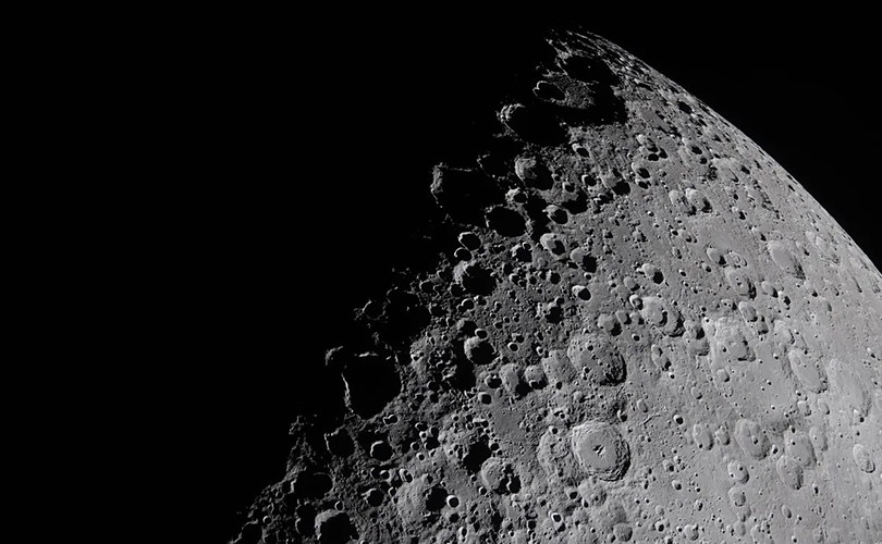
The Guardian said it well: “If you’ve been looking up at the moon with childlike wonder these past few days, you aren’t alone. NASA’s Artemis II lunar mission has captured imaginations at a time when wonder and optimism are in short supply.” The photographs of the moon in IRL that resulted from the mission are breathtaking.
Man has also looked to the moon for artistic inspiration through millennia. Artists who work with browngrotta arts not immune to celestial charm; we’ve gathered some examples here.
The travel website Fly Me to the Moon, lists possible reasons for the moon’s appeal. It could be the subconscious connection with the amorous ancient Greek goddess of the moon, Selene, or the moon’s association with fertility.
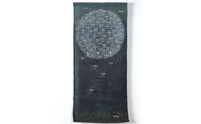
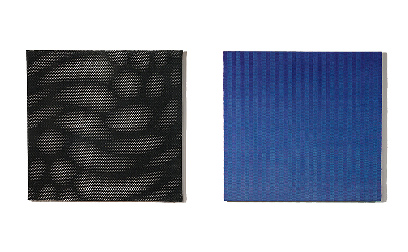
It could also be her ever changing nature that captures our attention. Her light illuminates our quietest and most contemplative hours. “In a dark sea of instability, the full moon in a richly deep blue sky is both reassuring and evocative,” says Laura Foster Nicholson. “Hints of reflective threads in Dark Moon aim to bring split seconds of insight and imagination, as do the stars.”
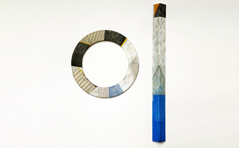
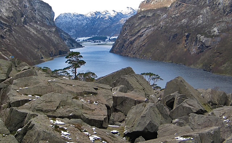
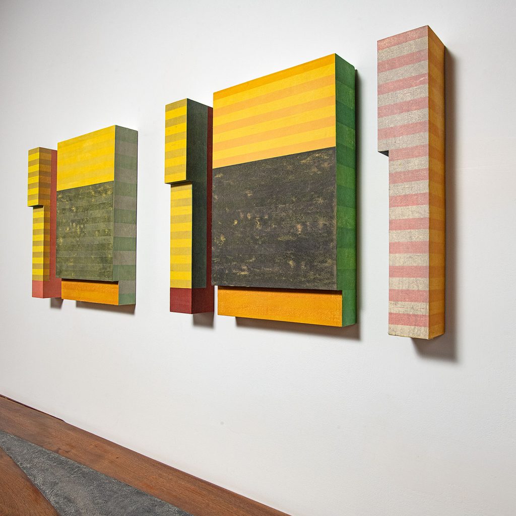
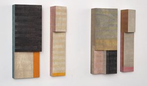
Or perhaps it’s simply the spectacle of moonlight. Paul Furneaux’s visit to the Norwegian fjords led to Fractured Moon, Fractured Mountain. He was particularly taken by the drama played on the fjords by the change of light, one half often shadowing the other — when translated to Fractured Moon, Fractured Mountain, it’s reminiscent of the drama of the familiar light and enigmatic sides of the moon.
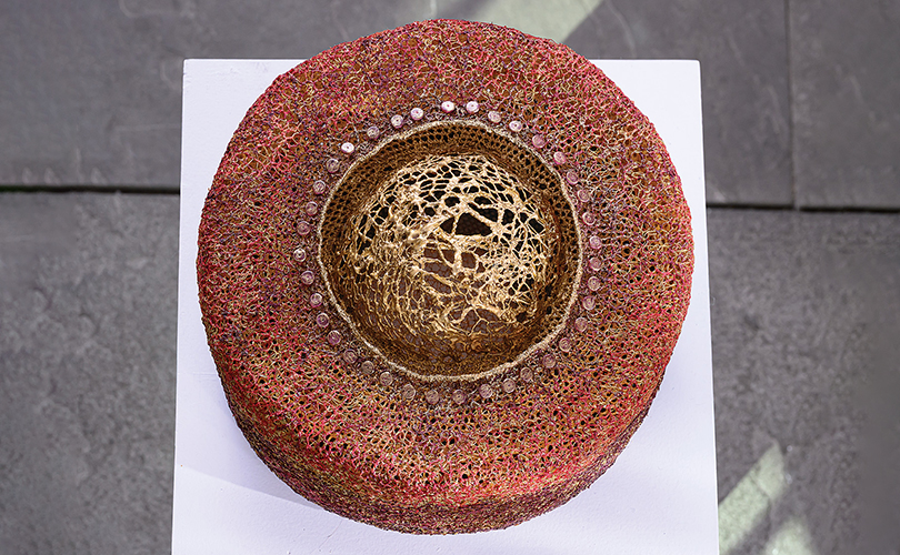
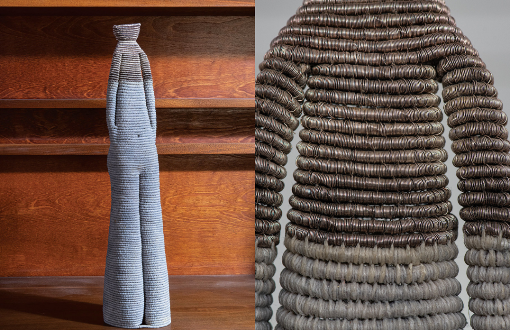
It’s also magical, and mystical. Golden Moon, by Norma Minkowitz, has a large, intricate orb rising up. It is a symbol of illumination, insight and mystery. “The moon is a metaphor for beauty in this world,” she says, “as well as acting as a source of light in the darkness”. Golden Moon is one of a series of vessel forms that Norma Minkowitz been creating since the 1990’s. The vessels represent containers of different thoughts: some dark, some optimistic and some, like Golden Moon, ethereal.
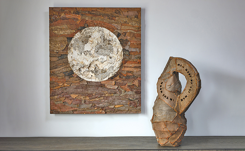
The moon has been used by artists to express “longing, change, the spiritual, the mysterious, and the sorrowful, according to WikiArt, the Visual Art Encyclopedia. In When Darkness Comes Calling, John
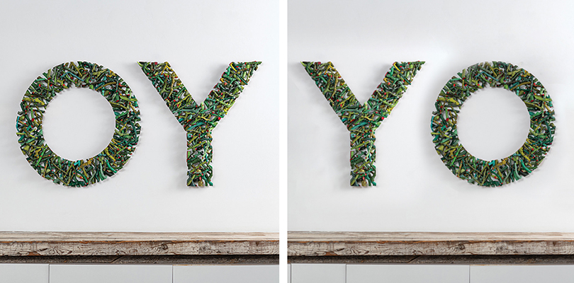
McQueen wanted to capture that magical moment when a full moon comes out in a dark sky. The light and dark contrast is achieved by surrounding the white birch bark of the moon with the darker back sides of the pine and birch barks. The title of the piece comes from the lyrics of a song by Lily Kershaw, As It Seems. In The Other Side of the Moon, McQueen makes a tongue-in-cheek observation about our obsession with the moon. One side of the vessel reads: Man made up the man in the moon. The second side says: The first self-serve in no man’s land.
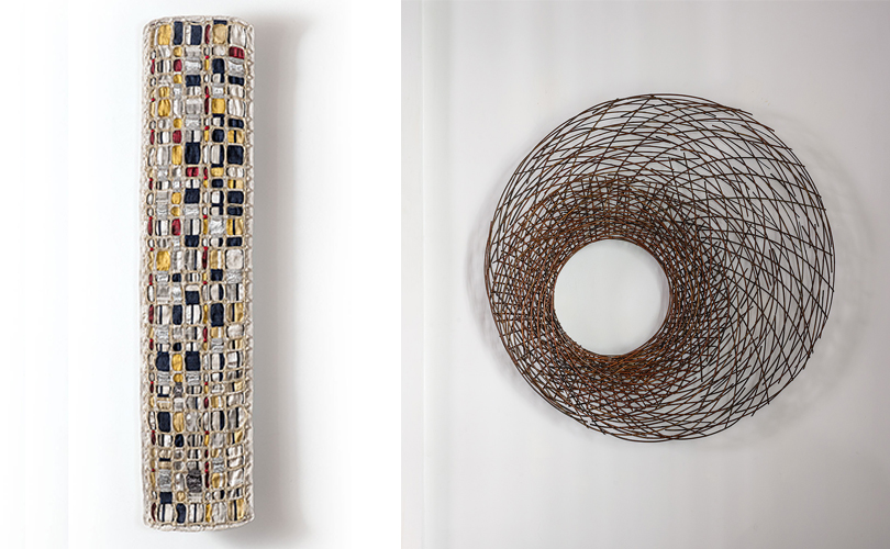
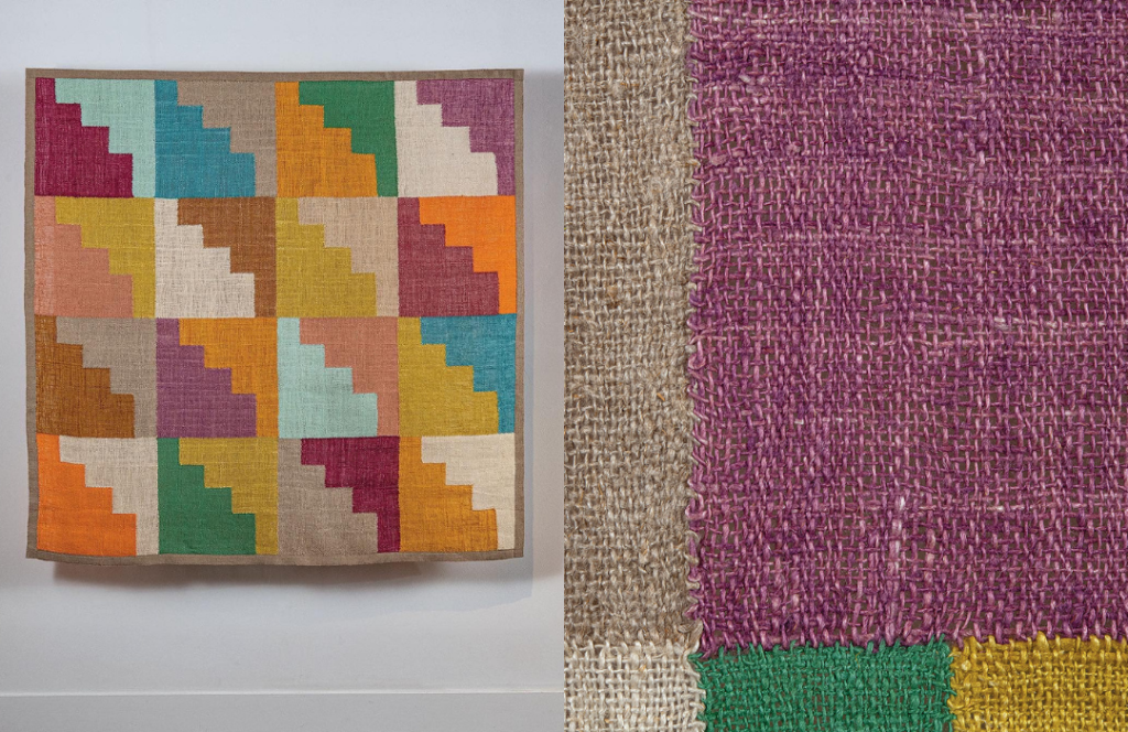
Works inspired by the moon that reflects a visual language that crosses geography and history. Here are moon-inspired works from artists in Venezuela and the UK. Eduardo Portillo and María Davila use indigo to illustrate the night, the moon, the sky, the clouds, the dawn; moments of every day; moments filled with blue.
Wishing you many lunar interludes and the mystical magic that accompany them.
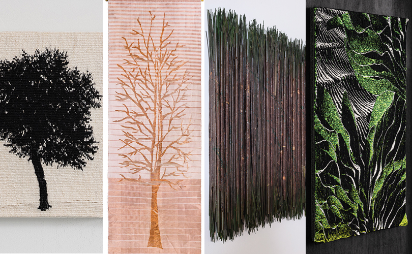


Art & Identity: A Sense of Place
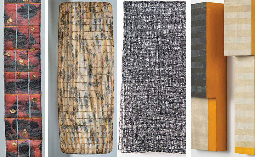
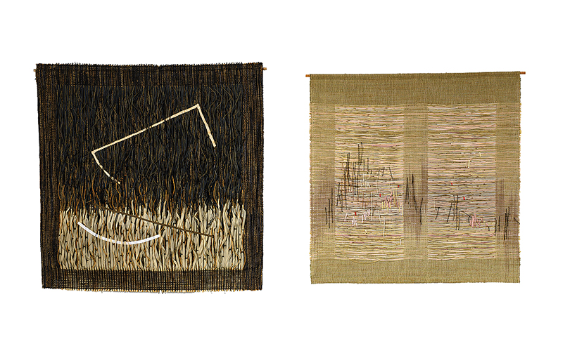
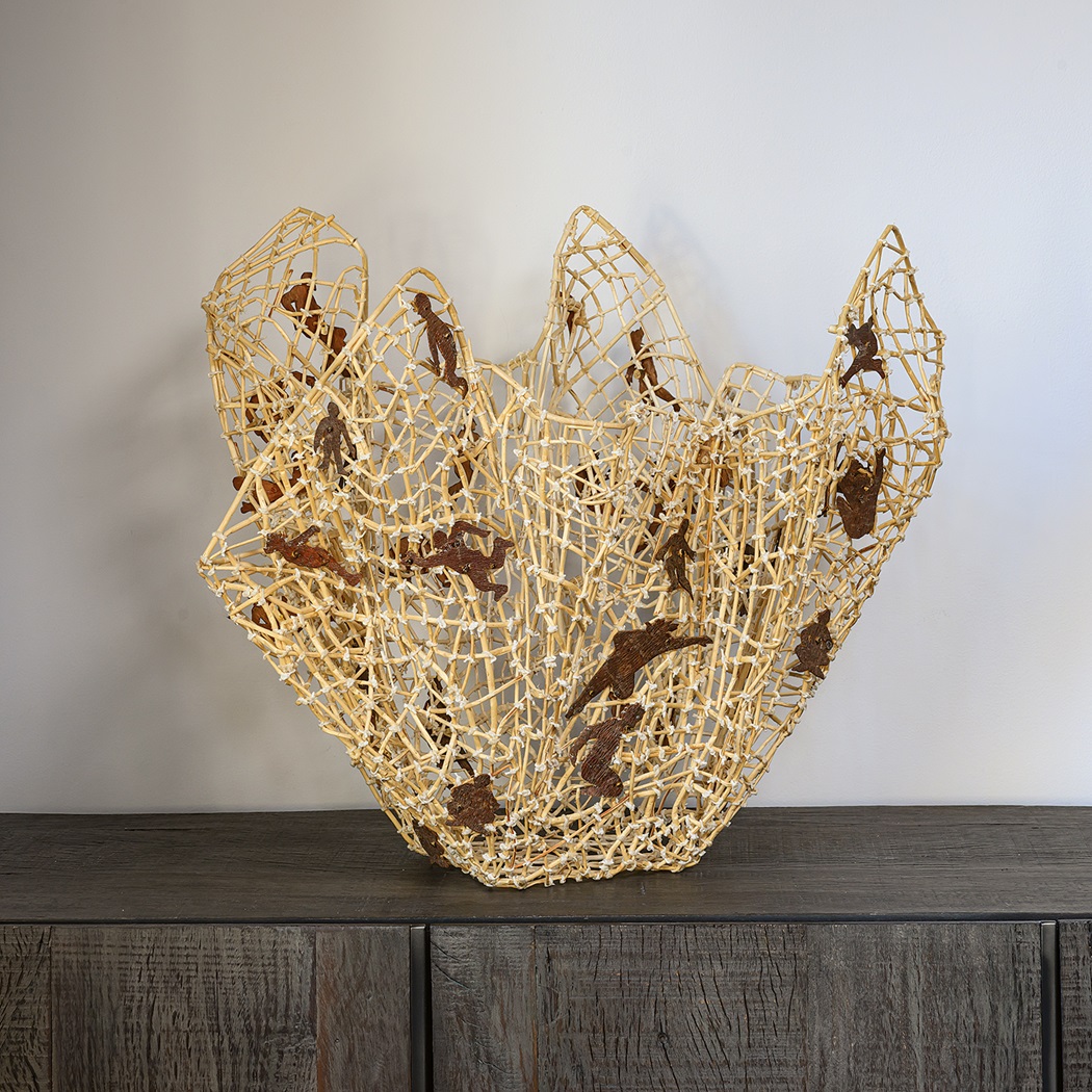
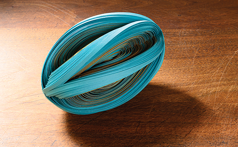
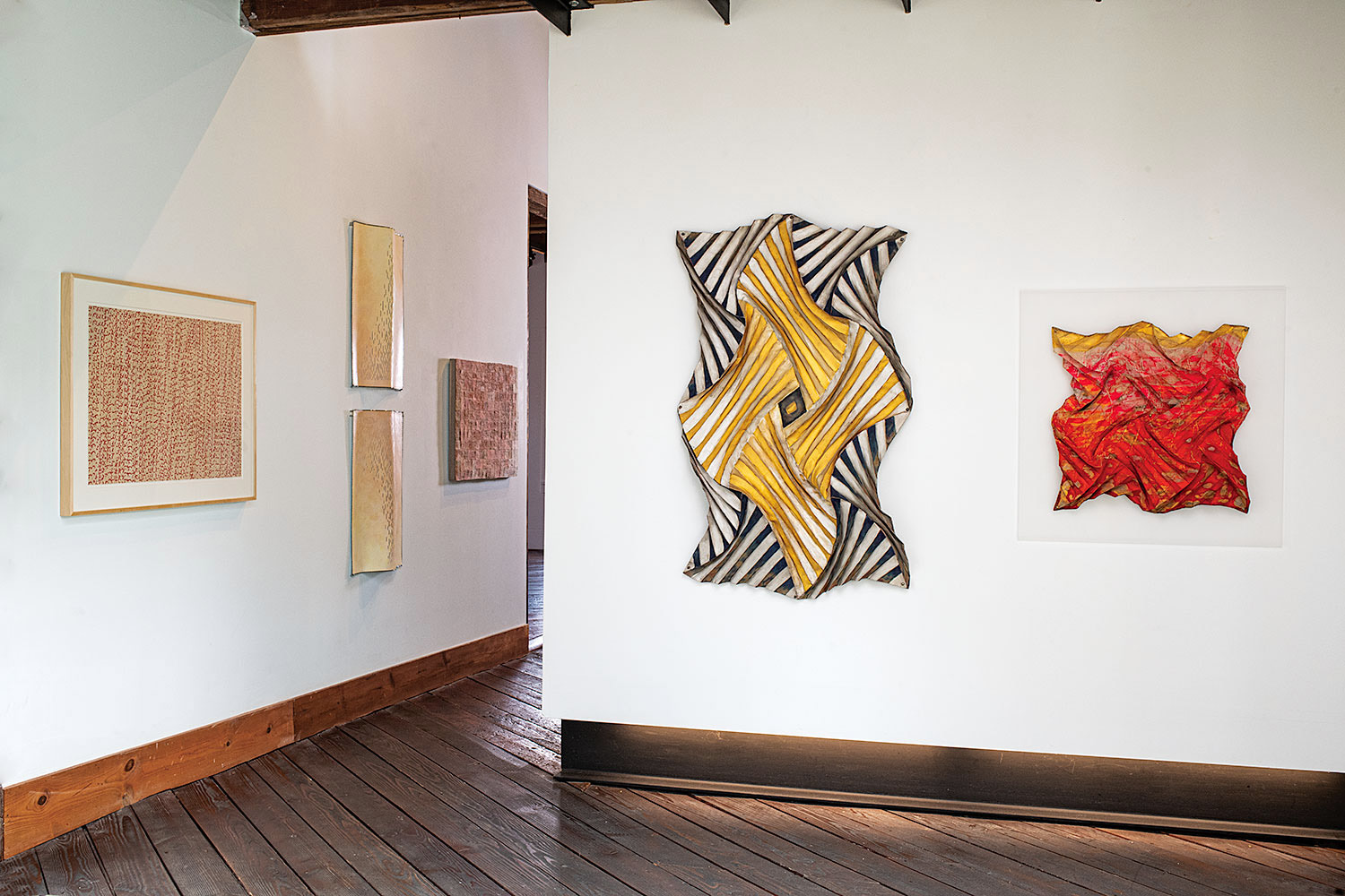
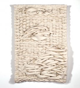
In our 2019 Art in the Barn exhibition, we asked artists to address the theme of identity. In doing so, several of the participants in Art + Identity: an international view, wrote eloquently about places that have informed their work. For Mary Merkel-Hess, that place is the plains of Iowa, which viewers can feel when viewing her windblown, bladed shapes. A recent work made a vivid red orange was an homage to noted author, Willa Cather’s plains’ description, “the bush that burned with fire and was not consumed,” a view that Merkel-Hess says she has seen.
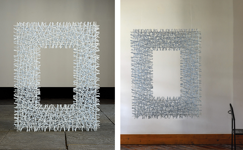
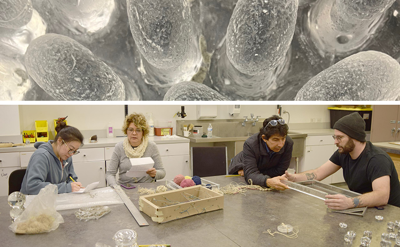
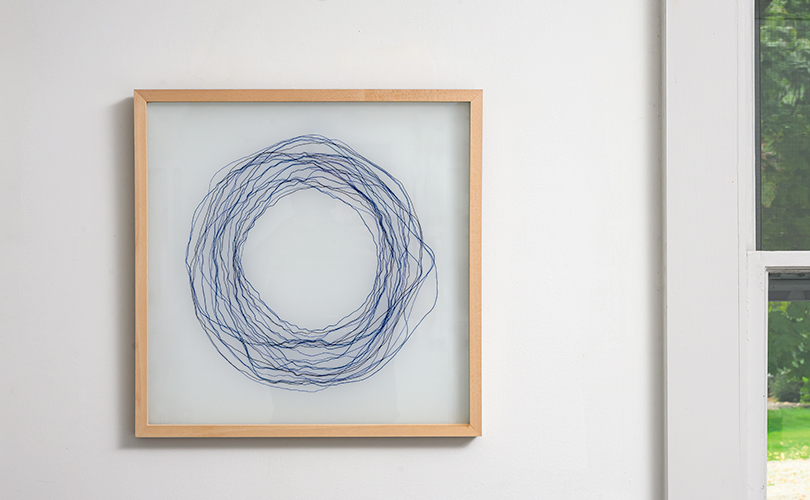
The late Micheline Beauchemin traveled extensively from her native Montreal. Europe, Asia, the Middle East, all influenced her work but depictions of the St. Lawrence River were a constant thread throughout her career. The river, “has always fascinated me,” she admitted, calling it, “a source of constant wonder” (Micheline Beauchemin, les éditions de passage, 2009). “Under a lemon yellow sky, this river, leaded at certain times, is inhabited in winter, with ice wings without shadows, fragile and stubborn, on which a thousand glittering lights change their colors in an apparent immobility.” To replicate these effects, she incorporated unexpected materials like glass, aluminum and acrylic blocks that glitter and reflect light and metallic threads to translate light of frost and ice.
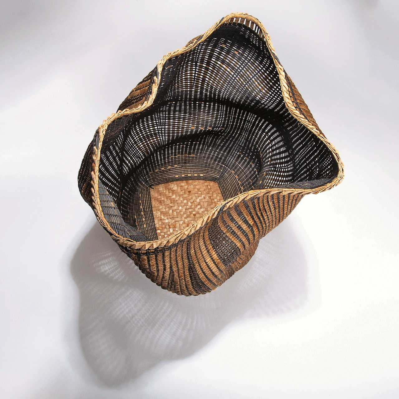
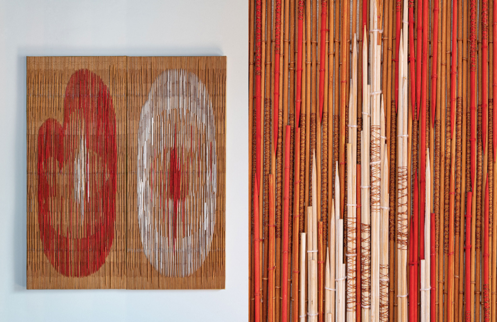
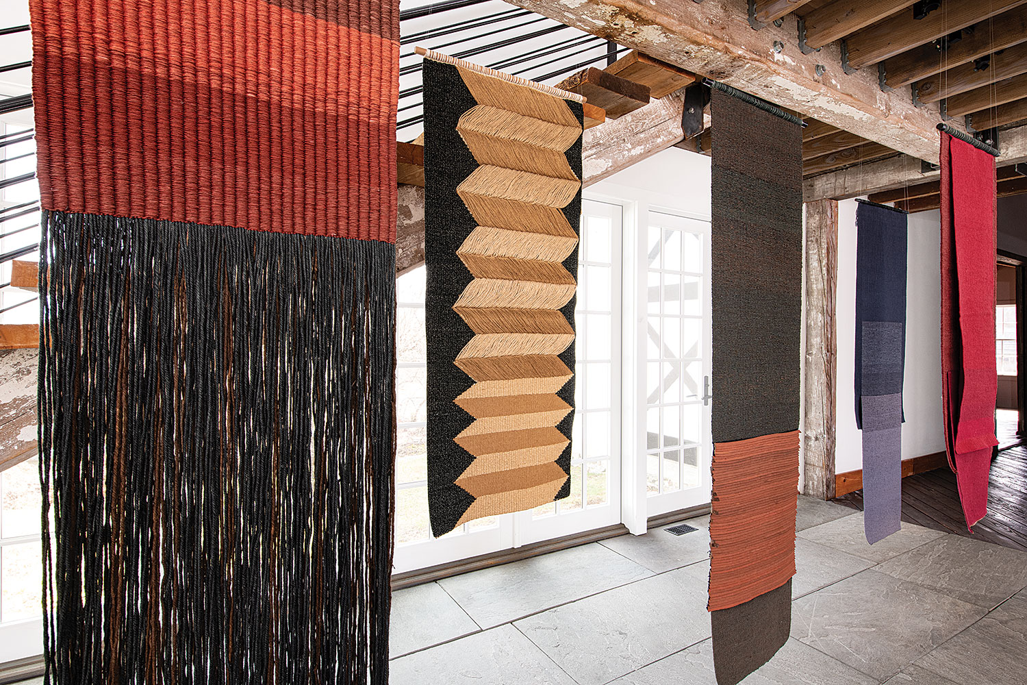
Mérida, Venezuela, the place they live, and can always come back to, has been a primary influence on Eduardo Portillo’s and Maria Davila’s way of thinking, life and work. Its geography and people have given them a strong sense of place. Mérida is deep in the Andes Mountains, and the artists have been exploring this countryside for years. Centuries-old switchback trails or “chains” that historically helped to divide farms and provide a mountain path for farm animals have recently provided inspiration and the theme for a body of work, entitled Within the Mountains. Nebula, the first work from this group of textiles, is owned by the Cooper Hewitt Museum.
Birgit Birkkjaer’s Ode for the Ocean is composed of many small woven boxes with items from the sea — stones, shells, fossils and so on — on their lids. ” It started as a diary-project when we moved to the sea some years ago,” she explains. “We moved from an area with woods, and as I have always used materials from the place where I live and where I travel, it was obvious I needed now to draw sea-related elements into my art work.”
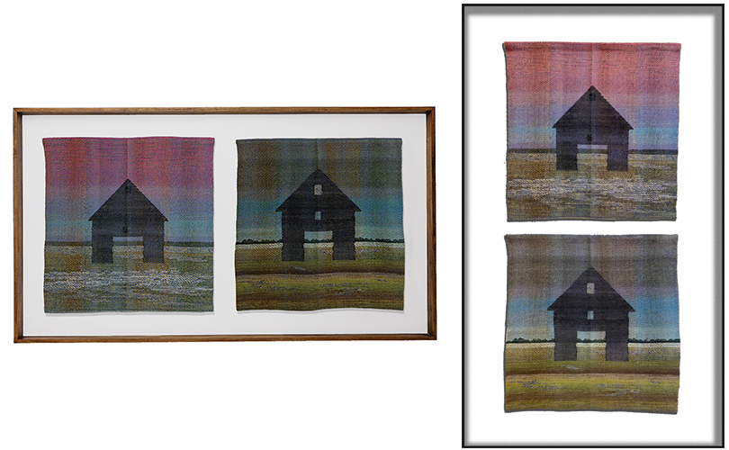
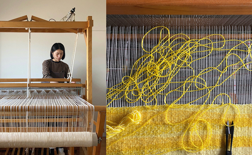
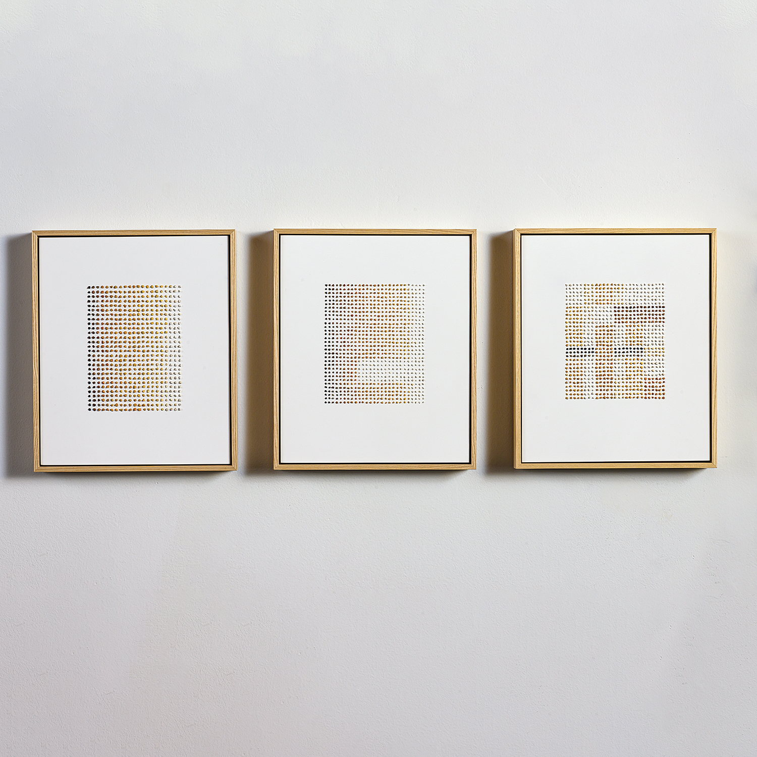
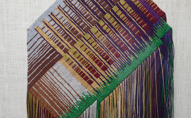
“I am born and raised in the Northeast,” says Polly Barton, “trained to weave in Japan, and have lived most of my life in the American Southwest. These disparate places find connection in the woven fabric that is my art, the internal reflections of landscape.” In works like Continuum i, ii, iii, Barton uses woven ikat as her “paintbrush,” to study native Southwestern sandstone. Nature’s shifting elements etched into the stone’s layered fascia reveal the bands of time. “Likewise, in threads dyed and woven, my essence is set in stone.”
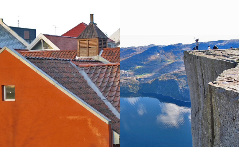
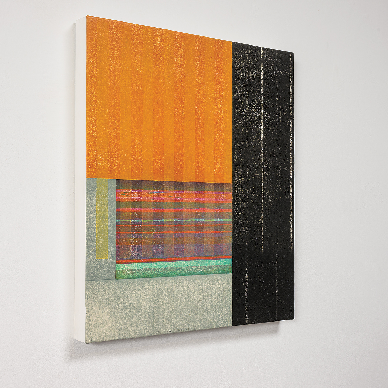
For Paul Furneaux, geographic influences are varied, including time spent in Mexico, at Norwegian fjords and then, Japan, where he studied Japanese woodblock, Mokuhanga “After a workshop in Tokyo,” he writes, “I found myself in a beautful hidden-away park that I had found when I first studied there, soft cherry blossom interspersed with brutal modern architecture. When I returned to Scotland, I had forms made for me in tulip wood that I sealed and painted white. I spaced them on the wall, trying to recapture the moment. The forms say something about the architecture of those buildings but also imbue the soft sensual beauty of the trees, the park, the blossom, the soft evening light touching the sides of the harsh glass and concrete blocks.”