Still firmly in the start of the year, New Year’s resolutions not abandoned yet, it’s an ideal time to explore the design trends that will define the aesthetic landscape of 2024. From color palettes to furniture styles, this year’s design pundits predict an array of options for transforming your living spaces into stylish and on-trend havens. Art can be an essential part of that transformation. Here are some of the 2024 insights we’ve compiled:
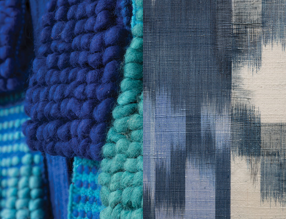
Color: the eternal appeal of blue
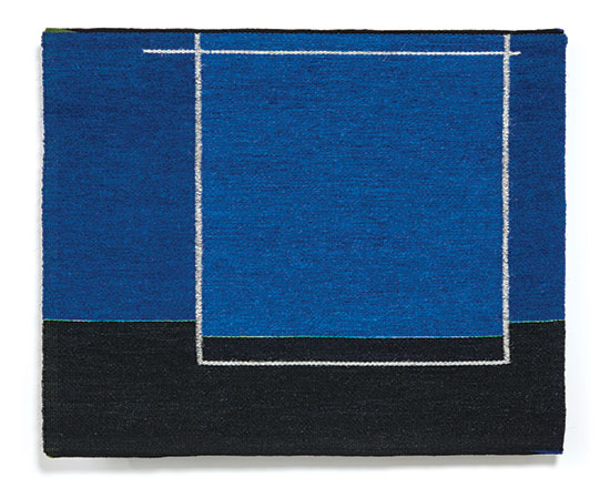
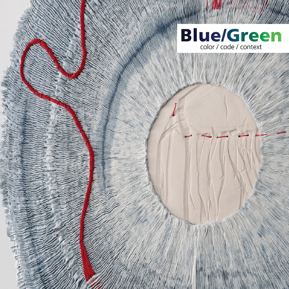
“One trend in particular is emerging as clear as the sky is blue,” says The Spruce, an interior design blog(“The 2024 Colors of the Year Point to One Trend You Need to Know,” Megan McCarty, November 7, 2023). Each fall, paint brands unveil their colors of the year, and for 2024, many of them declared shades of blue as the color to consider, including Skipping Stones by Dunn-Edwards, Blue Nova 825 by Benjamin Moore, Renew Blue by Valspar, Thermal by C@ Paints, Bay Blue by Minwax, and Bluebird by Krylon. Blue, as any of you who followed our 2018 exhibition Blue/Green: color, code, context know, is elemental…sky and sea, infinite in hue, tone, intensity and variation…indigo, azure, sapphire, ultramarine. As metaphor, it connotes integrity, tranquilty. It’s no wonder that it never really falls out of favor. The designers interviewed by The Spruce gave a number of reasons for including the color in one’s space. It’s calming and relaxing, subtle and subdued, and has a connection to nature. The Spruce quotes Chelse Thowe, the lead designer of Forge & Bow, sees a common thread in the paint brands’ colors of the year: each is reminiscent of clear skies and calm waters. “Blue is trending because it connects us with nature and feels rejuvenating,” Thowe says. “It brings a sense of stillness and creates a sanctuary from our busy lives.”
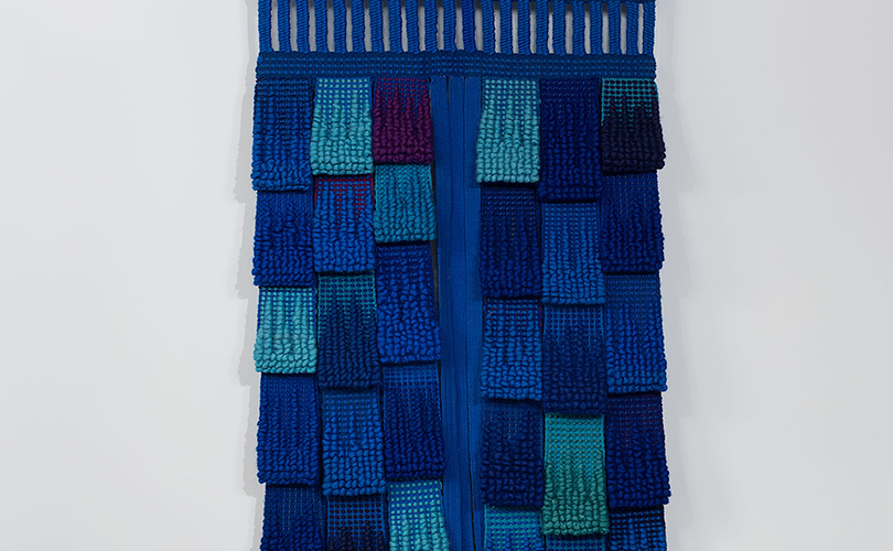
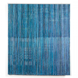
Many artists who work with browngrotta arts use indigo and other shades of blue to evince natural themes. In Totem aux Millefleurs Bleues, Micheline Beauchemin chose blue, turquoise and green to create a calm atmosphere of forest and leaves. “…[T]he color, though dark,” she said, “will be brilliant and beautiful.” Still others, choose it for its metaphorical power.
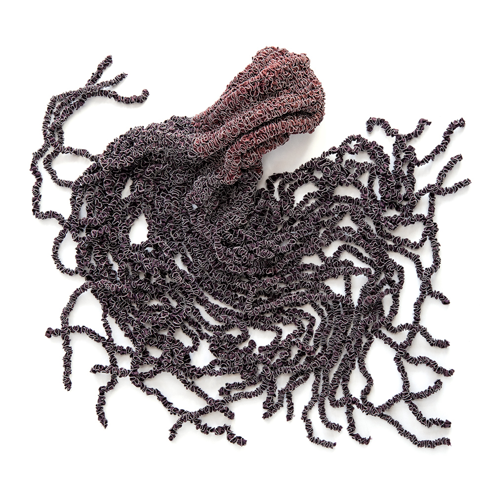
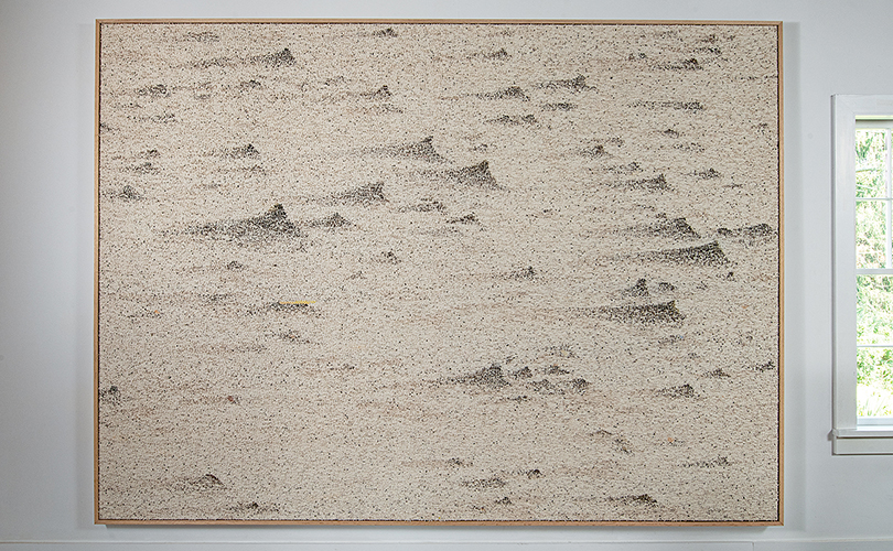
Rachel Max’s work, Continuum, explores the artist’s ambivalence about blue. “It is cold yet often warm and comforting. It is a color of depth and distance, of darkness and light and dawn and dusk.” Blue is linked closely to the sea and sky, and Max says, like our lives, she says, they seem infinite yet each has a beginning and an end. Continuum is like a Mobius strip, illustrating the contrasts and opposites, the finite and infinite.
Biophilic Design/Return to Nature
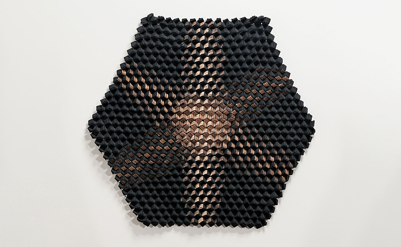
Interior designers predict that homeowners will seek to create calming and harmonious environments in the coming year. Biophilic design, with its emphasis on incorporating natural elements into interiors, will continue to flourish, bringing the outdoors inside through the use of plants, natural materials, and organic textures, says ZDS, (“Exploring the biggest interior design trends 2024“). This trend is one also predicted to have a parallel in the art world. Artsy interviewed 15 curators on defining art themes for 2024 (“15 Leading Curators Predict the Defining Art Trends of 2024,” Artsy, Maxwell Rabb, January 12, 2024), including Amy Smith-Stewart, Chief Curator, at The Aldrich Contemporary Art Museum, Ridgefield, Connecticut. Materials and methods carry meaning, Smith-Stewart told Artsy, “I predict we will see more artists incorporating organic materials or materials collected, grown, and harvested from the natural world into their work,” she said. Artists will seek to comment and address legacies of colonization, she predicts, as well as on issues of environmental justice and land use.
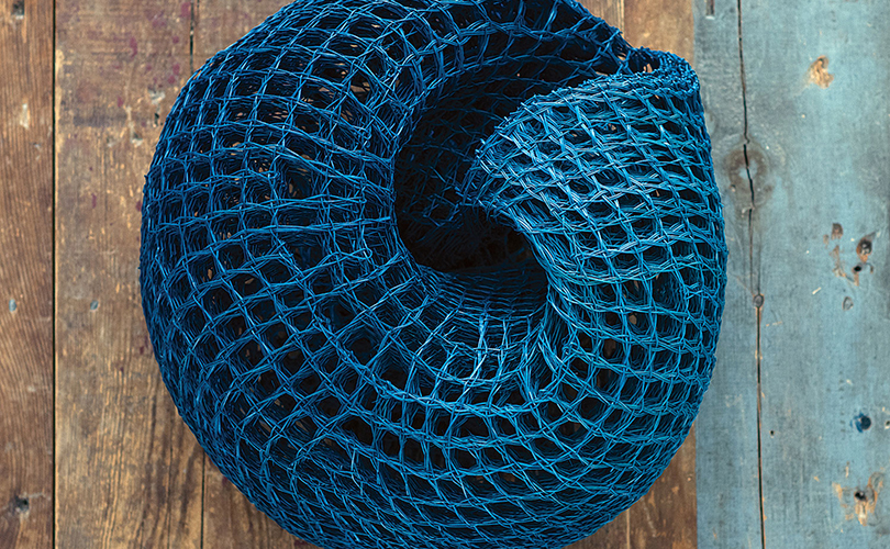
At browngrotta, James Bassler’s use of agave in Things Past is part of a project to use the plant waste created by the making of tequila. Bassler’s friend, the artist Trine Ellitsgaard, organized an exhibition of works made from agave. She has worked with artisans in Oaxaca, Mexico to create fibers and spun thread from agave waste to spin into rugs and bags and art.
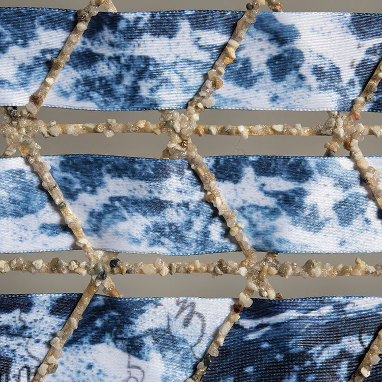
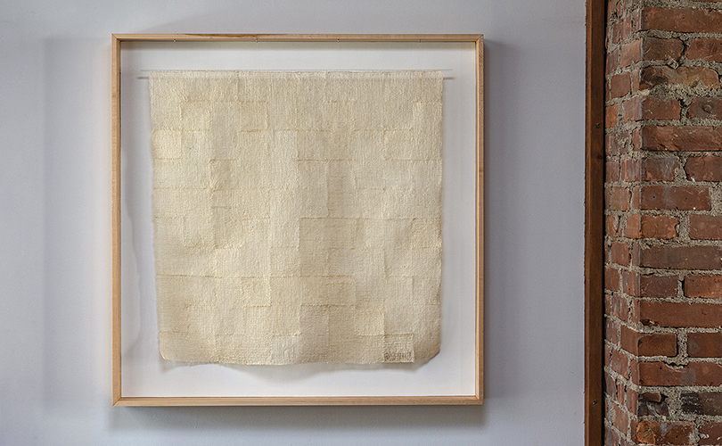
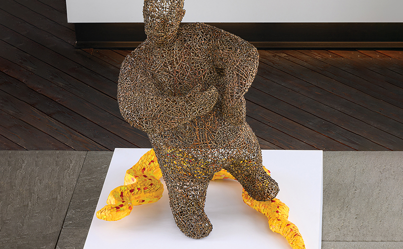
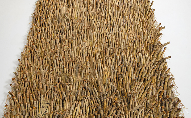
In Reserve, Ane Henriksen used material covered with oil spots, found washed up on the west coast of Denmark. Fishermen use the material on the tables in the galley, so the plates don’t slide off when on the high seas. The work highlights ecological peril. “Nature is threatened,” Henriksen says. “I hope this is expressed in my image, which at first glance can be seen as a peaceful, recognizable view of nature, but when you move closer and see the material, it might make you uneasy, and stir thoughts of how human activity is a threat against nature.” John McQueen has created provocative sculptures from twigs, branches and bark for many years. More recently, he has begun to add recycled plastics to highlight humans’ tenuous connection to nature. He illustrates this conflicted relationship in Arm & Hammer with a man stepping precariously on a snake made from recycled plastic bottles of detergent.
Celebrating the 70s and Icons
Each year, 1stDibs, the e-commerce interior design and fine art marketplace, aims to quantify subtle shifts in designers’ taste with its Designer Survey (“The 1stDibs Guide to 2024 Interior Design Trends,” Introspective, Cara Greenberg, December 19, 2023). This year’s survey drew responses from more than 600 industry professionals. The results report what excites designers at this point in time, “what they’ve had quite enough of and what they anticipate sourcing to conjure sublime living spaces in the months to come.” 1st Dibs reports a fresh enthusiasm for the 1970s, which 27 percent of designers in the US and 29 percent in the UK cited as the era they’ll draw upon for inspiration in 2024. “[E]expect to see an updated version of 1970: “a curated, earth-toned Laurel Canyon look, if you will — organic, relaxed, and comforting.” The survey also found that iconic design has lasting power. “Iconic designs are revered for a reason. Their forms are so pure, their function so unimpeachable that their lasting popularity should come as no surprise.”
We find the same purity in works from the 1970s by the icons of art textiles. Abbot’s Mantle made in 1971 by Glen Kaufman, reflects the experience in rug making and design that he gained at the Cranbrook Academy of Art, during a Fulbright in Scandinavia, and while working at Dorothy Liebes’ New York Design Studio.
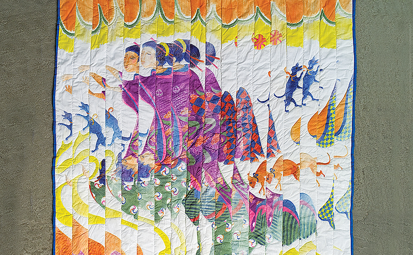
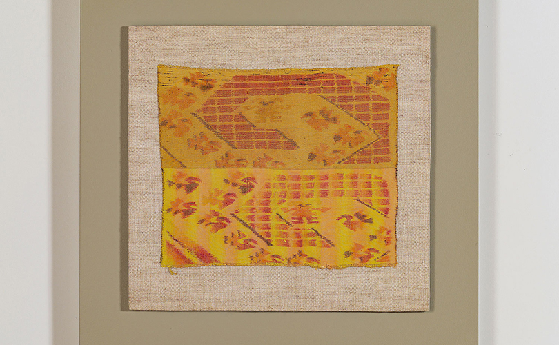
Puzzle of the Floating World (1976), by Katherine Westphal, who authored The Surface Designer’s Art: Contemporary, Fabric, Printers, Painters and Dyers (Lark Books,1993, Asheville, NC) contemporizes quilting.
Sherri Smith’s Linde Star is an imaginative stitched-and-plaited work, that was included in the seminal 1970s book, Beyond Weaving: the art fabric. Ritzi Jacobi, who was also featured in Beyond Weaving,
was known her heavily textured works, like Exotica Series made with Peter Jacobi in 1975, in which the couple used unusual materials such as sisal, coconut fibers, and goat hair.
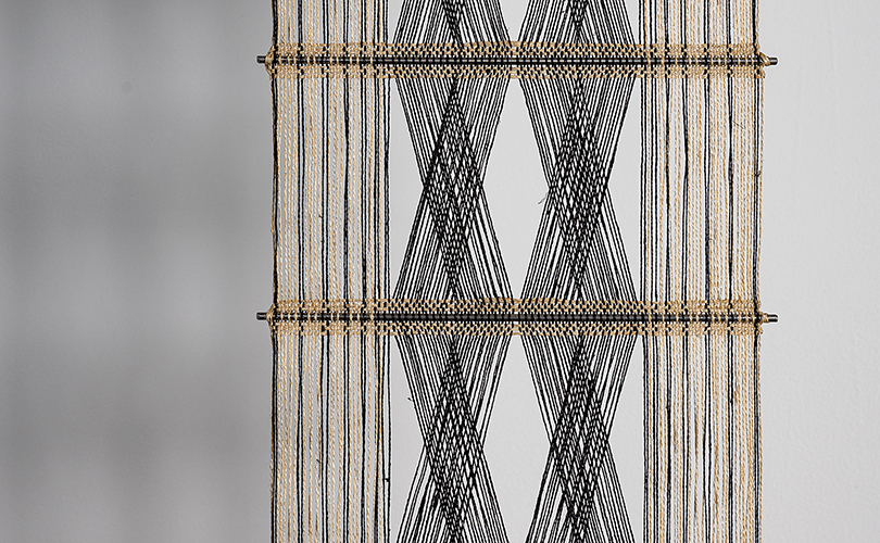
In Peruvian Tapestry (1972), Ed Rossbach, an influential artist, author, and teacher, continued his experiments re-envisioning traditional techniques. Peter Collingwood, knighted by the Queen of England, developed a practice that he called shaft switching to create complex and elegant works.
Conclusion:
The design and art trends of 2024 suggest ways to create spaces that are not only visually appealing but also deeply reflective of your personality and lifestyle. We are happy to help you source works from browngrotta arts to enable that process.
 Color Institute, Eiseman is the director of the Eiseman Center for Color Information and Training. She is the author of 10 books on color, including Color: Messages and Meanings a Pantone®