
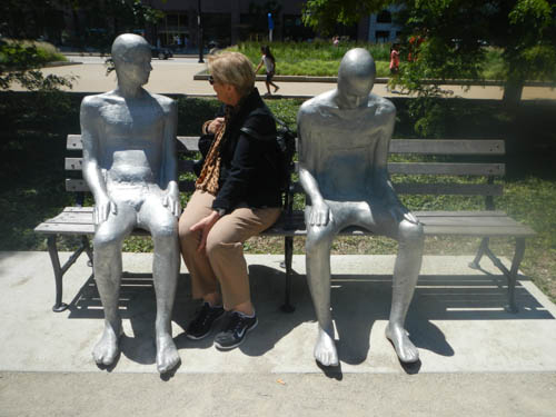
Sculptures by Steinunn Thórarinsdóttir of Iceland in Grant Park, photo by Tom Grotta
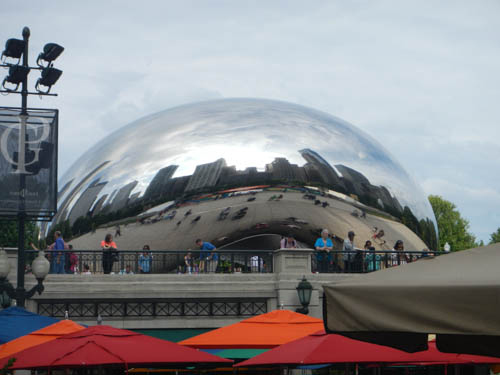
Chicago is a terrific town for walking. There is public sculpture everywhere of the most enjoyable kind — kids play on it; adults revel in it and the perspective alters as your vantage point changes.
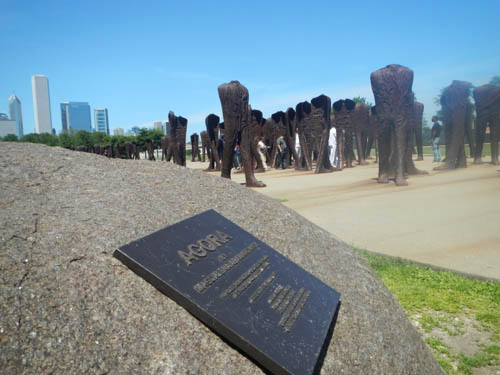
Agora by Magdalena Abakanowicz in Grant Park, photo by Tom Grotta
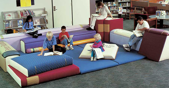
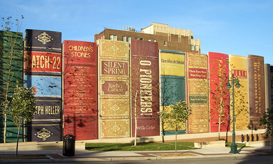
There are great galleries and museums and entertaining finds around every corner. There are bars and restaurants aplenty — on the river, with patios, with views and truly exceptional food.
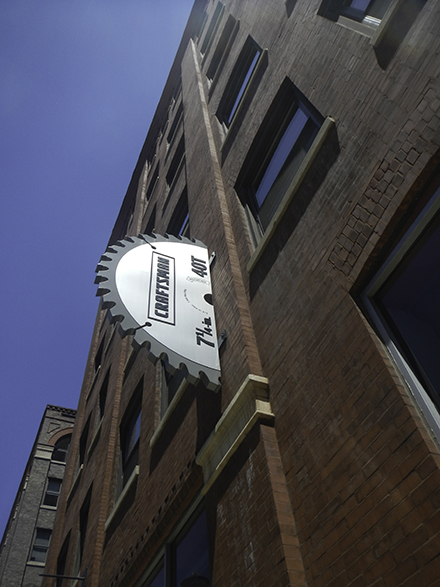
Imaginative Signage, Photo by Tom Grotta
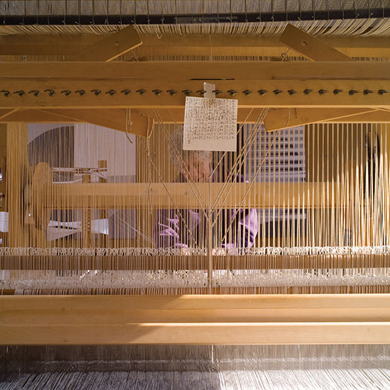
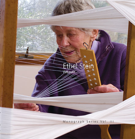
We were there for the opening of Ethel Stein: Master Weaver at the Art Institute of Chicago (through November 9, 2014). The weather was ideal, we wandered for hours and found much to amuse and admire, as you can see.
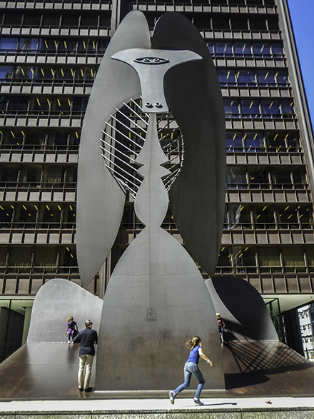
Untitled Sculpture by Pablo Picasso in Daley Plaza, Photo by Tom grotta
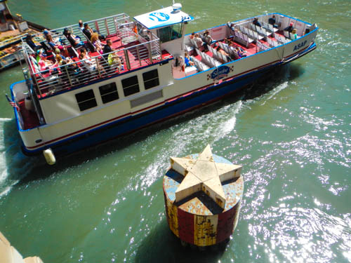
River View, photo by tom grotta

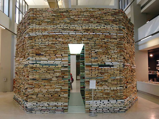
Art House, photo by tom grotta
Cloud Park by Anish Kapoor. Millennium Park, Photo by Tom Grotta
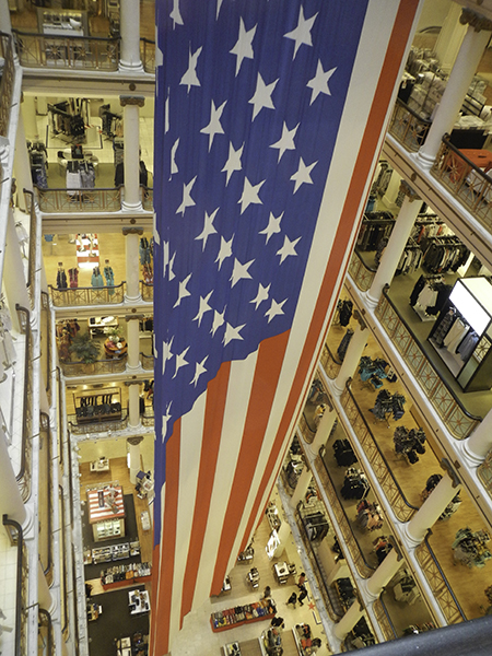
Lobby, Macy’s Flagship, Photo by Tom Grotta


Some Observations: On Light and Air
Recently I visited the Los Angeles County Museum of Art specifically to spend time immersed in the imagination of James Turrell whose retrospective covers fifty years of work exploring light, sky, perception, color, shape and architecture. http://www.lacma.org/art/exhibition/james-turrell-retrospective. The meditative quality of this exhibition encourages the viewer to be a considered observer and allow what they see and perceive to be altered by their physical experience with the work. Ultimately the transformative and ephemeral qualities of light exist in the mind of each person. The artist gives us the opportunity to bathe our senses in illusion and reflection.
The next day on a non-stop eastbound flight traveling in the morning from Los Angeles to Boston I was seated on the north side of the airplane and could view the magnificent snow covered Rocky Mountains below rising from the earth with the suggestion of a world without grief.
photo by Wendy Wahl
In the minutes that followed I found myself focused on the carbon footprint that air travel leaves and thinking about the best way to balance my personal footprint. Knowing for the moment “I am where I am” my gaze returned to the framed light as we swiftly moved above the fruited plains. I watched until somewhere over the Great Lakes the image through the oval-edged window changed into another remarkable illuminated landscape.
photo by Wendy Wahl
As a commercial airline passenger for over four decades I have encountered a wide range of situations and had experiences that touch on almost every imaginable emotion. Each flight has a unique dimension heightened by the sounds, sights, smells and physical proximity of the other passengers in a tightly enclosed space. The curious activity of moving at fast speeds from one environment to another, around and about what has become a very small sphere in a short period of time, stimulates thought about place, perception and the possibility of portals. Having flown on Pan Am, Continental, Delta, American Airlines, United Airlines, Laker Airways, Peoples Express, Southwest, British Airways, Hawaiian Air, TWA, Qantas, Virgin Australia, Aero Mexico, China Air, Alitalia, Air India, Lufthansa, Air France, JetBlue and a number of puddle jumpers – I’m feeling that of all these, Virgin America has created an illusion of a different sort for air travelers through the use of color and light.
Wendy Wahl
March 2014