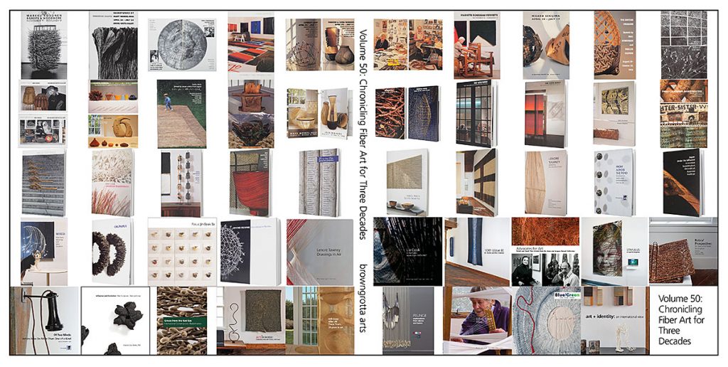
New Date: September 12 to 20, 2020: Volume 50: Chronicling Fiber for Three Decades
Optimistic as we are about June — when we’d tentatively rescheduled our Spring exhibition — as being the time when we’ll have passed the illness apex and be able to go out and about once more, we’ve decided a new date in September makes more sense. We’re afraid that masks and gloves and disinfectant will still be de rigeur in June and they will impact viewers experience of the art. Air travel restrictions may still be be in place, which means fewer artists in attendance and and fewer out-of-town visitors.
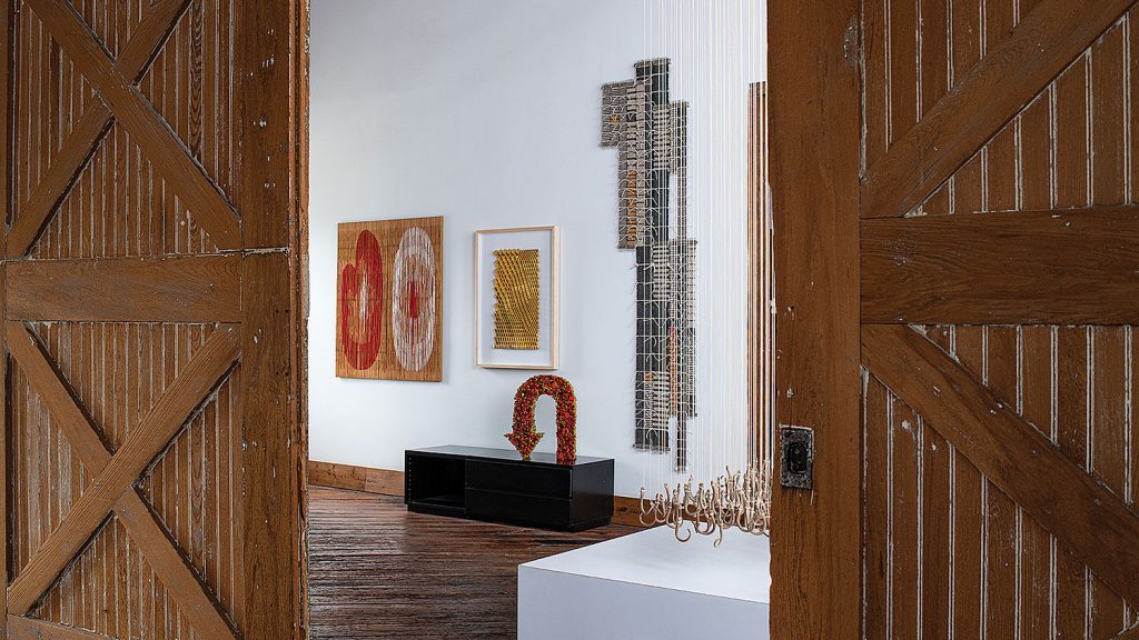
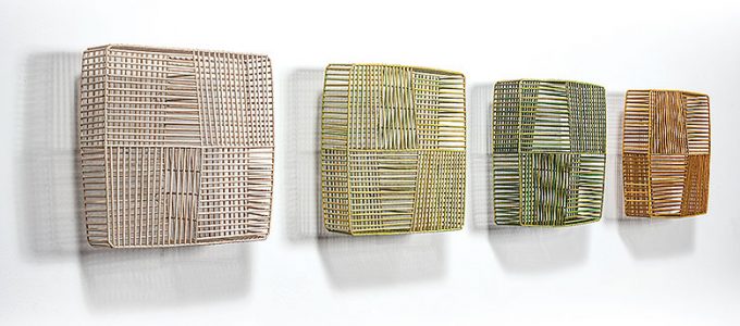
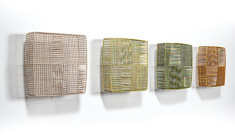
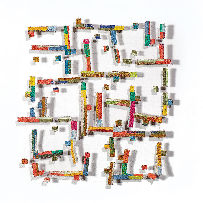
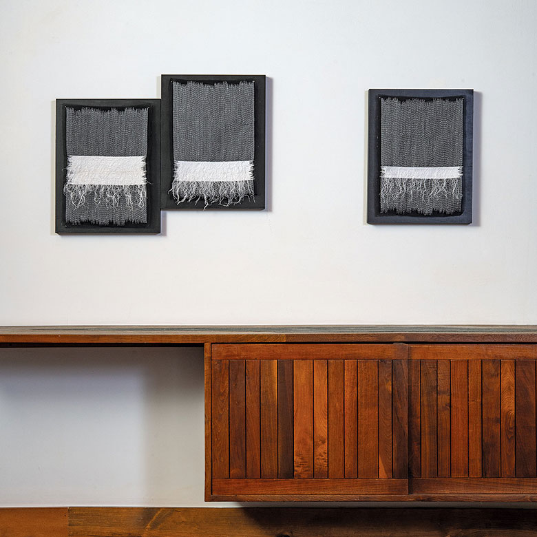
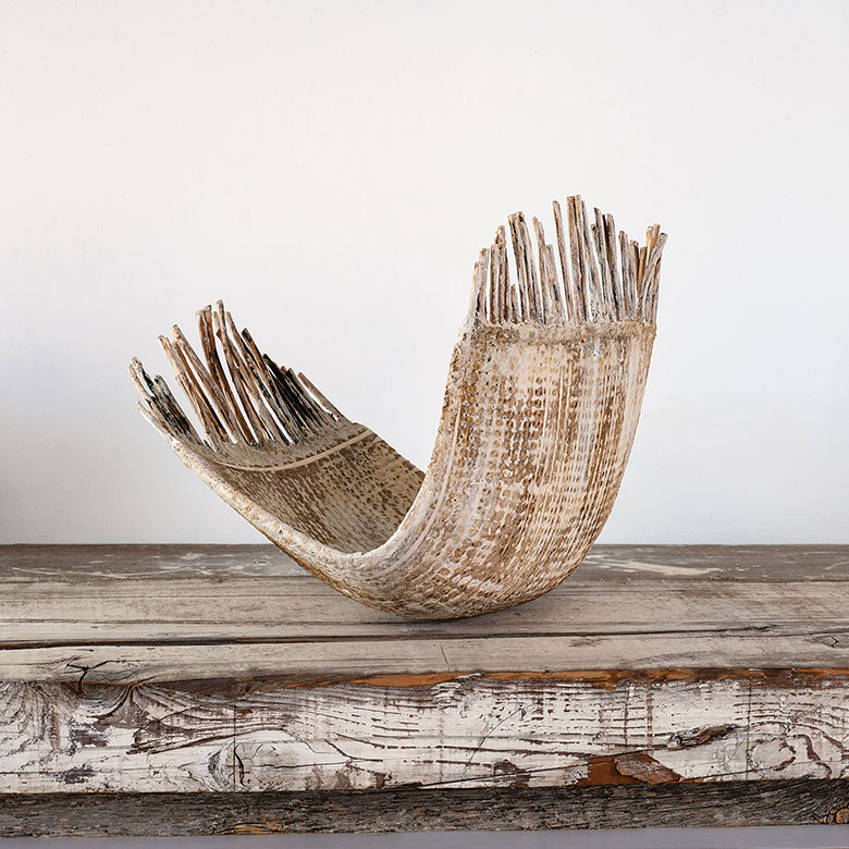
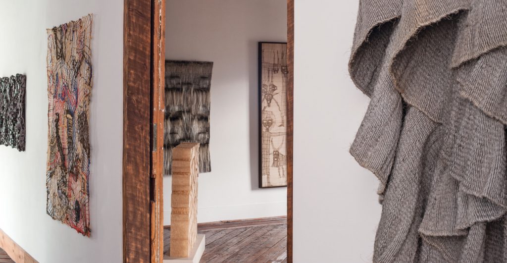
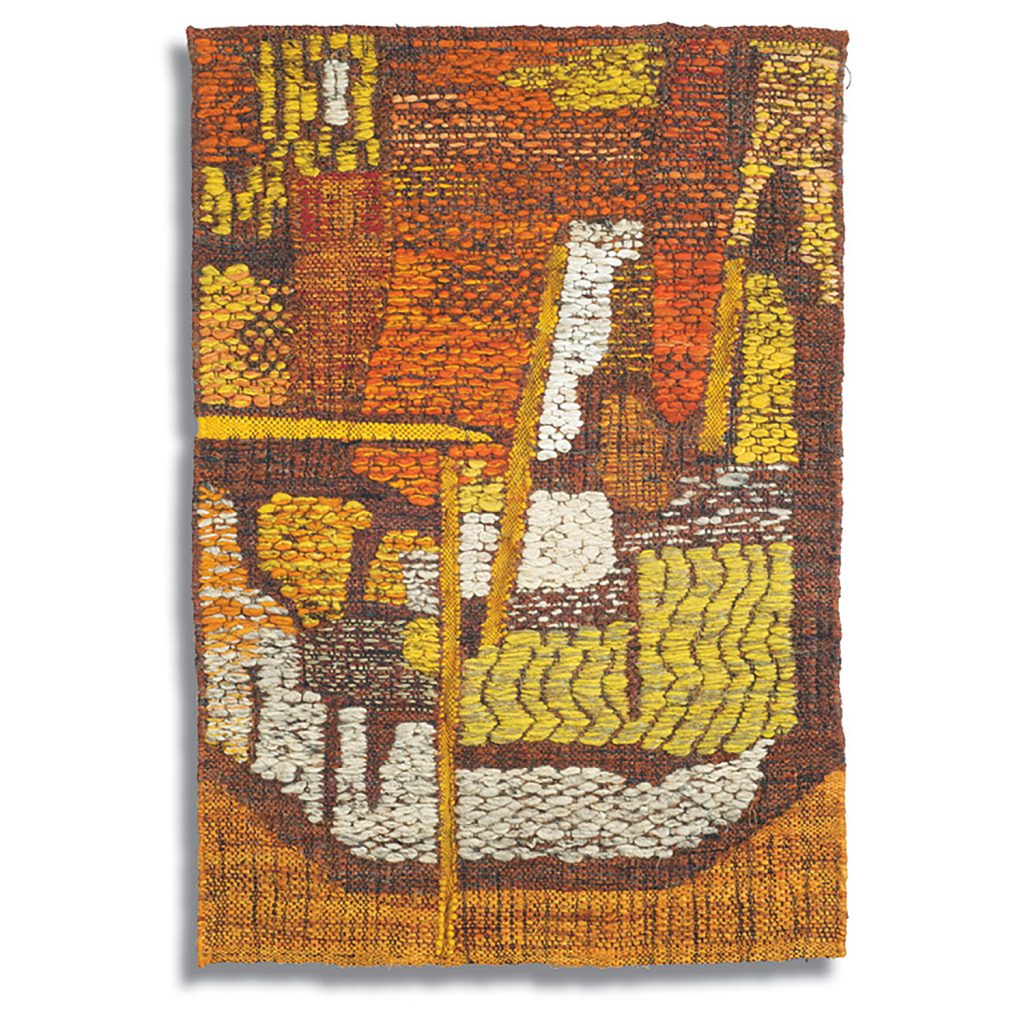
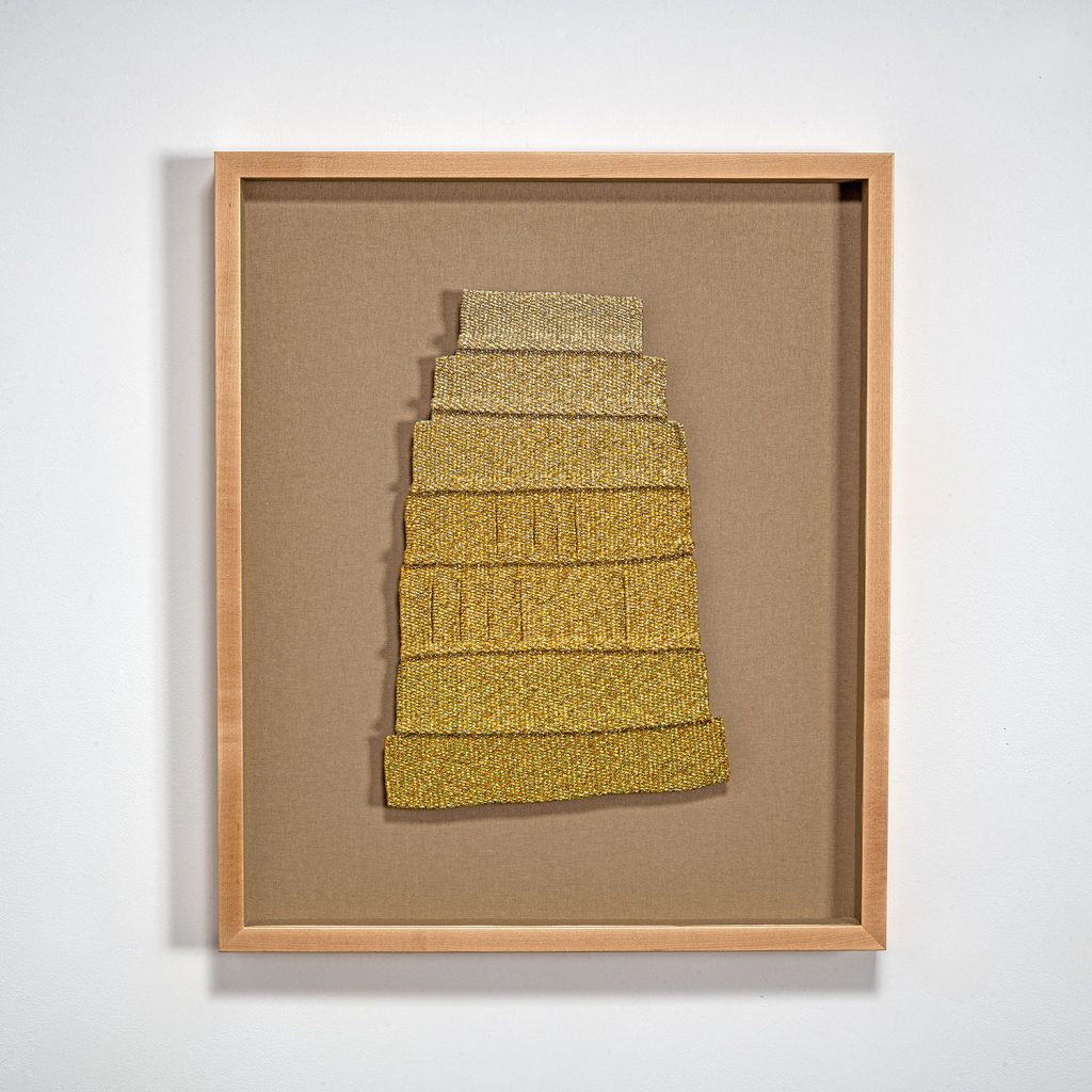
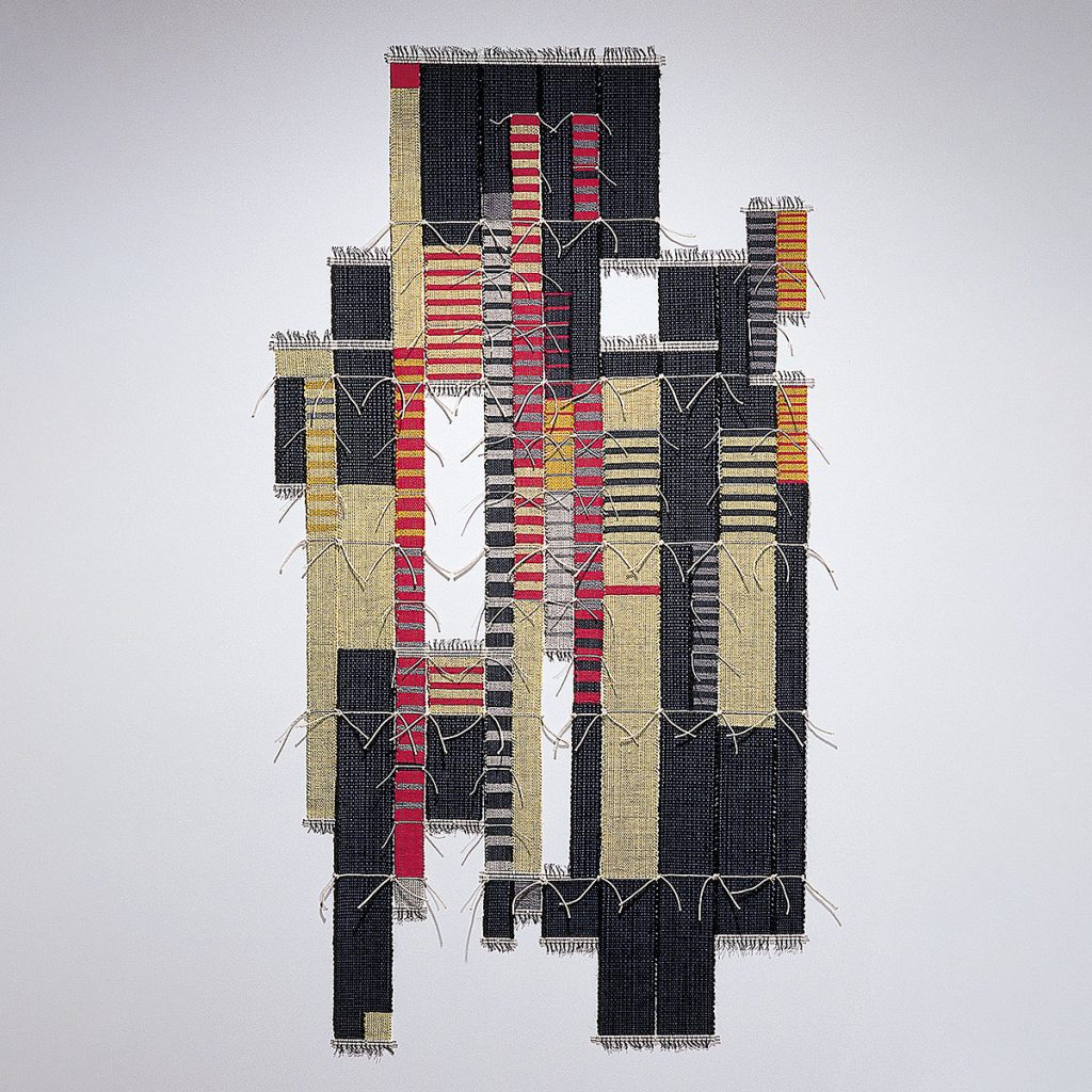
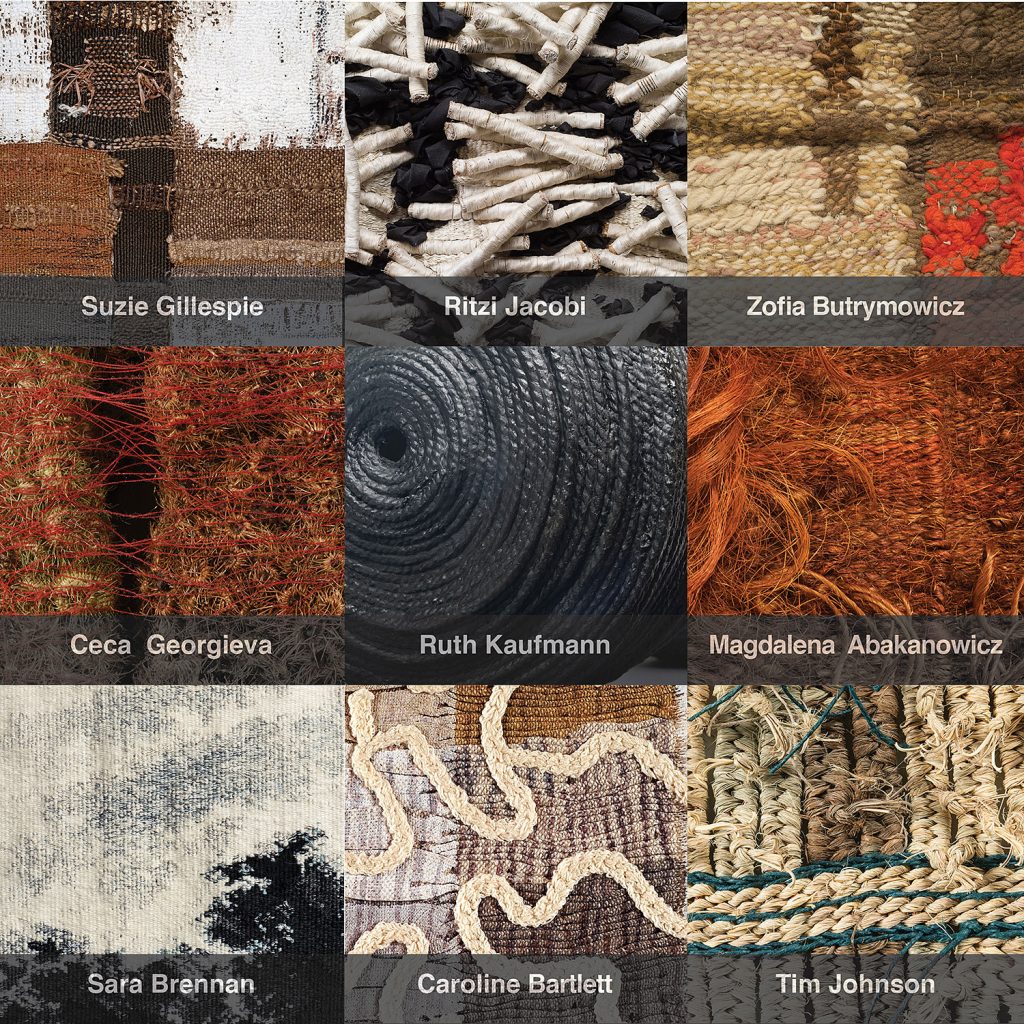
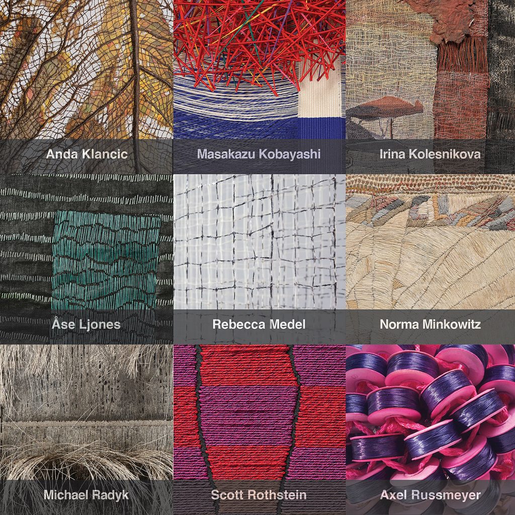
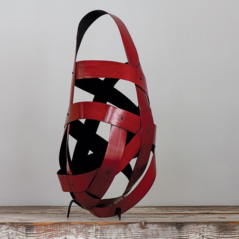
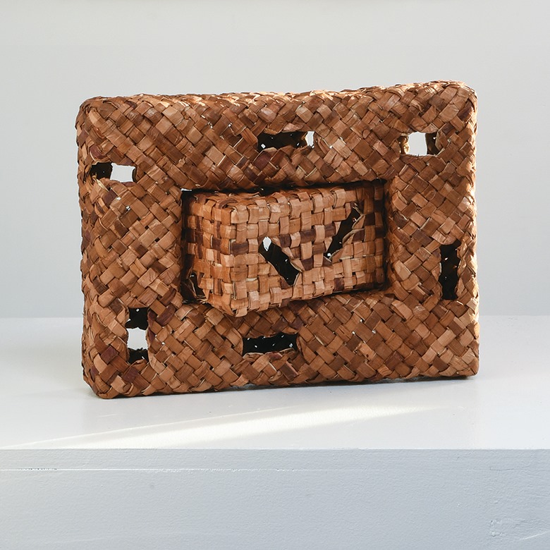
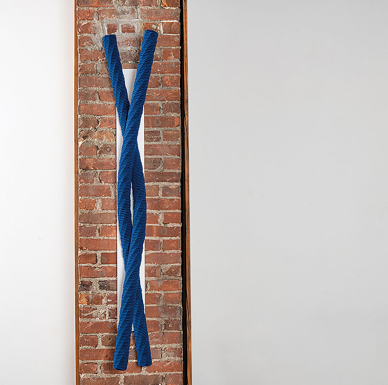
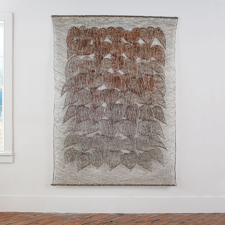
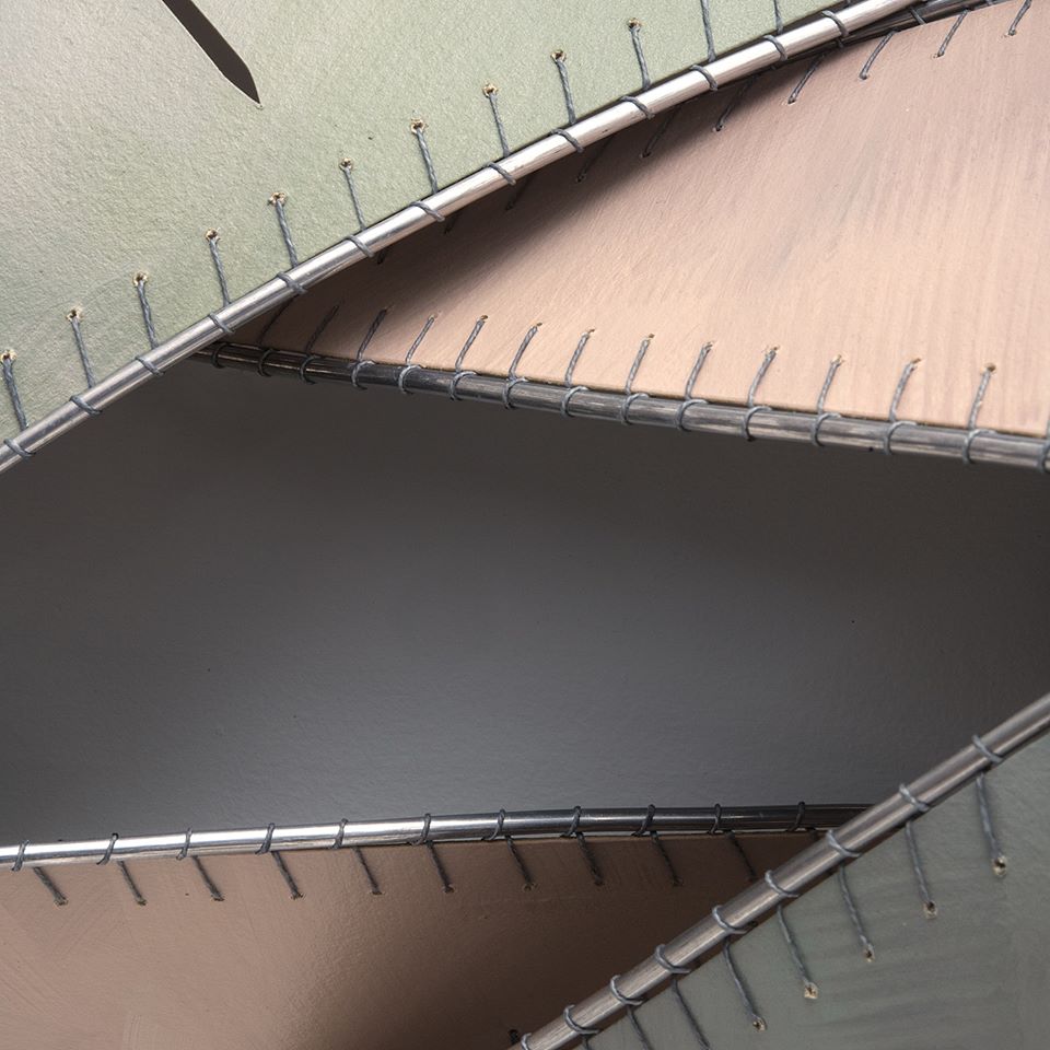
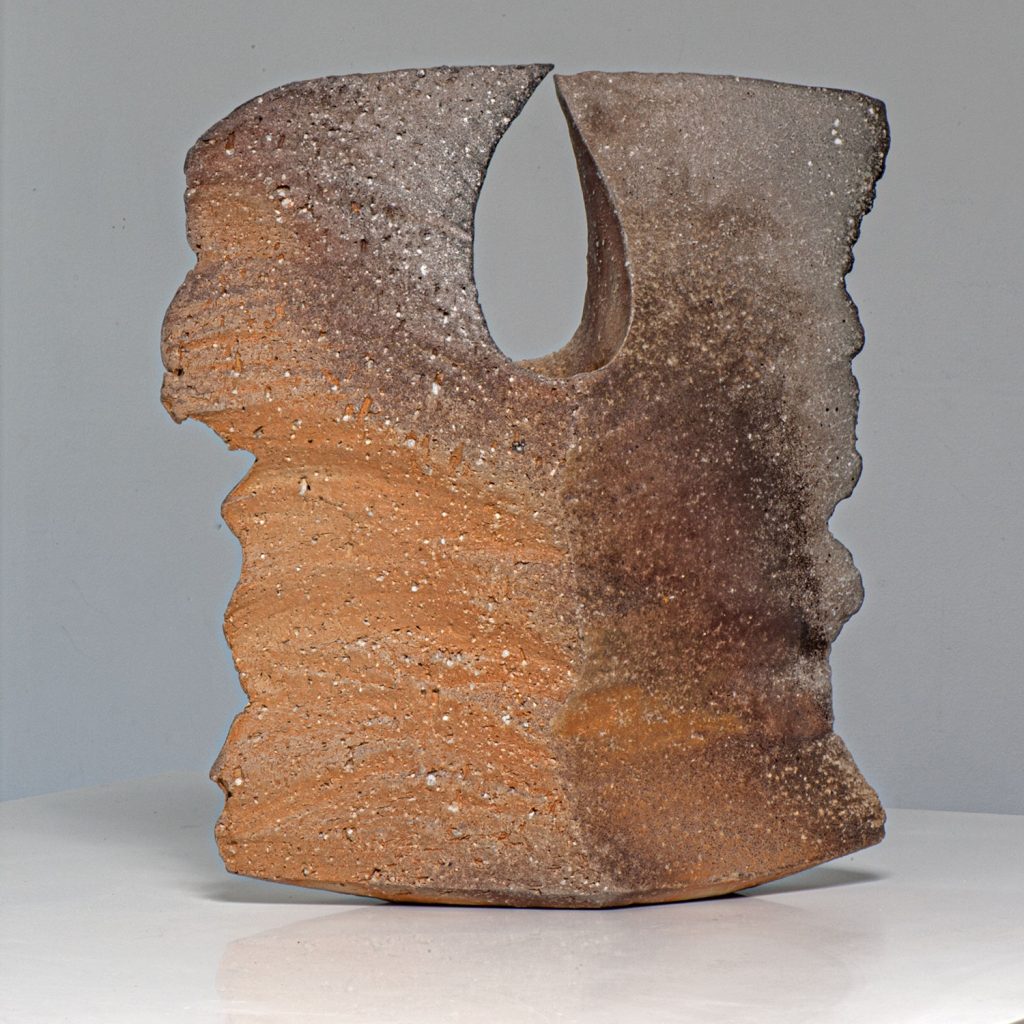
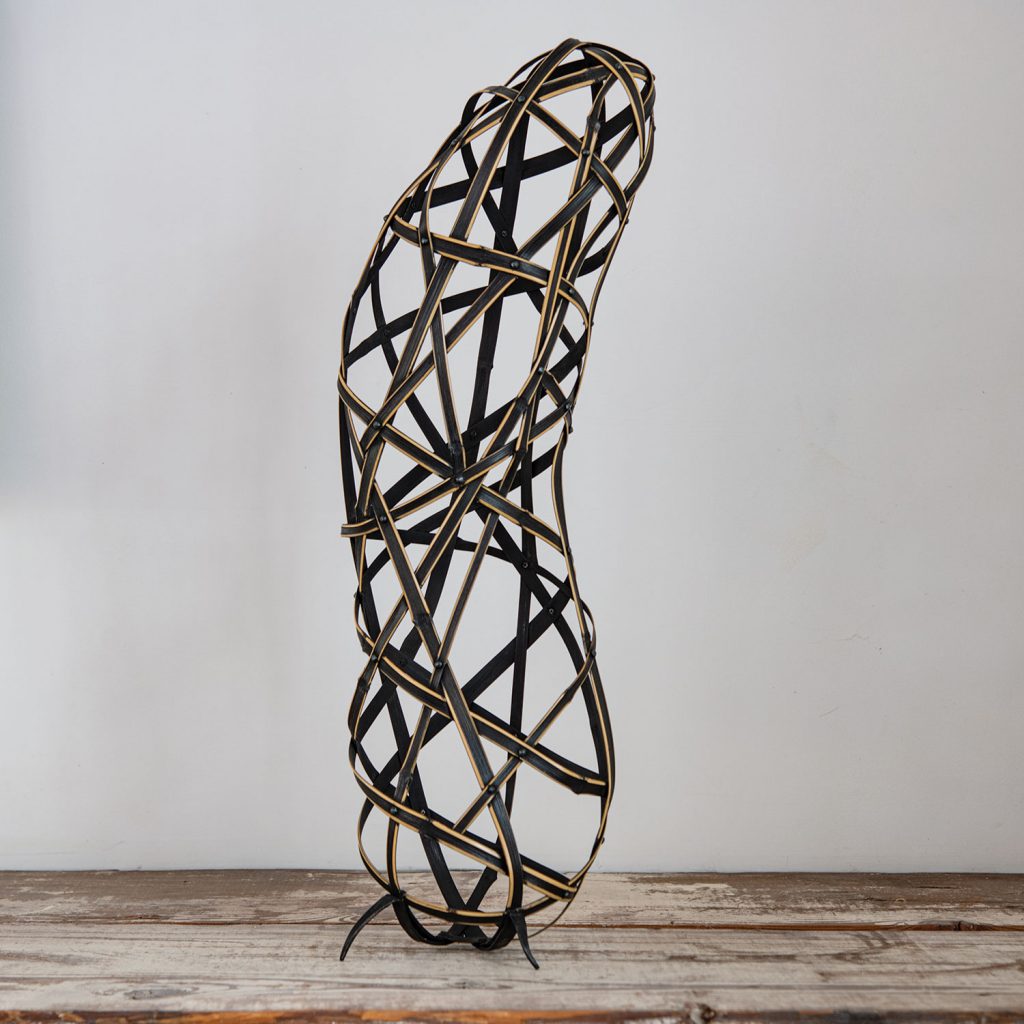
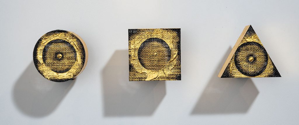
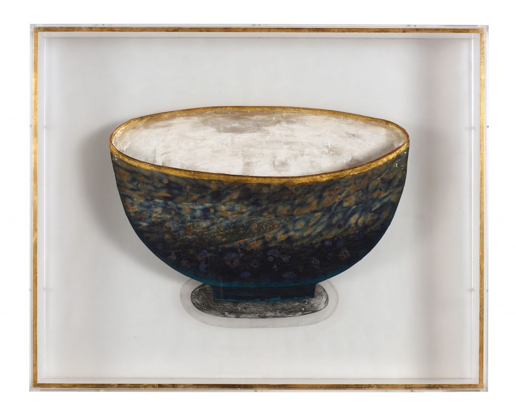
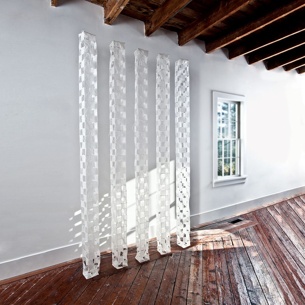
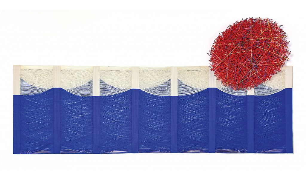
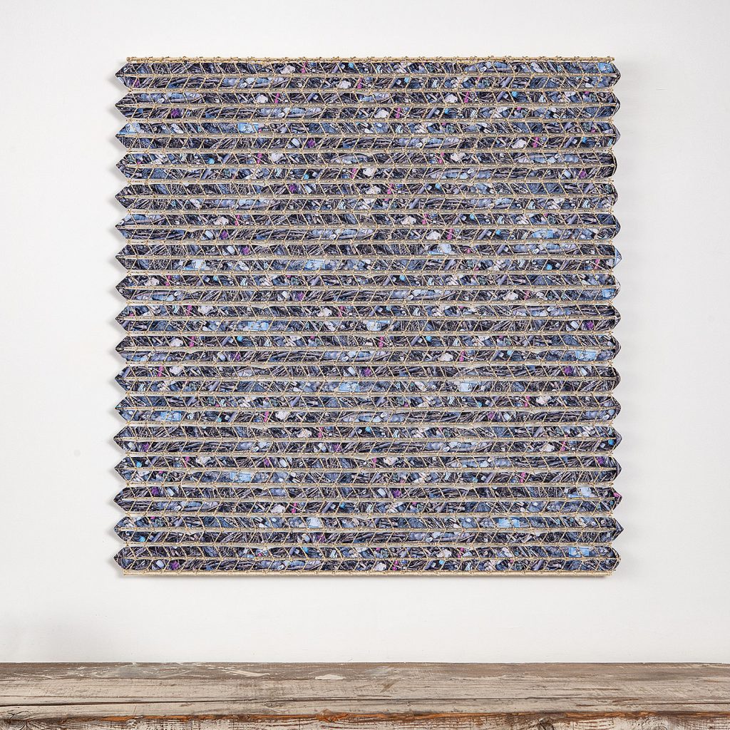
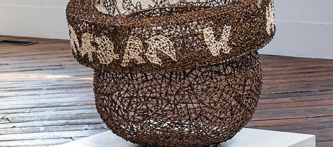
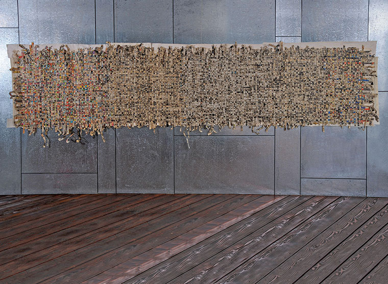
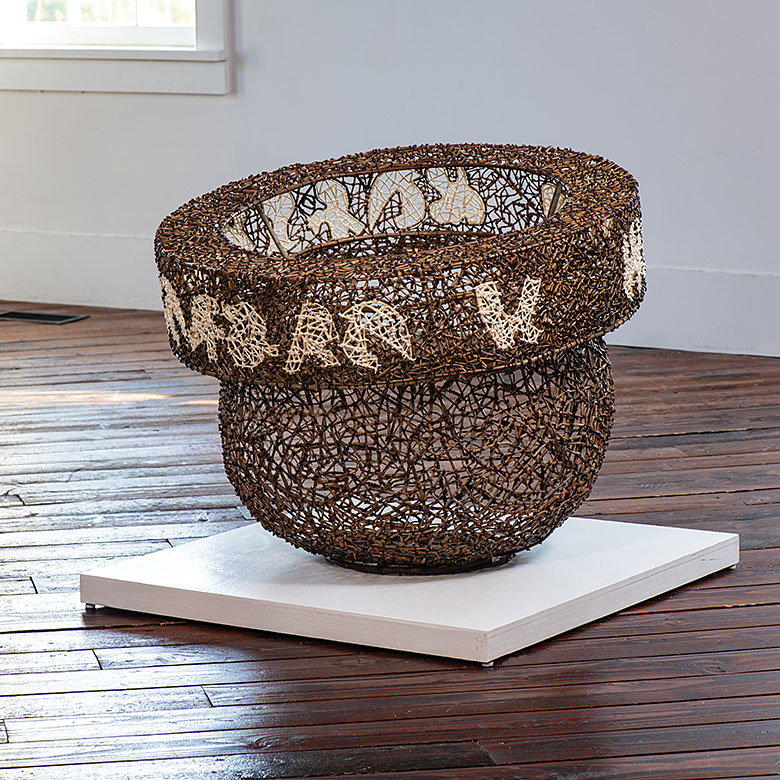
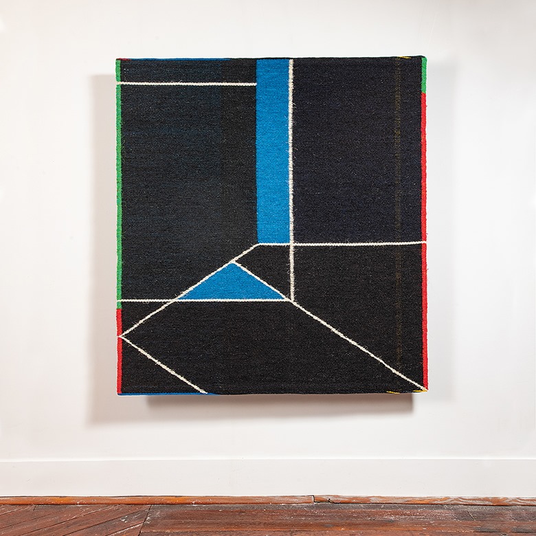
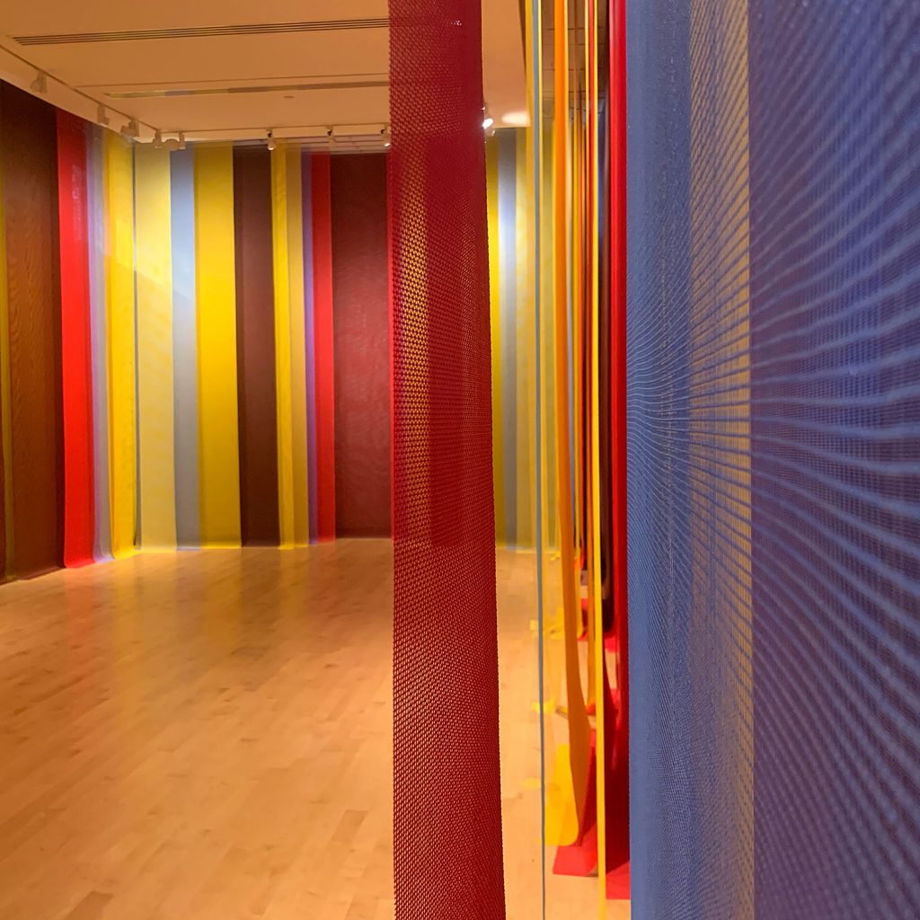
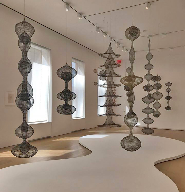
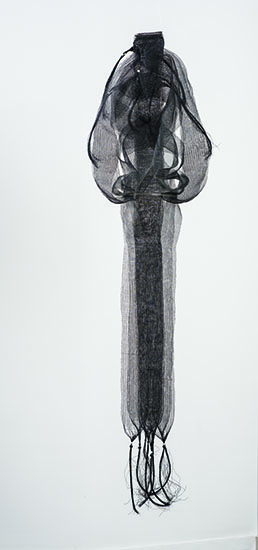
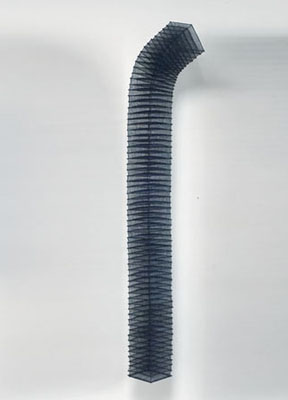
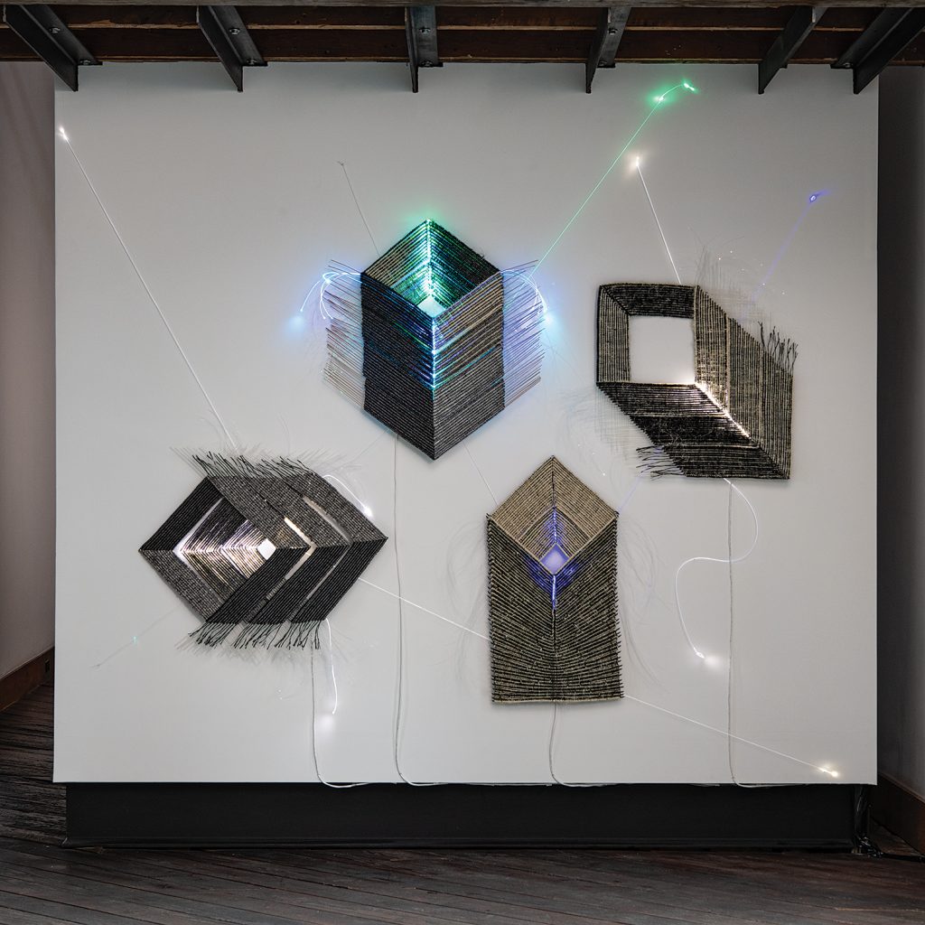
An exciting exhibition: Both impacts would be unfair as Volume 50: Chronicling Fiber for Three Decades has shaped up to be an exciting show. It features significant works by Lia Cook, Gyöngy Laky, Aleksandra Stoyanov and Grethe Sørenson. Works by well-known but new-to-the-gallery artist, James Bassler, are included in addition to striking installations by Annette Bellamy and Agneta Hobin and new approaches by Tim Johnson, Kari Lønning, Carolina Yrarrazával and Dail Behennah. Strong works by Chiyoko Tanaka, Neha Puri Dhir and Adela Akers are among other offerings from the more than 60 artists participating.
So, in 2020, our Spring show will become a Fall show. The Artist Reception and Opening will be onSaturday, September 12th. We’ll welcome you all then with whatever precautions are appropriate.
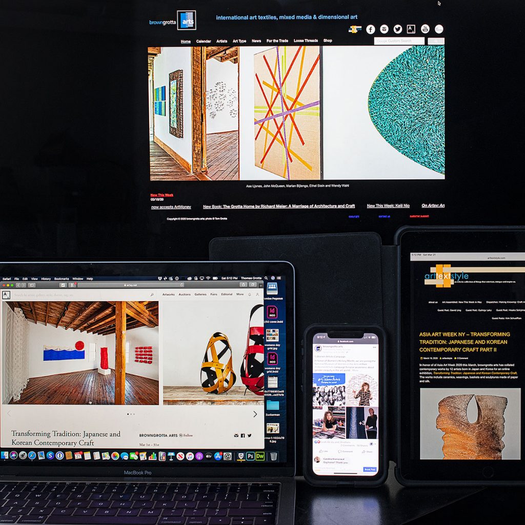
In the meantime, online: As a run up to September, we’ll be presenting a series of online exhibitions on Artsy highlighting artists and catalogs from our archives:
May 11th: Catalog Look back: California Dreaming Vols. 26, 20, 6 and more
June 8th: Catalog Look back: Cross Currents – Arts Influenced by Rivers and the Sea Vols. 38, 35 and more
July 13th: Catalog Look back: Fan Favorites — Sekimachi, Sekijima, Laky and Merkel-Hess,Vols. 24, 19, 2, 3, 8, 5, 15, 16, 19 and more
August 10th: Catalog Look back: Cataloging the Canon – Tawney, Stein, Cook, Hicks and So Monographs: 1-3; Focus: 1, Vols. 13, 28
Until then, we’ll keep posting content on arttextstyle and our Facebook, Instagram and Twitter pages.
Stay safe and well! We’ll see you in in person in September and online between now and then.