Category: Eco-Art

art on paper preview: Chris Drury’s Double Echo

Double Echo Chris Drury Inkjet print with UV coating 54.25" x 46.25" x 2.75", 2007 Edition 2/4 Echogram/ Echocardioagram (edition of 4)

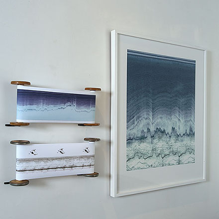
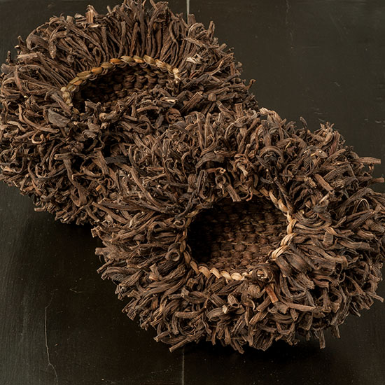
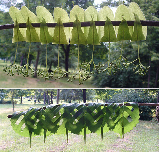
Double Echo, Chris Drury, Inkjet print with UV coating, 54.25″ x 46.25″ x 2.75″, 2007, Echogram, Echocardiogram, (edition of 4). Photo by Tom Grotta

We are heading to New York City tomorrow to set up for art on paper at Pier 36. Among the works we’ll be exhibiting is Chris Drury’s Double Echo, an inkjet print that merges a human echocardiogram and and echogram of Antartica, accompanied by the actual echocardiogram and the echogram on wooden spools. In 2006 and 2007, Drury spent more than two months with the British Antarctic Survey in Antarctica as artist-in-residence. The scientists there were looking at what they stood upon but could not see – the structure of the ice and underlying land formation. In parts of Antarctica the ice is four kilometers deep 900,000 years old – as old as our earliest ancestors. One of the scientists, Hugh Corr, described the remarkable images that result as like a “heartbeat of the Earth.” The fragment of an echogram in Double Echo is from Flight W34 over East Antarctica – a long cross-section of the ice beneath the flight, made by radar pulses sent down though the ice and back up into a computer in the aircraft. The echocardiogram is of the pilot’s heartbeat, superimposed over the top. An echocardiogram is very similar in technology to an echogram although it uses ultrasound rather than radar.

DSC_6185

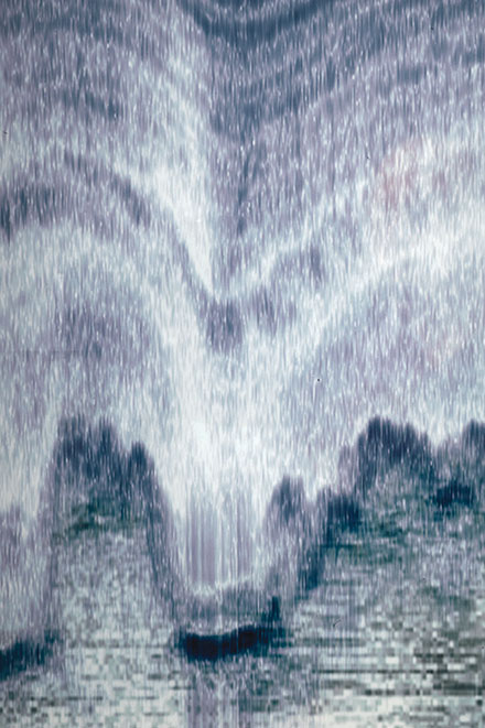
Double Echo, Chris Drury, Detail, Photo by Tom Grotta

For some time, Drury has been looking at systems in the body and on the planet, particularly systems of blood flow in the heart. He was invited by the heart surgeon, Mark Dancy, to make a blood flow courtyard (Echoes of the Heart) at Central Middlesex Hospital, adjoining the Cardiac ward. It was Dancy’s department that agreed to do an echocardiogram on the pilot who flew those echogram flights in Antarctica and so enabled Drury to make the work Double Echo. A print from that series hangs on the walls of that particular ward. The hours of the exhibition are Friday, March 4th and Saturday, March 5th, 11 – 7 p.m.; Sunday, March 6th, 12 – 6 p.m. There is a Preview, benefiting the Brooklyn Museum, Thursday, March 3rd, from 6 – 10 p.m. For ticket and other information visit: http://thepaperfair.com/ny/for-visitors/fair-dates-hours-location/.


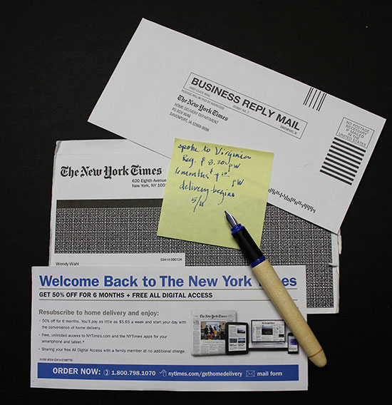
It’s Never Too Early: How to Buy Art in Your 20s

Lizzie Farey, Deborah Valoma and Stéphanie Jacques

Lizzie Farey($1,800), Deborah Valoma($1,700) and Stéphanie Jacques($1,200). Photo by Tom Grotta

Thanks to the DIY movement and a mass of online and cable design and decor resources, we’ve never had more encouragement to create environments that inspire and invigorate. Art can be an essential element of such an environment and investing in art need not be a bank breaker. Domino, a curated site that encourages readers to “bring your style home,” offers several tips for buying art in your 20s, including not buying too big and not being afraid to invest http://domino.com/how-to-buy-art-in-your-twenties/story-image/all. We at browngrotta arts have a few additional thoughts:

6tt INYO (95-2), Tsuruko Tanikawa, brass and iron wire, coiled and burned, 7.5" x 6.5" x 14", 1995

INYO (95-2), Tsuruko Tanikawa, brass and iron wire, coiled and burned, 7.5″ x 6.5″ x 14″, 1995 ($1,200)

1) Think objects: If you are in your first apartment or are fairly certain that a move is in your future, Ceramics, Art Baskets, Glass sculptures can be easier to place in your next home than a large wall piece may be.

Naomi Kobayashi Red & White Cubes

Naomi Kobayashi Red & White Cubes ($1,000 each)

2) Invest for impact: Prints are generally less expensive than originals, editions less expensive than a one off. And you will find that some mediums are, in general, priced more accessibly than others. Art textiles and fiber sculpture are an example. Work by the best-known artists in the field go for under a million dollars, compared to tens of million dollars for paintings by well-recognized artists.  You can start small with works in fiber, ceramics and wood, and create a small, but well-curated, collection. Consider Naomi Kobayashi, a Japanese textile artist whose work is in the permanent collection of many museums, including the Metropolitan Museum of Art and whose work can be acquired for $1000.  Or an up-and-coming artist like Stéphanie Jacques from Belgium, whose masterful multi-media works address issues of gender and identity, and begin at prices below $1500.

GRAY WITH BLACK, Sara Brenan, wool & silks linen, 12.5” x 19”, $1,900 photo by Tom Grotta

GRAY WITH BLACK, Sara Brenan, wool & silks linen, 12.5” x 19”, $1,900 photo by Tom Grotta

3) Take advantage of digital placement: Reviewing art online is a great way to expose yourself to a wide variety of work, and develop your personal aesthetic. Once you’ve found a work that appeals, digital placement can give you a greater level of confidence before you press “Buy.” At browngrotta arts, we ask clients to send us a photo of the space the propose to install the work. We can digitally install the piece, to scale and with shadow, so you have a sense of how will work there.

32pc CONSTRUCTION III, Pat Campbell, rice paper, reed, 8" x 7.5" x 5.5", 2002

32pc CONSTRUCTION III, Pat Campbell, rice paper, reed, 8″ x 7.5″ x 5.5″, 2002

4) Document: If the work you purchase has appeared in a book or a catalog, make sure you get a copy. Ask the seller for any information he/she has on the artist for your files. On each artist’s page on browngrotta.com, you can find a list of publications in which the artist’s work appears. The documentation is good to have for insurance and appraisal purposes and you can watch as the artist’s cv —hopefully — expands in the next several years.

5) Buy for love: It’s great to learn 10 years down the road that a work of art you purchased has appreciated and is worth more than you paid for it. We’d argue, though, that if you’ve enjoyed owning it for 10 years, and thought each time you looked at it, “I really love that piece,” you’ll have gotten your money’s worth, and enriched your life in the process.


Art Events — From the Ground Up: ART inspired by Nature

From The Ground Up Banner Bendheim Gallery . Photo by Tom Grotta

From The Ground Up Banner Bendheim Gallery . Photo by Tom Grotta

We are pleased to have partnered with the Greenwich Arts Council for From the Ground Up: ART Inspired by Nature, at the Bendheim Gallery in Greenwich through October 29th. The exhibition is beautifully installed by Gallery Director and the gallery space is quiet and contemplative. There are three small galleries and a dramatic entry space, where works by Jane Balsgaard, Gyöngy Laky and Stéphanie Jacques join Dawn Mac Nutt’s willow figures, companions to the bronze MacNutt figure that stands in front of the Arts Council Building.

From the Ground Up: ART inspired by Nature installation, Stéphanie Jacques, Gyöngy Laky, Jane Balsgaard, Dawn MacNutt. Photo by Tom Grotta

From the Ground Up: ART inspired by Nature installation, Stéphanie Jacques, Gyöngy Laky, Jane Balsgaard, Dawn MacNutt. Photo by Tom Grotta

Paintings are interspersed with photographs and sculptures of natural materials, providing viewers a varied view of nature as envisioned by artists. There are 12 in this exhibition, from the US and abroad: Jane Balsgaard, Laura Cunningham, Stéphanie Jacques, Donald Landsman, Gyöngy Laky, Dawn MacNutt, John McQueen, Kyle Norton, Ángel Mieres, Lizzy Rockwell, Hisako Sekijima and Masako Yoshida.

From the Ground Up: ART inspired by Nature installation, Hisako Sekimachi, Gyöngy Laky, Jane Balsgaard, Photo by tom Grotta

From the Ground Up: ART inspired by Nature installation, Hisako Sekimachi, Gyöngy Laky, Jane Balsgaard, Photo by tom Grotta

The exhibition includes paintings by Ángel Mieres, born in Caracas, Venezuela, whose vibrant, bright works are an abstract exploration of fragile, natural motifs, such as butterflies or flowers.

From the Ground Up: ART inspired by Nature installation, Gyöngy Laky, Jane Balsgaard, Photo by tom Grotta

From the Ground Up: ART inspired by Nature installation, John McQueen, Kyle Norton, Photo by tom Grotta

Kyle Norton, who studied photography at Rochester Institute of Photography, takes lush photographs of fruits and vegetables, magnifies their size from a few inches to a dramatic three feet or so — offering nature up close and personal, as it were.

John McQueen‘s three-dimensional works are made of natural materials — twigs, bark, cardboard — he prides himself on not needing to go the arts supply store. In Same Difference, for example, the juxtaposition of detailed sculptures of the Hindu god, Ganesh, a bonsai and a sump pump is visually engaging. When McQueen explains the simple and smart connection amongst the three —all soak up water, through a trunk, root system or a pump — the work can be appreciated on additional level.

From the Ground Up; Greenwich Art Council, John McQueen, Jane Balsgaard, Photo by Tom Grotta

From the Ground Up; Greenwich Art Council, John McQueen, Jane Balsgaard, Photo by Tom Grotta

In front of the building that houses the Bendheim Gallery stands Dawn MacNutt’s Timeless Form and viewers have an opportunity to hear her speak about it’s creation through a mobile device link. You can hear her here:

Dawn Macnutt Timeless Figure bronze Sculpture and Otocast in front of the Greenwich Arts Council. Photos by Tom Grotta

From the Ground Up: ART inspired by Nature, will be at the Bendheim Gallery, Greenwich Arts Council, 299 Greenwich Avenue, Greenwich, CT, 06830 . P 203.862.6750 F 203.862.6753 . info@greenwicharts.org through October 29th. The Arts Council’s Gala, Arts Alive will be on October 17th at the Art Center. To buy a ticket, go to: http://www.greenwichartscouncil.org/Arts-Alive.html.


Influence and Evolution Introduction: Tim Johnson

Tim Johnson Butterbur baskets. Photo by Tom Grotta

Tim Johnson Butterbur baskets. Photo by Tom Grotta

Tim Johnson, a sculptor of natural materials, is among the artists included featured in Influence and Evolution: Fiber Sculpture then and now, opening April 24th at browngrotta arts in Wilton, Connecticut and continuing until May 3rd. Like pioneer fiber artist Ed Rossbach, Johnson is an incessant experimenter — with material, technique, venue. Last November, for example, he spent several weeks exploring the pastures, cow tracks, streams and pathways that make up Briddlesford Lodge Farm

25. Tim Johnson Invisible Pathways Briddlesford Lodge Farm Residency. Photo by Tim Johnson

25. Tim Johnson Invisible Pathways Briddlesford Lodge Farm Residency. Photo by Tim Johnson

on the Isle of Wight. As the farm’s first Artist in Residence Johnson was invited to create the inaugural exhibition in the newly restored and architecturally re-designed Hop Kilns Heritage Center.Using a variety of materials gathered on the farm including Butcher’s Broom, Hazel, Honeysuckle, cow muck and bailer twine, he created a series of suspended panels that investigated the layered history of the land’s usage and geography. Black bailer twine is embroidered mapping out fields and pathways, twilled cane picks up patterns from an old winnowing fan in the heritage centre’s collection and Ash twigs reference the hedgerows, hurdles and coppiceing traditions of the island. “I am more than happy to admit the influence of makers such as Ed Rossbach, whose book, The New Basketry, I bought for the mighty sum of £1.50 when I was still a schoolboy in the 80s,” Johnson says. “While for many years the influence

Tim Johnson Rush Baskets

Tim Johnson-rush.baskets. Photo by Tom Grotta

did not emerge in my work and I did not understand how to work with basketry techniques and materials, when I eventually started making baskets it was like coming home to the work I had always wanted to make.” A series of Johnson’s vessels, made of rush and Butterbur, will be featured in Influence and Evolution, which opens at 1pm on April 24th. The Artists Reception and Opening is on Saturday April 25th, 1pm to 6pm. The hours for Sunday April 27th through May 3rd are 10am to 5pm. To make an appointment earlier or later, call: 203-834-0623.


John McQueen: Established Artist Award Exhibition Opens in New York

John McQueen talking about his piece Teeter at the opening of TOO: Melinda R. McDaniel and John McQueen, the exhibition opening

John McQueen talking about his piece “Teeter” at the opening of TOO: Melinda R. McDaniel and John McQueen, the exhibition opening

Last May, John McQueen was surprised to learn he had been awarded the second annual Established Artist award (for artists over 40 years old) from the Arts Center of the Capital Region in Troy, New York. McQueen, who has lived in the area for more than a dozen years, was pleased, telling Amy Biancolli of The Time Union, “You don’t know you’re up for it, so [it’s] the idea that I’m just here by myself, making stuff, and no one else in the Capital Region would even know – and suddenly I’m recognized.” Recognition has come from elsewhere before now, however. McQueen’s work is found in dozens of museums and private collections, including the Museum of Arts and Design in New York, the Racine Museum of Art in Wisconsin and the Philadelphia Art Museum in Pennsylvania. He is a Fellow of the the American Craft Council and a winner of the Master of the Medium award from the James Renwick Alliance, Smithsonian Institution, National Museum of American Art, Washington D.C.

attendees viewing "Same Difference" by John McQueen

attendees viewing “Same Difference” by John McQueen

TOO: Melinda R. McDaniel and John McQueen, the exhibition that accompanies the award, opened on Friday, January 30th at the Arts Center. McDaniel is the winner of the companion Emerging Arist award for 2014. In TOO, the two artists work in repetition within their chosen materials, meticulously creating pieces that concentrate on form and texture. McQueen’s three-dimensional works are made of natural

John McQueen Reading from his piece "Bird Brain" at TOO: Melinda R. McDaniel and John McQueen

John McQueen Reading from his piece “Bird Brain” at TOO: Melinda R. McDaniel and John McQueen

materials — twigs, bark, cardboard — he prides himself on not needing to go the arts supply store. In Too, his several-part sculpture, Teeter, includes shingles from a lake house and a hand, originally created as the mold for another project. Raillery is made of the corrugated cardboard that surrounded a Murphy bed. McQueen’s works invoke word and world associations. Some of these are made by the viewer, others are there in the artist’s intent. In Same Difference, for example, the juxtaposition of detailed sculptures of the Hindu god, Ganesh, a bonsai and a sump pump is visually engaging. When McQueen explains the simple and smart connection amongst the three —all soak up water, through a trunk, root system or a pump — the work can be appreciated on additional level. For Bird Brain, one is initially awed by the form — a book of cursive words created of tiny willow twigs tied with waxed linen — then challenged to decipher the names, like “Frogmouth,” and “Lyre bird.”

You have until March 31st to see TOO: Melinda R. McDaniel and John McQueen, http://www.artscenteronline.org/too-melinda-r-mcdaniel-john-mcqueen/13161/. Or see browngrotta arts’ online folio of the John McQueen works in the exhibition at: http://www.browngrotta.com/digitalfolios/McQueen.Digital%20Folio.2015/FLASH/index.html


Catalog News – Of Two Minds: Artists Who Do More Than One of a Kind


Of Two Minds: Artists Who Do More Than One of a Kind Exhibition Catalog Cover

Of Two Minds: Artists Who Do More Than One of a Kind Exhibition Catalog Cover

Hot off the presses is our 42nd catalog, Of Two Minds: Artists Who Do More Than One of a Kind. The 76-page full-color volume features 87 images of work by 25 international artists in textiles, glass and mixed media. The introductory essay, Transcendence: Language, Universality and the Plastic Arts was written by  Elisabeth R. Agro, the Nancy M. McNeil Associate Curator of American, Modern and Contemporary Craft and Decorative Arts at the Philadelphia Museum of Art. “Artists retain their own language of making and identity within but share a universal nonverbal language that communicates formation, movement, attitude and meaning,” she writes. In Of Two Minds: Artists Who Do More Than One of a Kind,  “[a]rt and language are intertwined as conveyances of communication.” Order a copy for $35.00 plus tax and shipping from browngrotta arts at http://browngrotta.com/Pages/c38.php.


Process Notes: Gyöngy Laky on Red in Art and Life

photo by Gyöngy Laky

photo by Gyöngy Laky

Early in 2013, I was working in my studio in San Francisco on a commission for a collector using the beautiful small branches of deep purplish/red/brown California Manzanita.  I decided to paint the slant cut ends of each twig piece in a color.

photo by Gyöngy Laky

Red in life: Gyöngy calls her self a “one-color drinker.”
photo by Gyöngy Laky

As I began to figure out what that color might be, I also began listening to Orhan Pamuk’s captivating, fascinating, informative and suspenseful murder mystery novel set in the 16th C, My Name Is Red.  (16 discs 20.5 hrs.)  Sometimes it is difficult to trace the provenance of specific details as they evolve in the studio, but toward the end of the book I realized that the “Turkish” red that I had chosen from my many test samples of color for the sculpture must have been suggested by Pamuk’s extraordinary novel.  (During this period I was also listening constantly to the music of Otis Redding when not Pamuk’s story, so his music may have played a role in my subconscious decision making activity also.)

photo by Gyöngy Laky

photo by Gyöngy Laky

The Pamuk discs were given to me by a wonderful young British artist, Rebecca Taber, who was my studio assistant for a time before relocating to Southern France.  When I emailed her that I was immersed in Pamuk, she responded,  “it’s so symbolic in many ways.  I loved the way there was a description of the clash between cultures seemingly so contemporary and yet never forgetting the period in the 1500’s when it is set. What a great studio partner!  It’s so lovely to think of you there deep in Turkish red soaking up the streets of Istanbul whilst in San Francisco!” Reading Pamuk’s novel the reader will be immersed in feeling this extraordinary color and learning fascinating things about Turkey and art.

photo by Gyöngy Laky

“Do not forget that colors are not known, but felt.” – Pamuk
photo by Gyöngy Laky

In Chapter 31 – “How exquisite it is to be red.”

I do love red, though I find it a difficult and tricky color.  I am currently working on my second red “devil” question mark sculpture.  I want a wide range of reds.  I can mix seemingly unlimited variations of greens, but reds… even when carefully mixing, they start looking alike within very narrow ranges – all the deep reds start looking similar and all the orange reds start looking as if from the same mixture.

Red is powerful.  Some while ago, as women began to be more prominent in politics, I noticed that more and more of them were wearing red.  It struck me as strange to see the few reds among all the dark suit uniforms of the men.  I did not like it.  It was such a strong image showing us how few women there were in leadership roles.  Then I began to dislike seeing women in red.  More and more of the TV newscasters, CEO’s of companies and female pundits appeared in red.  Red on television often vibrates!  This is very distracting.  There is no light red.  Light red is pink.  Pink, in my opinion, is an even worse color for women… and little girls… now ubiquitous in pink, shoes, princess dresses, back packs, purses, socks, etc. (thank you Disney!). Every other color I can think of can be presented in a light version, but not red (though, perhaps, black is an exception, as well, becoming grey – many think of grey as a separate color.)

photo by Gyöngy Laky

photo by Gyöngy Laky

Red for women is associated with erotic… being hot.  We call women tomatoes.  Red for hearts – blood red.  Red for emotion.  Red faced – blushing.  Little Red Riding Hood.  Red is powerful.  Red is political.  Red is distracting as no other color can be.  It may, conversely, be as attracting as no other color can be.

And, from Pamuk I learned, red is not known, but felt….  And that is something I have always experienced when using it and why, I now realize, I like it so much.


Guest Blog: Wendy Wahl on Newspapers Then and Now

The following story describes an obsession with a newspaper that some people may take for granted.  Perhaps at one point this desire was heightened because I had been included in the paper’s folds.

ww-image-#1-scan

photo by Wendy Wahl

As I took the 106 steps from an east door of my home I focused on the sensation of my feet walking across the recently laid pavers, onto the gravel drive and through a break in the stonewall to the street to see if it had really arrived. I had waited over 20 years for this moment and I savored each stride with anticipation that was punctuated with my own sounds of excitement. Patient hopefulness described my wait to unfold the neatly layered sections to discover what was inside. Though I feared it wouldn’t be there like so many times before and all my expectations would be shattered, I still felt somehow today was different.

For several years I would get in my car and travel the approximate 10 miles roundtrip to Taylor’s Country Store where I had reserved my copy of the paper.  Back then Taylor’s could be described as a charming, dusty, ramshackle, screen-door-hits-you-on-the-way-in-and-out kind of place. The entrance was so close to the two-lane main road that when you pulled up to park in the allotted space you’d be lucky not to hit anything or anyone. Inside the store was something you had to physically experience. There was nothing there I would eat; many of the product expiration dates had been reached and much of the packaged food was unrecognizable. It was one of the few destinations between my house and pretty much anything else heading east towards the University of Rhode Island just beyond the Kingston train station.  The store marked the north end of the Great Swamp. Mom and Pop Taylor were the quintessential shopkeepers who were humorously kind. I would usually run into someone I knew there. Around the same time the Department of Transportation took out the rotaries aka suicide circles on Route 138, Taylor’s closed.  The Alternative Food Co-op moved in which I welcomed having nearby because you could purchase fresh, local fruits and vegetables, eggs and dry foods in bulk.  An Asian Market followed this that brought lemongrass, tamarind and an array of new flavors to my neighborhood; a delicious culinary addition to rural South County but neither carried the newspaper I wanted to wrap up in at least on the weekend.

In 1990 I contacted The New York Times to see if I could get the paper delivered.  I was instructed to fax my order in.  If you remember this was a time when answering machines were being challenged by the immediacy of the fax machine.  I saw it as the thin edge of the personal communications wedge. After getting no results from my requests via this technology I picked up the telephone, not a smart phone or a cordless, but a copper connected landline and made the call to the subscription office to create an account to get the paper delivered to my doorstep. The person on the other end of the phone seemed genuinely helpful to include me in the community of those who wake up to find “all the news that fit to print” within arms length.  The representative took my name, address and credit card information and told me that I should expect to wait 4-6 weeks for my first delivery.  I immediately put the expected date into my day-at-a-glance book and waited with great expectation.  I probably don’t have to tell you that it didn’t arrive and oddly enough they started to send subscriptions advertisements. When I called to find out what happened the explanation was that “currently there isn’t delivery of the Sunday Times in your area.” I was told it could be mailed and I may receive it on Wednesday or Thursday. Seriously?

Geographically Rhode Island isn’t that far away from New York and the whole state is the size of the county of Los Angeles.  Myself a native Angelino, I often think of the avocado and loquat trees that dotted the landscape and how the Santa Monica Mountains terminate at the sea.  My thoughts drift to a time where the scent of citrus from the fruit groves lingered in the air after passing through the San Gabriel valley on a two-hour drive to the snow-covered San Bernardino range.  I still remember the importance of our first RCA color console.  The latest in home technology that aired Walter Cronkite every evening, the Jetsons on Saturday mornings and the Ed Sullivan show on Sunday night but this didn’t change home delivery of several newspapers that were available at the time.  Looking back, it was an era of door-to-door sales of print subscriptions that included magazines, books and in our case the newspaper from the Big Apple.  I mistakenly assumed I could receive The New York Times delivered in New England.  Now I understand that even by Rhode Island driving standards I’m off the beaten track.  In order to get to where I live you have to travel off the main east west artery of the state passing through turf fields, an Audubon preserve bordered by a white pine forest, cross over a one lane bridge, go past a pottery up a winding hill and at the time down an unpaved road to arrive at the last house whose postal address was a rural route and where three town lines intersect in the road in front of the house.  I explained to the representative whom I hoped had a sympathetic ear that it was only two-and-a-half miles off the main road.  The representative told me there just weren’t enough people who wanted delivery in my neck of the woods.  I asked if they would just leave it at the end of the road so I could pick it up there. They stopped sending notices.

A new rhythm developed where I would call the toll-free subscription number every few months to go through the motions of creating an account only to be met with the same results.  After the millennium my efforts dwindled to every six months and then perhaps once a year.  Then suddenly sometime in 2007 they began to send offers again letting me know that delivery was available in my area.  I took the bait each time over and over again.  I was delighted to see my invitation to get home delivery and at an introductory price of 50% off in my mailbox.  I would dutifully fill out the form, repost it and back it up with a call where I would be informed that in fact it would be on its way.  Yes, it’s finally happening – I’d dance about and sing hallelujah!  My husband would look at me with a raised eyebrow “are you going to fall for it again?”  Always hopeful, my response was “indeed.” But as you can guess, it didn’t happen.  To my family I must have seemed so pathetic to continue on this ridiculous ride for years.  Eventually I stopped responding to the solicitations giving up on the prospects of it ever happening.  However, in early April last year I received a notice in the mail from the subscription office that delivery was available.  I thought, what have I got to lose?  I called.

ww-image-#2

photo by Webdy Wahl

Admittedly I’d become relatively skeptical but perhaps this was the moment – the time had arrived when I would actually be able to get it delivered.  If this sounds like a promotional ad for The New York Times, perhaps it is.  Drum roll please…last year on a Sunday morning in May I went to my Providence Journal box where I had requested the Times be placed, a logical idea since both papers are now printed and delivered from the same location, to see if it was there and it was!  It would have been enough that it arrived at all but it was Mother’s Day and it had the Travel of the Times magazine – armchair candy.  So pleased to have the newspaper in my hands I began separating the paper by quickly scanning and then for the moment setting aside the front page because it’s too grim to take in the global inequities so early in the day.  The striking contrast of headlines and stories to the needed advertisements to keep it printed is unsettling.  I move on to the SundayReview, my favorite section, where I’m confident I will discover something that will inform my work.  That week I was introduced to Alice E. Kober, the instrumental backstage player in deciphering Linear B, “an unknown language in an unknown script” as described by linguist Margalit Fox author of recently released The Riddle of the Labyrinth: The Quest to Crack an Ancient Code.  It made me think about lost civilizations.  In that same section was a news analysis titled The Hidden World Under Our Feet.  As a mycophile and tree hugger it caught my eye.  Jim Robbins articulates the idea that “the world’s ocean of soil is one of our largest reservoirs of biodiversity” and that “the complex soil ecosystem is highly evolved and sophisticated”. His new release The Man Who Planted Trees  (different from the book with the same title by Jean Giono, published in 1953 and I suspect inspired by) documents one nurseryman’s quest to clone the biggest trees on the planet in order to save our forests and ecosystem.  I’m feeling gratified for all my efforts.  Then it’s on to each section: Arts and Leisure, Travel, BookReview, SundayBusiness, SundayStyles, SportsSunday, and the Magazine where I’m puzzled, challenged and humbled by Will Shortz.  Unfortunately the New England edition doesn’t have a classified section. Nostalgia wafts in on a zephyr and I can see my father in his plaid wool robe sitting at the kitchen table, the overhead fixture illuminating the plate of peanut butter filled celery troughs and his reflection in the sliding glass door, reading the want ads out of curiosity.  For me some weeks the paper is devoured the day it arrives and is then left lying about the house and studio to be reread and reused.  There is something so comforting about curling up on the sofa or sitting at the round table with a really good newspaper.  I enjoy the feel of it between my fingers, the smell of the ink and that familiar font that I now need magnifiers to read.

ww-image-#3

photo by Wendy Wahl

Newspapers have many uses beyond their primary function to communicate information and ideas.  Among these the most intriguing is as a medium for making art.  Picasso immediately comes to mind as appropriator of the material.  In 1909, Fillippo Marinetti coerced Le Figaro to print his controversial manifesto promoting the Futurist movement.  In the 21st century Jim Hodges covered a newspaper from Amman, Jordan in 24k gold.  An exhibition celebrating the relationship between newspapers and the arts titled Shock of the News at the National Gallery of Art in Washington, DC documents these and many other 20th century artists using newspaper as a medium for the message. Print-Inspired Art: All The News That’s Fit To Paint : NPR .

I embrace the reality of digital access to information at my fingertips like a library on the desktop – when the technology is working.  Recently while scrolling through the TED Talks I came across a presentation by Jacek Utko, a Polish newspaper designer and former architect who is questioning the notion that newspapers can be saved by reconnecting readers through good design and content choices.  Something along the lines of form follows function.  www.ted.com/…/jacek_utko_asks_can_design
Now as I walk back to my house carrying the newspapers each week I feel a sense of relief in finally having The New York Times delivered directly on Sunday.  Unfortunately sometimes this feeling is too quickly followed by the fear that now that I can have it delivered it might go out of print altogether and soon not be physically delivered anywhere.

 Wendy Wahl

February 12, 2014


Objects of Desire Gift Guide: Part 3 -The Natural Order

Choose among baskets, sculptures and wall works of natural materials including wood bark, cockle burrs, leaves and feathers.

Natural Order Objects

1) HAYSTACK RIVER BASKET, Dorothy Gill Barnes
early river teeth, 14.5″ x 21″ x 16″, 2011

2) PANIER-MAISON II, Stéphanie Jacques
wood, willow, raw clay coated and limewash, 16.5″ x 21.25″ x 21.25″, 2010

3) MARAG, Lizzie Farey
willow, wax and galloway pebble, 
16.5″ x 11.5″ x 11.5″, 2006

4) GUARDIAN II, Jan Buckman
waxed linen and hawthorne branches, 
27″ x 7.5″ x 7″, 2002

5) BIRD BRAIN, John Mcqueen
woven willow twigs, waxed string , 26″ x 23.5″ x 23″, 2002

6) CAMPHOR, Lawrence LaBianca
glass with photo, branch, steel, 12″ x 22″ x 7″, 1999

7) EMU, Virginia Kaiser
pine needles, Emu feathers, stitched with linen, 14″ x 5″ x 5″, 2011

8) PUSSY WILLOW XIIII, Markku Kosonen
willow, 8″ x 12″ x 12″, 1996

9) LEAF BOWL, Kay Sekimachi
skeleton of big leaf maple, 8″ x 5″ x 5″, 2011

10) FITTINGS V, Hisako Sekijima
cherry and maple, 
8″ x 10″ x 9″, 1999

11) CRADLE TO CRADLE, Gyöngy Laky
apple, commercial wood, screws, 16 x 30″ x 30″, 2007

12) CHINESE LANTERN, Ceca Georgieva
burdock burrs, chinese lantern, 16” x 8.25” x 4.75”, 2012

13) MOTHER  & CHILD, Dawn MacNutt
twined willow, 
36″ x 9″ x 9″, 2009, $3,000

47db TWENTY FIVE SQUARES14) TWENTY -FIVE SQUARES, Dail Behennah
willow silver plated pins, 
37.5″ x 37.5″ x 3″, 2007


Eco-Art Update: Images for Earth Day

Many of the artists promoted by browngrotta arts address nature and environmental concerns in their work.  In honor of Earth Day, we present a series of images of works from Europe, Asia, the US and the UK.  These include outdoor sculptures by Chris Drury and Ceca Georgieva,  ethereal sculptures of jute by Naoko Serino and a complex new basket, A Panic of Leaves by John McQueen, made of sticks and strings.
Green Leaves by Ceca Georgieva, photos by Ceca Georgieva

Green Leaves by Ceca Georgieva, photos by Ceca Georgieva

These are images of some of Ceca Georgieva’s “park art experiments.” Georgieva is a textile artist working in the field of nature art. “Working with natural materials not only brings me joy,” she says, “but also much wisdom. In even the smallest piece of grass there is incorporated history, meaning and purpose. I admire and learn from her genius “installation” of design, color, smell and light … It is a great challenge to enter her laboratory and to be able to add my own thing.”

Window on Blood and Water by Chris Drury, photos by Chris Drury

Window on Blood and Water by Chris Drury, photos by Chris Drury

Window on Blood and Water is a temporary installation at Abbaye Jumieges, near Rouen in France created by Chris Drury for the region’s festival of Water. The work takes the shape and dimensions of the arch of the ruined church and fills it with a flow pattern of water and blood from the heart, drawing a link to the nearby river Seine and the Abbey’s violent history over the centuries. The work is 78.75 feet x 26.25 feet and is made from split logs and stones from the ruin. The exhibition of six works opens on May 14, 2013 and runs through the Summer/Autumn season.
Naoko Serino Detail, photo by Naoko Serino

Naoko Serino Detail, photo by Naoko Serino

Works made entirely of jute are created by Naoko Serino of Japan. Moon Lee says that in Serino’s work,”the golden sheen and sinuous strands of jute yield a most spectacular softness and luminosity. The natural fibers are spun densely or pulled thin, making for infinite gradations of densities. Irregular shapes in varying degrees of transparency provoke an effect that is strongly biological. Spheres, tubes, tubes contained within spheres, spheres contained within cubes, and rows of coiled strands evoke thoughts of phospholipid bilayers of cell membranes, veins, sea sponges, and so forth.” http://thecreatorsproject.vice.com/blog/naoko-serino-spins-vegetable-fiber-into-golden-sculptures.
A Panic of Leaves by John McQueen, photo by Tom Grotta

A Panic of Leaves by John McQueen, photo by Tom Grotta

John McQueen’s vessel form celebrates leaves — their diversity of shape and color. McQueen often “draws” with sticks, in ways that make a viewer consider his or her relationship to the world. “Steel is natural,” he says, “because it comes from an iron ore in the ground. But when you look at steel, you don’t connect it with the ground because it’s been processed so many times, whereas there’s a direct visual connection between looking at my work and seeing the world.”