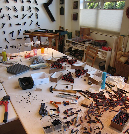
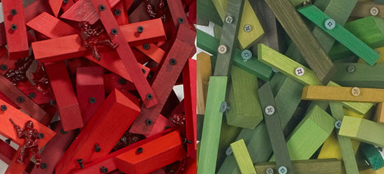
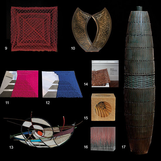
Early in 2013, I was working in my studio in San Francisco on a commission for a collector using the beautiful small branches of deep purplish/red/brown California Manzanita. I decided to paint the slant cut ends of each twig piece in a color.
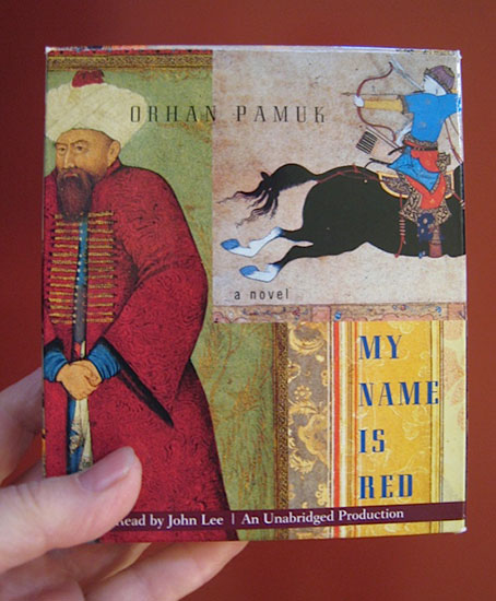
As I began to figure out what that color might be, I also began listening to Orhan Pamuk’s captivating, fascinating, informative and suspenseful murder mystery novel set in the 16th C, My Name Is Red. (16 discs 20.5 hrs.) Sometimes it is difficult to trace the provenance of specific details as they evolve in the studio, but toward the end of the book I realized that the “Turkish” red that I had chosen from my many test samples of color for the sculpture must have been suggested by Pamuk’s extraordinary novel. (During this period I was also listening constantly to the music of Otis Redding when not Pamuk’s story, so his music may have played a role in my subconscious decision making activity also.)
The Pamuk discs were given to me by a wonderful young British artist, Rebecca Taber, who was my studio assistant for a time before relocating to Southern France. When I emailed her that I was immersed in Pamuk, she responded, “it’s so symbolic in many ways. I loved the way there was a description of the clash between cultures seemingly so contemporary and yet never forgetting the period in the 1500’s when it is set. What a great studio partner! It’s so lovely to think of you there deep in Turkish red soaking up the streets of Istanbul whilst in San Francisco!” Reading Pamuk’s novel the reader will be immersed in feeling this extraordinary color and learning fascinating things about Turkey and art.
In Chapter 31 – “How exquisite it is to be red.”
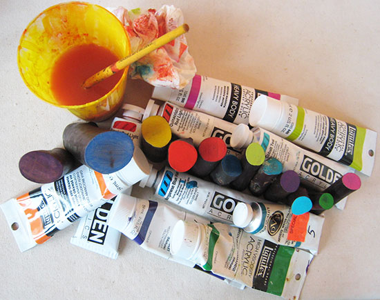
I do love red, though I find it a difficult and tricky color. I am currently working on my second red “devil” question mark sculpture. I want a wide range of reds. I can mix seemingly unlimited variations of greens, but reds… even when carefully mixing, they start looking alike within very narrow ranges – all the deep reds start looking similar and all the orange reds start looking as if from the same mixture.
Red is powerful. Some while ago, as women began to be more prominent in politics, I noticed that more and more of them were wearing red. It struck me as strange to see the few reds among all the dark suit uniforms of the men. I did not like it. It was such a strong image showing us how few women there were in leadership roles. Then I began to dislike seeing women in red. More and more of the TV newscasters, CEO’s of companies and female pundits appeared in red. Red on television often vibrates! This is very distracting. There is no light red. Light red is pink. Pink, in my opinion, is an even worse color for women… and little girls… now ubiquitous in pink, shoes, princess dresses, back packs, purses, socks, etc. (thank you Disney!). Every other color I can think of can be presented in a light version, but not red (though, perhaps, black is an exception, as well, becoming grey – many think of grey as a separate color.)
Red for women is associated with erotic… being hot. We call women tomatoes. Red for hearts – blood red. Red for emotion. Red faced – blushing. Little Red Riding Hood. Red is powerful. Red is political. Red is distracting as no other color can be. It may, conversely, be as attracting as no other color can be.
And, from Pamuk I learned, red is not known, but felt…. And that is something I have always experienced when using it and why, I now realize, I like it so much.
The Year in Books: Art, Life and Learning — Part 1
It’s been a literary trip back in time for some of browngrotta arts’ artists this year. Every day since February, Wendy Wahl has chosen something at random to read from a well-preserved, slightly earthy smelling set of the 1957 World Book Encyclopaedia. “This pursuit began,” she explains, “when I brought the volumes into the house from the studio to use as a barricade on furniture for my then one-year old Labrador Retriever. It kept her off the sofa but when I wasn’t looking she decided to explore Volumes A and N-O to see how they tasted. Volume M stands out in my memory, the letter of moving water. Included on the glossy pages are mangoes, mathematics, music, Moscow, Mexico, Morocco, molybdenum, money, minerals, medicine, manuscripts, Magna Carta, Mozart, Mendelssohn, monotype, mimeograph, motion pictures, moons, meteors, Mary, Moses, Mohammed, Manet, Monet, Matisse, milk, meat, mushroom, Madison, Marx but no Mandela. It has been revealing to look at these entries through the lens of the editors writing fifty-six years ago; I’m interested in how and what is presented and this 40th edition’s place in the 20th century.” Mary Merkel-Hess spent the entire autumn of this year reading one book – War and Peace by Leo Tolstoy. “My husband and I and a few others read it under the tutelage of an enthusiastic, young Russian professor,” she writes, “who served tea cakes and strong coffee during each of our discussions. Yes, it’s a great book and our study quickly led us to consider the history surrounding the book (Napoleonic wars), the complicated and fascinating Tolstoy family (especially the marriage of Leo and Sonya) and the use of the book and characters in other works of art – music and film. There is an American film version of the book starring Audrey Hepburn and a much better Russian film version which runs to 8 hours or so. We and our fellow classmates were captivated and the writing was, of course, superb. We read the new translation by Richard Pevear and Larissa Volokhonsky. I am not exactly recommending War and Peace, but if you would like to be submersed for awhile, able to ignore the news and unable to engage in topical conversation, I do recommend choosing it or another of the ‘great books’ as a way to take the focus off your regular life. I am now considering The Idiot by Dostoyevski (the favorite book of Pope Francis) or Joseph and His Brothers by Thomas Mann, which my daughter gave me a few years ago. Either way, I know I am in for the perfect escape.” Look for more recommendations in our next post.