Summer Solstice is the radiant first day of summer in the northern hemisphere. It arrives this week. It will be the longest day of the year and the shortest night. A holdover from pagan days, when our connection to nature was far, far closer, the solstice marks — among other things — the sun’s peak energy, the height of nature’s vitality and the boundary between seasons. Not surprisingly, these are topics that engage artists.
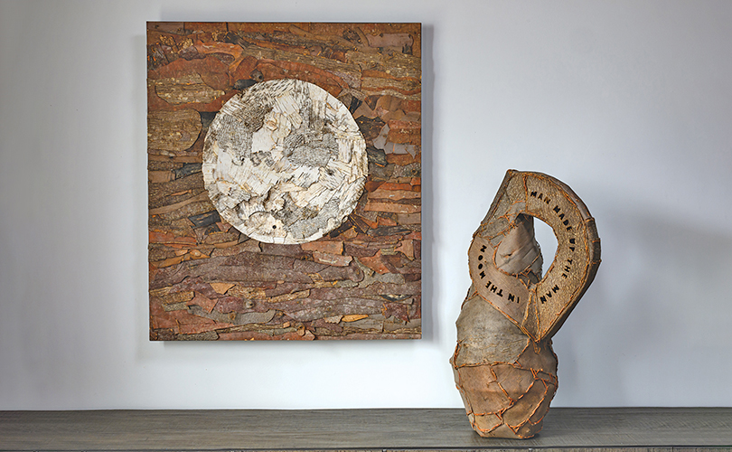
We wish you a successful solstice and celebrate it with art. The summer solstice in art spans thousands of years, evolving from ancient astronomical monuments to romanticized folklore and expressive modern landscapes. Among the most famous is Summer Solstice (In Memory of the American Chestnut Tree), by Charles Burchfield (1893 -1967). Burchfield wanted to celebrate “this great moment when the sun and earth meet in their greatest intimacy—a truly mystical event—” by painting one of his grandest landscapes.
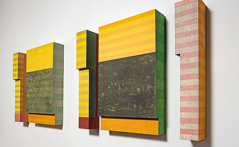
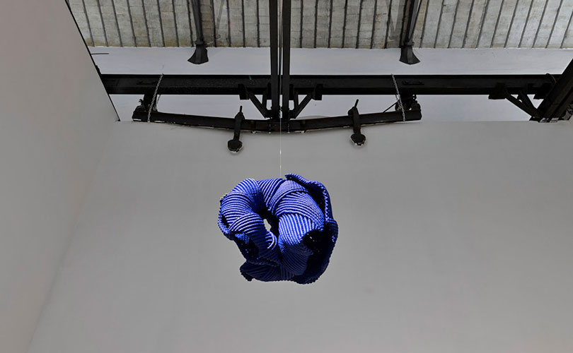
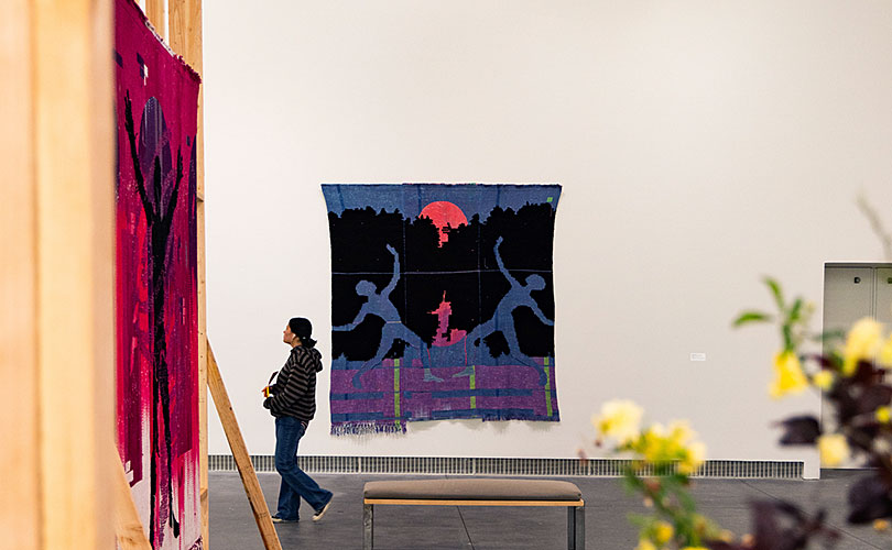
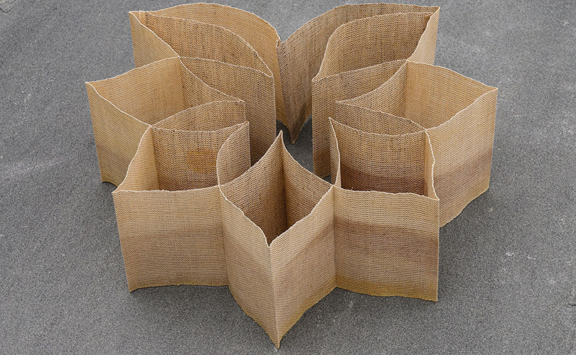
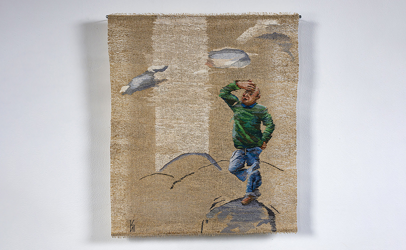
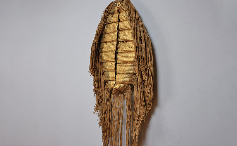
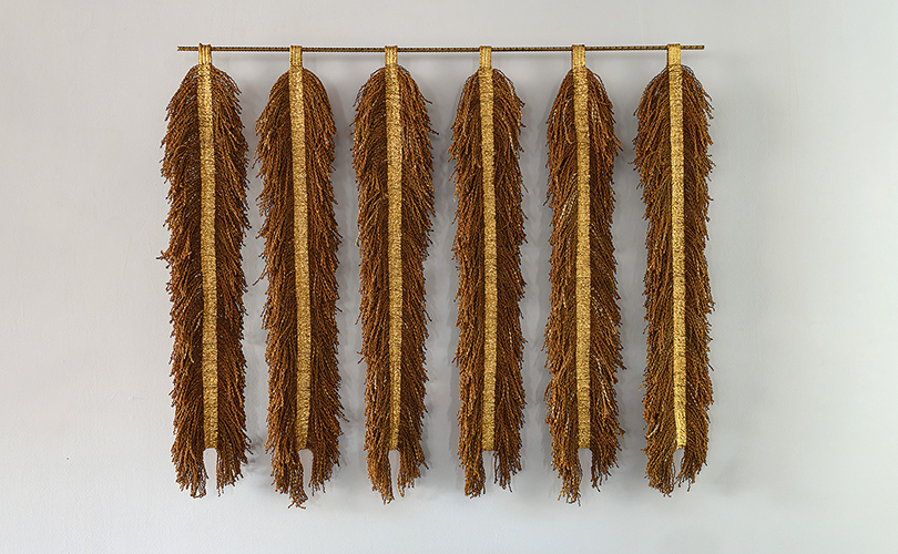
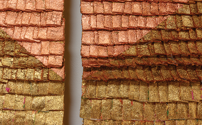
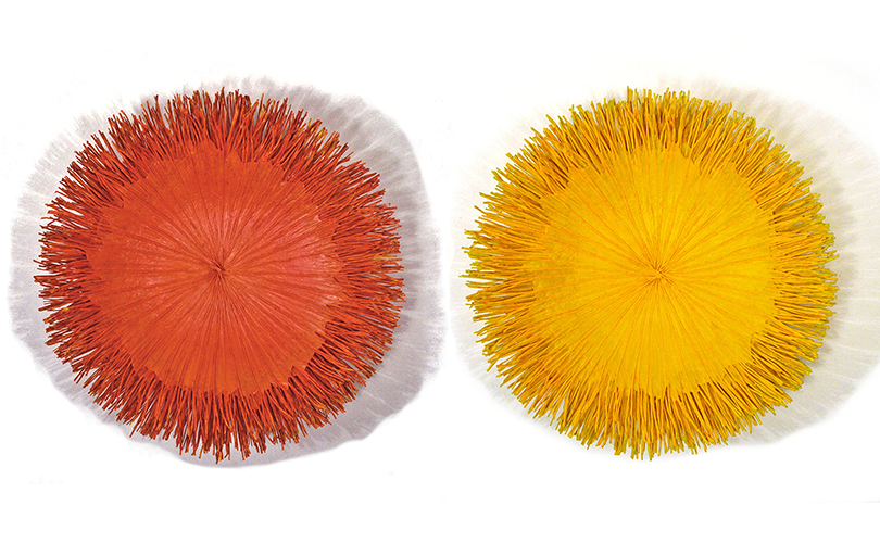
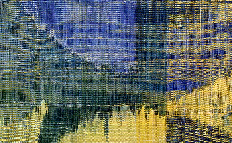
The primary hues are vibrant and earthy. They include sunny yellow and gold to represent the sun, peak solar energy, joy, and illuminations and lush geen: to symbolize fertility, abundance, growth, and the vibrant earth. Also featured in solstice celebrations are fiery orange and red to reflect passion, courage, and the transformative energy of fire like that in My Sun for Everyone by Lija Rage. Sky and water blue that echo the expansive summer sky, as you will see in Sol de la Tarde (by Eduardo Portillo and María Davíla, are yet another combination evoked by this event.
Cultures around the globe have historically celebrated this celestail event. Its core symbolic meanings encompass several universal themes, including: Triumph of Light: The abundance of daylight symbolizes enlightenment, the shedding of darkness, and the awakening of the spirit; and Abundance and Fertility: Historically viewed as the height of the growing season, the solstice represents the earth’s fertility, blossoming, and a bountiful harvest.
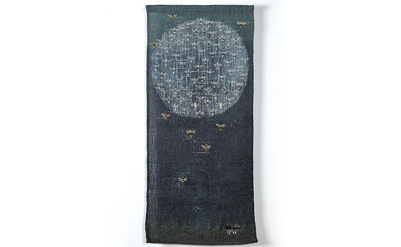
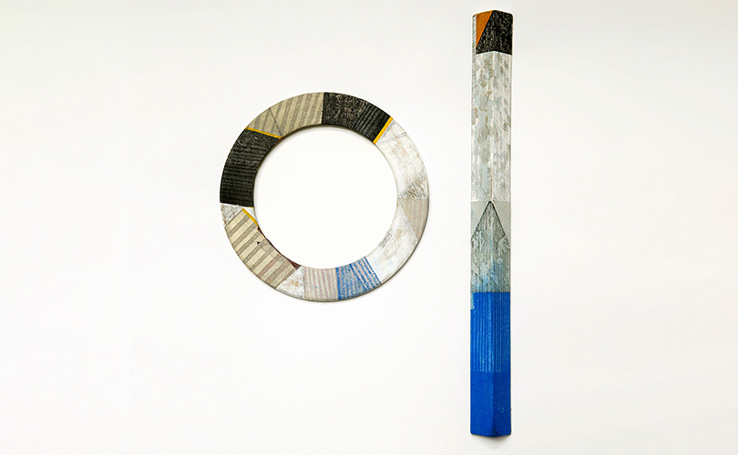
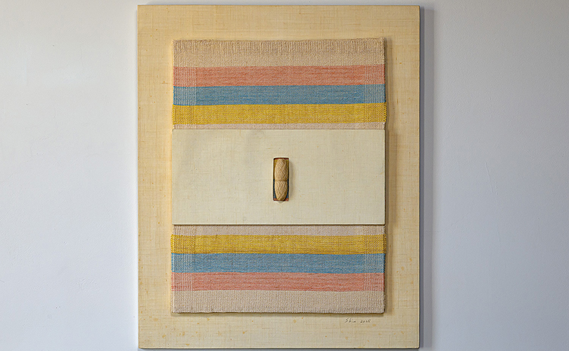
Also included are Life Balance and Duality: Despite celebrating the maximum sunlight, the summer solstice also quietly marks the day the sun “stands still” and the days begin to shorten. This duality symbolizes the delicate balance between light and dark, action and stillness, epitomized in Polly Barton’s Sun Dial. Also represented, New Beginnings: The energetic shift toward summer is often used as a symbolic marker to let go of old patterns, set new intentions, and manifest personal growth. Emotional Summer, by Young-ok Shin, explores this theme.
We wish you all these and more. Happy Solstice!